Business expenses can quickly spin out of control and cause you, the proprietor, quite a bit of undue stress. So, how do you prevent it and more importantly how do you get back the monetary control that you need in order to keep your business healthy?
Pay Attention to Even the Smallest Business Expenses
 The important thing, when cutting business expenses, is to go over thems with a fine-tooth comb. Begin by taking a look at your available funds and your overall expenses. Scour your accounting information and pay attention to all of the details.
Plug the leaks
#1 Check your records for exactly where your cash is going, who you are paying, etc. Make sure all of the expenses are vital (and legitimate), and see if there can be changes made in order to increase revenue. Plug the leaks, whether it is employee theft of office supplies or wasted electricity. These things might seem small but [Read more…] about 7 Tips to Cutting Business Expenses

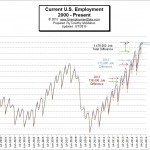
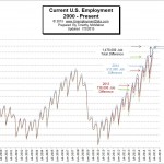
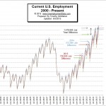
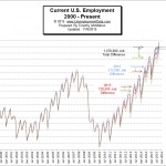 According to the current Bureau of Labor Statistics data, the employment situation for the month of October 2015 was as follows: The number of Unadjusted jobs reported for October 2015 was 143.739 million. That was up from June’s previous peak of 142.836 million.
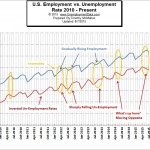
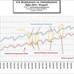
 When looking at employment vs. unemployment you would think that they would simply be the inverse of each other. Flip one over and you have the other. But the U.S. Bureau of Labor Statistics (BLS) actually uses two entirely different surveys to calculate them. So by comparing them we can spot irregularities. See
 The misery index combines two factors that can make life difficult for people i.e. unemployment and inflation. High levels of price inflation (rapidly rising prices) will cause households to have difficulty affording the basic necessities while high unemployment will leave a high percentage of households without any income at all.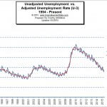
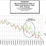
 September Employment Numbers Disappointing
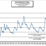
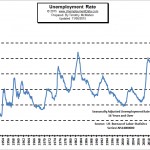
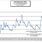 The U.S. Bureau of Labor Statistics (BLS) also released the newest unemployment data for September 2015 today. According to the BLS, the current “Seasonally Adjusted” Unemployment Rate for September is 5.1% identical to August. The BLS reported the “Unadjusted” Unemployment Rate is 4.9% which is lower than August’s 5.2% . See
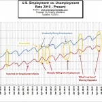
 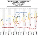 In our chart of employment vs. unemployment we compare them and although you would expect that employment and unemployment are simply the inverse of each other (i.e flip one over and you have the other) actually there are several anomalies in the data. Because the U.S. Bureau of Labor Statistics (BLS) uses two separate surveys to calculate the data it helps us see
  In an age where companies must use a wide range of different marketing tactics to compete, the salesman has somewhat of a bad reputation. While many salespeople are helpful professionals, many people think of the aggressive telemarketer or the high-pressure car salesman when they picture what it looks like to work in sales. In actuality, sales jobs can be extremely lucrative and the experience attained can offer professionals an extreme advantage in the job market. Here are six payoffs you might not expect to have when you start a career in sales.
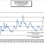 The U.S. Bureau of Labor Statistics (BLS) also released the newest unemployment data for August 2015 today. According to the BLS, the current “Seasonally Adjusted” Unemployment Rate for
 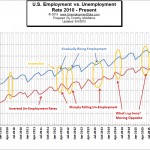 In our chart of employment vs. unemployment we compare them and although you would expect that employment and unemployment are simply the inverse of each other (i.e flip one over and you have the other) actually there are several anomalies in the data. Because the U.S. Bureau of Labor Statistics (BLS) uses two separate surveys to calculate the data it helps us see
  Your employees are the heart of your business, so hiring the right applicant is a huge decision you want to get right the first time. Large-platform job-search sites can generate hundreds of applicants for your opening, but you’ll need to develop a good strategy for limiting that pool if you want to find the perfect candidate. Below are five tips to help you narrow your applicant field and attract the candidates you really want.