
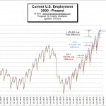
 The BLS issued their “preliminary estimates” for the employment situation for the month of July 2015. Their abbreviated report using seasonally adjusted numbers says, “Total nonfarm payroll employment increased by 215,000 in July, and the unemployment rate was unchanged at 5.3 percent, the U.S. Bureau of Labor Statistics reported today. Job gains occurred in retail trade, health care, professional and technical services, and financial activities.”
The full report of unadjusted numbers states that there were 141.794 million jobs in July down from 142.817 million jobs initially reported in June. At the same time they revised the numbers for June up to 142.839 million making the real loss of jobs -1,045,000. See Current Employment Commentary for more information.
 The U.S. Bureau of Labor Statistics (BLS) also released the newest unemployment data for July 2015 today. According to the BLS, the current “Seasonally Adjusted” Unemployment Rate for July is 5.3% the same as June but down from May’s 5.5%. The BLS reported the “Unadjusted” Unemployment Rate is 5.6% which is lower than January’s 6.1% but up from June’s unadjusted 5.5%. See Current Unemployment Chart for more information.
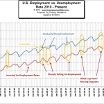 Normally, you would expect that employment and unemployment should simply be the inverse of each other. Flip one over and you have the other. However, in the chart of employment vs. unemployment we see several anomalies in the data. Since the U.S. Bureau of Labor Statistics (BLS) actually uses two entirely different surveys to calculate them it helps us see when some of the data “doesn’t quite fit”. See Current Employment vs. Unemployment Chart.
U3 vs. U6 Unemployment
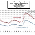 The Bureau of Labor Statistics (BLS) uses six different measures of unemployment i.e. U-1 through U-6. This chart compares the broader U-6 rate with the commonly used U-3 unemployment rate. You may notice that when unemployment rises the gap between U-3 and U-6 generally increases. For instance, the difference was only 2.7% in October 2000, when unemployment was at the lowest levels on this chart. At that point, U-3 was 3.6% and U-6 was 6.3%. But at the peak of unemployment in January 2010 U-3 was at 10.6% but U-6 shot all the way up to 18% for a difference of 7.4%. More…
Historical Employment Levels Compared to Recessions
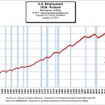 This chart shows the actual number of jobs in addition to showing recessions shaded blue as per the official description of a “recession” by the National Bureau of Economic Research (NBER).
Generally, recessions correspond pretty well to declines in employment (i.e. increased Unemployment). This is especially true since unemployment is one of the major factors NBER uses to determine whether there is an official recession. See Employment During Recessions for more information.
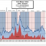 Created by economist Arthur Okun, the misery index combines two simple data sets that determine how difficult life is for the average citizen but during the 1960’s when it was created the index was actually at historically low levels.
The two factors it uses are inflation and unemployment. High levels of price inflation (rapidly rising prices) will cause households to have difficulty affording the basic necessities while high unemployment will leave a high percentage of households without any income at all. High combined levels will cause havoc throughout the economy and a high level of distress, discomfort and political unrest. See Misery Index.
Seasonal Adjusting
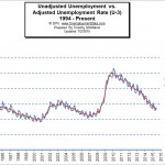 Seasonal adjustment is a statistical technique which is supposed to mitigate the influences of weather, holidays, the opening and closing of schools, and other recurring seasonal events from economic data. This should allow statisticians to spot nonseasonal movements in the data. So theoretically removing the seasonal fluctuations makes the data easier to compare from month to month and in practice it looks somewhat like a moving average smoothing out the peaks and valleys. So let’s look at how seasonally adjusted data compares to unadjusted unemployment data on a chart.
What is the “Real” Unemployment Rate?
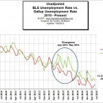 Often there is mistrust of government numbers so the Gallup survey people began doing their own survey on unemployment rates back in 2010, in an effort to determine the True Unemployment Rate. We compare their results with the results the BLS publishes in this chart. Thus we see that the Gallup numbers are usually higher than the BLS numbers with the BLS numbers consistently presenting a rosier picture. See: BLS vs. Gallup Unemployment Rates. See Also:
- Monthly Historical Unemployment Rates from 1948 through the present.
