
On June 3rd the U.S. Bureau of Labor Statistics released its “surprisingly weak” monthly Employment Report which the media is touting as “terrible”. According to the media “only 38,000 jobs were created” in the month of May. Although experts were predicting an increase two or three times as large.
This was the smallest gain since September 2010 partially fueled by the Verizon strike of 34,000 but even with that extra 34,000 payrolls would have increased by only 72,000. Fed Chair Janet Yellen has said monthly gains of roughly 100,000 jobs are needed to keep up with growth in the work-age population.
However, like most Government statistics it is only half the story. First of all, the numbers quoted are
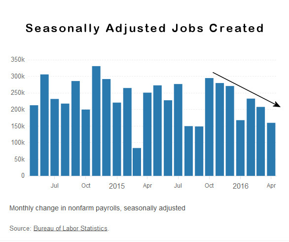 On a seasonally adjusted basis employment has fallen while on a non-adjusted basis the actual number of non-farm employed has increased from 142.887 Million to 143.944 million for a net increase of 1,057,000 jobs but since April traditionally sees a large increase in seasonal workers the seasonally adjusted number says that we were only 160,000 jobs better than what we would expect if there were zero jobs growth.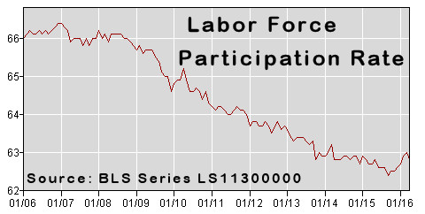
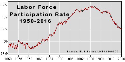

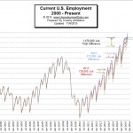 According to the current Bureau of Labor Statistics data, the employment situation for the month of October 2015 was as follows: The number of Unadjusted jobs reported for October 2015 was 143.739 million. That was up from June’s previous peak of 142.836 million.
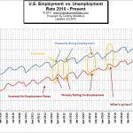
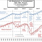 When looking at employment vs. unemployment you would think that they would simply be the inverse of each other. Flip one over and you have the other. But the U.S. Bureau of Labor Statistics (BLS) actually uses two entirely different surveys to calculate them. So by comparing them we can spot irregularities. See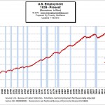
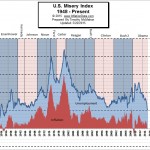 The misery index combines two factors that can make life difficult for people i.e. unemployment and inflation. High levels of price inflation (rapidly rising prices) will cause households to have difficulty affording the basic necessities while high unemployment will leave a high percentage of households without any income at all.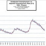
 The BLS issued their “preliminary estimates” for the employment situation for the month of August 2015. The Commissioner’s report regarding the Seasonally Adjusted numbers says, “Nonfarm payroll employment increased by 173,000 in August, and the unemployment rate edged down to 5.1 percent. Employment rose in health care and social assistance and in financial activities, while manufacturing and mining employment declined.”
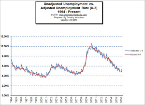
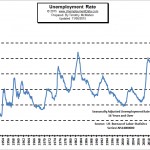
 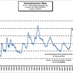 The U.S. Bureau of Labor Statistics (BLS) also released the newest unemployment data for August 2015 today. According to the BLS, the current “Seasonally Adjusted” Unemployment Rate for
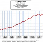
 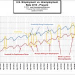 In our chart of employment vs. unemployment we compare them and although you would expect that employment and unemployment are simply the inverse of each other (i.e flip one over and you have the other) actually there are several anomalies in the data. Because the U.S. Bureau of Labor Statistics (BLS) uses two separate surveys to calculate the data it helps us see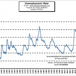
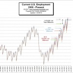

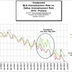
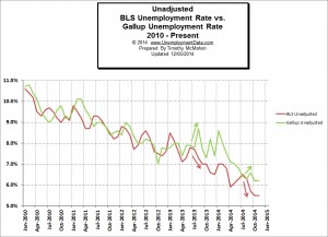 Once again the BLS numbers are quite a bit different than the independently generated Gallup numbers. This is no surprise, based on the long-term comparison between the BLS numbers and the Gallup numbers the BLS numbers consistently present a rosier picture than the Gallup numbers do.