
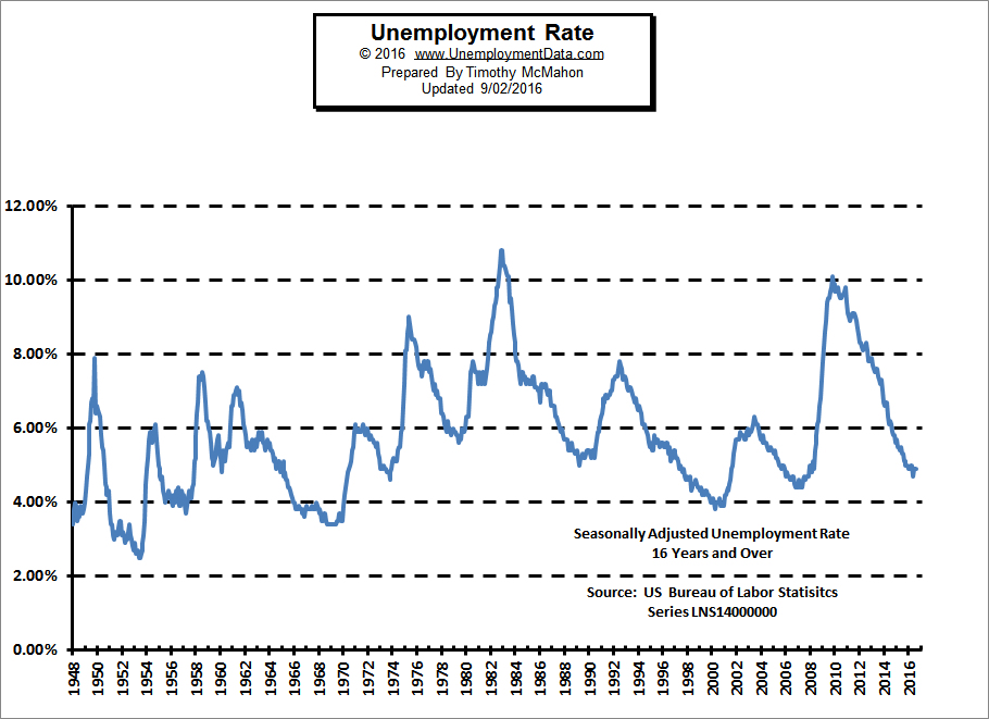
The U.S. Bureau of Labor Statistics (BLS) released the Unemployment numbers for the month of August on Friday September 2nd. The commonly quoted Seasonally Adjusted U-3 Unemployment rate was 4.9% for the third month in a row. The unadjusted U-3 Unemployment rate was 5.0% and Gallup’s equivalent was 5.4% for a “mere” 0.4% difference.
The broader U-6 Unemployment rate (also unadjusted) which includes “discouraged workers”, “marginally attached workers” and Part time workers who want to work full-time was 9.7% in August while Gallup’s equivalent which they call the “Underemployment rate” was 3.4% higher at 13.1%. The civilian non-institutional population increased another 234,000 this month bringing it to 253,854,000.
According to the BLS Commissioner’s report for this month:
 “Nonfarm payroll employment increased by [seasonally adjusted~ editor] 151,000 in August, and the unemployment rate remained at 4.9 percent. Employment continued to trend up in several service-providing industries. Incorporating revisions for June and July, which reduced nonfarm payroll employment by 1,000 on net, monthly job gains have averaged 232,000 over the past 3 months. In the 12 months prior to August, employment growth averaged 204,000 per month. Employment in food services and drinking places continued to trend up in August (+34,000). Over the year, the industry has added 312,000 jobs… Mining employment continued on a downward trend in August (-4,000). Although job losses have moderated in the last 3 months, employment in mining has fallen by 223,000 since a peak in September 2014.”
In other words, the vast majority of the jobs added over the last year are at places like McDonald’s and Hooters… while high paying mining jobs have fallen off a cliff… not the basis for building a robust economy. Although to be fair there has also been a large increase in the number of stock brokers, perhaps indicating that speculation is on the rise again. See Current Unemployment Rate Chart for full commentary.
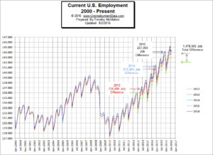 The number of Unadjusted jobs reported for August was 144.424 million up from July’s 144.200 million but down from June’s 145.215 million. Employment is barely above November 2015’s previous peak of 144.122 million.
According to the BLS, in November 2007 there were 139,443,000 people employed, the unadjusted unemployment rate was 4.5% and the civilian non-institutional population was approximately 232 million. In August of 2016 there were 144,424,000 employed for a net increase of 4.914 million jobs with an unadjusted unemployment rate of 5.0%.
But now there are 253.854 million civilians (not in jail, the military or institutions). So the population has increased by roughly 22 million. Since almost half of the population is looking for jobs (Gallup says the payroll to population rate is roughly 47%) we would need roughly 10.34 million (22 x 0.47) more jobs just to be at the same employment level we were in 2007. But employment only increased by 4.914 million. So we are about 5.43 million jobs short. But somehow the unemployment rate is roughly the same??? See Current Employment Data for more info.
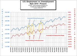
Our Current Employment vs Unemployment Chart compares the Employment rate to the Unemployment rate as reported by the BLS in an effort to get the true employment picture.
From the chart we can see that there are occasions when they are not exact mirrors of each other.
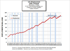
Historically employment is closely tied to recessions and that is no accident. The Historical Employment Data chart provides the employment data overlaid on blue bars showing periods of official recessions. The recovery beginning in 2011, which looks fairly impressive until you realize that it took until June of 2014 to exceed the employment levels of November 2007 and by that point the civilian non-institutional population had grown from 232.939 million to 247.814 million (or almost 16 million).
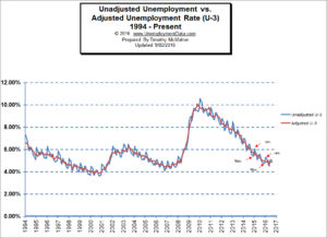
The U.S. Bureau of Labor Statistics (BLS) publishes the U.S. Unemployment Data and promotes the Seasonally Adjusted U-3 Unemployment Rate as the primary measure of unemployment. But often when we look at the adjusted Unemployment rate it is moving in the opposite direction as the unadjusted Unemployment rate. Compare them here.
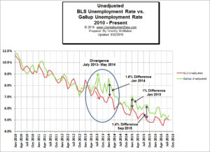 The Bureau of Labor Statistics (BLS) and the Gallup Survey people both generate numbers to help us understand the employment/unemployment situation. Unfortunately, they often present a different picture. Typically the BLS data presents a rosier picture than the independently surveyed Gallup numbers. However, like the previous two summers the gap between the BLS and the Gallup numbers closed for July 2016 with the BLS and the Gallup numbers coming in identical. The numbers for the month of August showed the gap returning with the BLS saying the Unadjusted U-3 Unemployment rate is 5.0% while Gallup says it is 5.4%. Compare the BLS and Gallup numbers.
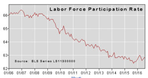 If we look at the BLS’ Seasonally Adjusted Labor Force Participation Rate we see that is has fallen drastically since 2009. Prior to 2009 it held fairly steady at around 66% of the workforce being employed but it is now below 63%. In January 2015, the Labor Force Participation Rate was 62.9% it slowly worked its way down to 62.5% in October 2015 and November but has now rebounded a bit back up to 62.8% in August 2016. A falling LFPR indicates a larger percentage of the total population is not looking for a job either voluntarily or involuntarily.