
![]() On Friday October 6th the U.S. Bureau of Labor Statistics (BLS) released their monthly employment survey results for the month of September. Every month the BLS conducts two surveys one contacts a sampling of households and the other collects data from businesses. Then they massage some of the numbers to “Seasonally Adjust” them and release them to the media.
On Friday October 6th the U.S. Bureau of Labor Statistics (BLS) released their monthly employment survey results for the month of September. Every month the BLS conducts two surveys one contacts a sampling of households and the other collects data from businesses. Then they massage some of the numbers to “Seasonally Adjust” them and release them to the media.
According to the BLS, the current “Seasonally Adjusted” Unemployment Rate for September (released October 6th) is 4.2% DOWN from 4.4% in August. The current “Unadjusted” rate is 4.1% down from 4.5% in August.
Seasonal adjustment provides something like a moving average leveling out the bumps due to normal seasonal variations. See: Unadjusted vs. Seasonally Adjusted Unemployment Rate for more information about Seasonal Adjustment.
According to the BLS Commissioner’s report for this month:
“The unemployment rate declined to 4.2 percent in September, and total nonfarm payroll employment changed little (-33,000), the U.S. Bureau of Labor Statistics reported today. A sharp employment decline in food services and drinking places and below-trend growth in some other industries likely reflected the impact of Hurricanes Irma and Harvey. “
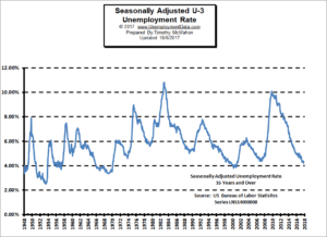
See: Current Unemployment Rate Chart for more info.
In the very next paragraph, based on the Household Unemployment Survey, he said, “The unemployment rate decreased by 0.2 percentage point to 4.2 percent in September, and the number of unemployed persons declined by 331,000 to 6.8 million. Both measures were down over the year.”
Declining unemployment means more jobs! So which is it 331,000 more jobs? -33,000 fewer jobs? Or 340,000 more jobs?
Well, in the first instance the commissioner is talking about “Seasonally Adjusted Employment” based on the Current Employment Statistics Survey (CES) which is the compilation of the reports submitted by 390,000 businesses every month. So on a Seasonally Adjusted basis there were -33,000 fewer jobs created than “average” in September. So that is how they get the -33,000.
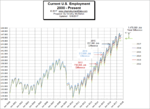 However, without adjusting the number we see that the non-adjusted numbers show August Employment at 146,540,000 and September Employment at 146,880,000 which is actually an increase of 340,000 jobs rather than a loss of -33,000. And finally, if we look at the household survey called the Current Population Survey (CPS) where they contact 15,000 households every month (out of a group of 60,000 statistically chosen) they estimate the unemployment rate and extrapolate that that resulted in about 331,000 more jobs. My guess is that their extrapolation was off by about 9,000. Maybe it’s just me but I would think reports submitted by 390,000 businesses would be a bit more accurate than questions asked of 15,000 individuals.
This is pure speculation on my part but I’m wondering if it could be that some of the people in the household survey don’t want to tell the Government survey person that they got a job because then they might lose some other benefit they are collecting (perhaps illegally)? It would only take a few of the 15,000 sample to skew the results for the whole country by 9,000. Of course there is no way the BLS surveyor is going to correlate their survey answers with other agencies (they’re government employees after all) but if you’re answering question why take chances , right?
See: Current Employment Commentary for more info.
Labor Force Participation Rate (LFPR)
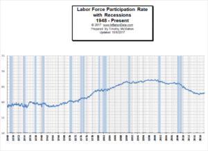 According to the Bureau of Labor Statistics the “Labor Force” is made up of both employed and unemployed people. Unemployed people are defined as those who are actively looking for work. Once you stop looking (i.e discouraged workers) you are no longer in the official labor force. Since the 2008 great recession the LFPR has fallen drastically. Ever wonder if the LFPR always declines during recessions? Well, we did so this month we’ve created a new chart of the LFPR compared to recessions and the results will surprise you. At least they surprised us.
See Labor Force Participation Rate for more info.
Employment By Sectors
The following Bubble Chart from the Bureau of Labor Statistics shows employment gains and losses by sector. Sectors to the right of the vertical line gained jobs while those to the left lost jobs. The most obvious outlier is the Leisure and Hospitality bubble in the lower left corner. which lost a whopping -111,000 jobs. Unfortunately, these are also one of the lowest paid sectors earning an average of only $404.30 per week. These losses may be primarily due to the dual hurricanes of Harvey and Irma shutting down much of the tourism in the Southeastern United States during September. Interestingly, had this sector not lost -111,000 jobs the seasonally adjusted numbers would have been +78,000 instead of -33,000. Although a portion of the +8,000 gains from Construction might not have happened. Other notable gains were +27,000 in Education and Health Services (returning Teachers?), +21,800 in Transportation and Warehousing, +13,000 in Professional and Business Services, +10,000 in Financial Services, and +6,700 in Wholesale Trade.

How to read this chart:
Bubbles location on the chart tell us two things:
Change in Employment Levels over the most recent month.
Average Weekly earnings.
The further to the right the bubble the larger the increase in the number of jobs. The higher up on the chart the larger the average salary.
The dotted horizontal line tells us the average weekly salary of all categories.
The solid vertical “Zero” line tells us that bubbles to the left of this line actually lost jobs this month.
Employment and Average Weekly Earnings by Industry for All Employees,
September 2017, Seasonally Adjusted
| Industry | Monthly Change in Employment |
Average Weekly Earnings |
Employment Level |
|---|---|---|---|
|
Total private |
-40,000 | $913.32 | 124,322,000 |
|
Mining and logging |
2,000 | $1,466.10 | 721,000 |
|
Construction |
8,000 | $1,132.57 | 6,911,000 |
|
Manufacturing |
-1,000 | $1,085.88 | 12,447,000 |
|
Wholesale trade |
6,700 | $1,182.78 | 5,932,800 |
|
Retail trade |
-2,900 | $564.54 | 15,809,000 |
|
Transportation and warehousing |
21,800 | $927.56 | 5,110,500 |
|
Utilities |
0.0 | $1,665.77 | 552,700 |
|
Information |
-9,000 | $1,412.07 | 2,707,000 |
|
Financial activities |
10,000 | $1,254.00 | 8,473,000 |
|
Professional and business services |
13,000 | $1,152.00 | 20,807,000 |
|
Education and health services |
27,000 | $869.20 | 23,217,000 |
|
Leisure and hospitality |
-111,000 | $404.30 | 15,873,000 |
|
Other services |
-5,000 | $757.95 | 5,761,000 |
You might also like:
- Unemployment Rate Chart – The seasonally adjusted unemployment rate from 1948 to the present is one of the most watched statistics. Where is it now and should you trust it?
- U-6 Unemployment Rate– U-6 is the broadest measure of unemployment and includes all classes of Unemployed plus those ”marginally attached” and/or part-time for economic reasons.
- Current Employment Data – How many jobs are there actually? This chart shows Employment since Jan 2000 and what the current trend is.
- Historical Employment Data Chart– How Many People Are Actually Employed? This chart shows the actual employment rate without all the mumbo jumbo. It gives a clear picture of the employment level in the United States from 1939 to the Present. When employment is rising the economy is growing. When the employment rate levels off or declines times are not so good. Take a look and see how employment rates correspond to recessions over time.
- Labor Force Participation Rate