
September nonfarm payroll report from the Bureau of Labor Statistics (BLS)
![]()
- Unadjusted U-3 was Down from 5.3% to 4.6%
- Adjusted U-3 was Down from 5.2% to 4.8%
- Unadjusted U-6 was Down from 8.9% to 8.1%
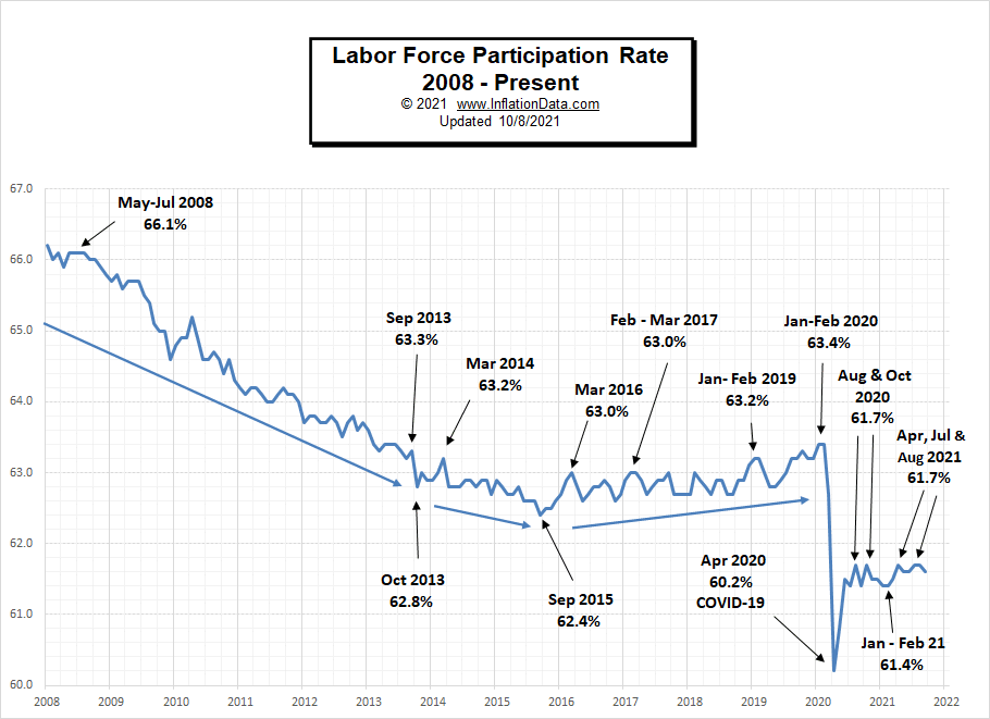
- Labor Force Participation Down from 61.7% to 61.6%
- Unadjusted employment rose from 147.028 million to 147.682 million
Although these numbers are generally an improvement over last month (except Labor Force Participation), the market expected better. Bloomberg was projecting jobs growth of roughly 2.5x what we actually got.
According to the Commissioner of the U.S. Bureau of Labor Statistics:
Nonfarm payroll employment rose by 194,000 in September, and the unemployment rate fell by 0.4 percentage point to 4.8 percent.
Notable job gains occurred in leisure and hospitality, in professional and business services, in retail trade, and in transportation and warehousing.
Employment declined in public education over the month.
As usual, they are talking about “Seasonally Adjusted Jobs” from the “Current Population Survey (CPS)” rather than looking at the results reported by actual companies in their “Current Employment Statistics survey (CES).”
But looking at the CES report, we see…
Initially, the BLS reported 146.856 for August, which they adjusted to 147.028 million. For September, they are currently saying employment is 147.682 million.
This is an increase of 826,000 jobs based on their original estimates. Or an increase of 654,000 based on their updated numbers.
However, the market considers this a “much softer-than-expected September nonfarm payroll report” since Bloomberg was projecting 500,000 new jobs instead of the CPS Seasonally Adjusted 194,000.
The labor force participation rate dipped to 61.6% from August’s 61.7% rate, compared to forecasts of an increase to 61.8%.
Employment by Sector
The employment “bubble chart” shows each sector separately (on a seasonally adjusted basis). Bubble Size tells us total employment for each industry (i.e., larger bubbles mean more people are employed in that sector). Bubble location on the chart tells us, Change in Employment Levels over the most recent month… The further to the right the bubble, the larger the number of jobs, and the higher up on the chart, the larger the average salary.
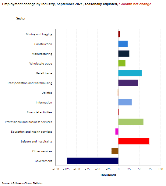
Typically you would expect Education to be up significantly in September, but instead, many Teachers refused to return to work due to mandatory vaccination concerns. Some have chosen to become private tutors instead (which are not counted in the employment numbers). Leisure & Hospitality, Professional & Business Services, and Retail were the largest gainers.
Average weekly wages rose from $1,066.33 in August to $1,073.58 in September.

Employment and Average Weekly Earnings by Industry
September 2021, Seasonally Adjusted
| Industry | Monthly Increase | Average Weekly Earnings | Employment Level |
| Total Private Employment | 317,000 | $1,073.58 | 125,569,000 |
| Mining and Logging | 4,000 | $1,624.27 | 647,000 |
| Construction | 22,000 | $1,330.00 | 7,447,000 |
| Manufacturing | 26,000 | $1,212.81 | 12,446,000 |
| Wholesale trade | 16,900 | $1,327.16 | 5,735,800 |
| Retail trade | 56,100 | $683.69 | 15,407,600 |
| Transportation and Warehousing | 47,300 | $1,042.97 | 5,894,700 |
| Utilities | -500 | $1,906.46 | 537,600 |
| Information | 32,000 | $1,634.67 | 2,806,000 |
| Financial Activities | 2,000 | $1,509.00 | 8,850,000 |
| Professional and Business Services | 60,000 | $1,358.63 | 21,064,000 |
| Education and Health Services | -7,000 | $1,014.36 | 23,665,000 |
| Leisure and Hospitality | 74,000 | $496.49 | 15,321,000 |
| Other Services | -16,000 | $879.36 | 5,748,000 |
Another way to look at these monthly numbers. This one includes government jobs which lost a whopping 125,000 jobs.
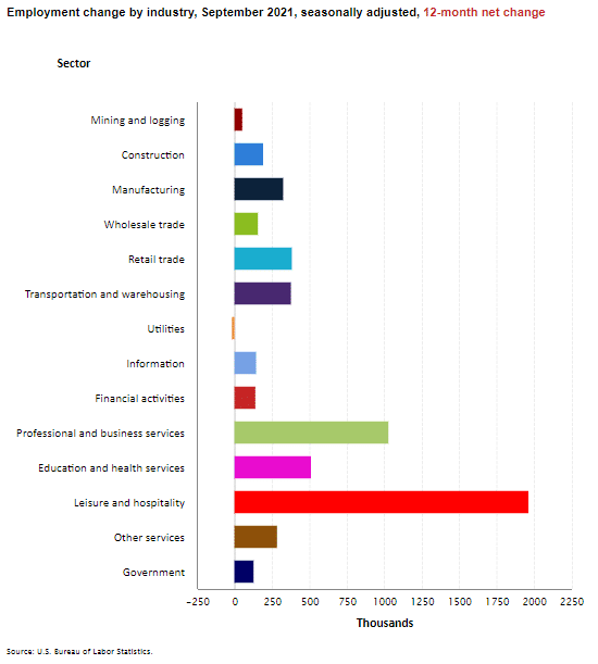
Looking at Employment Change by Industry over the last 12 months we can see the improvement in all the sectors except Utilities which tend to be very stable year over year.
Source: BLS
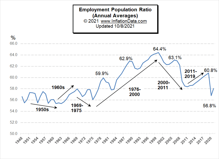
Employment-Population Ratio
Last month we expanded our coverage of the Employment-Population Ratio. This chart shows the actual percentage of the population that is working, unlike the Labor Force Participation Rate, which shows the portion of the population that is working or looking for work.
In this chart, we can see the long-term trends in the percentage of the population that is working. For more information and to see the full commentary on these trends, see Employment-Population Ratio.
U1 through U6 Unemployment Rates
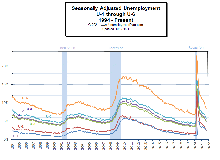
For more information about the various measurements of unemployment, see What Is U-6 Unemployment?
Current Employment
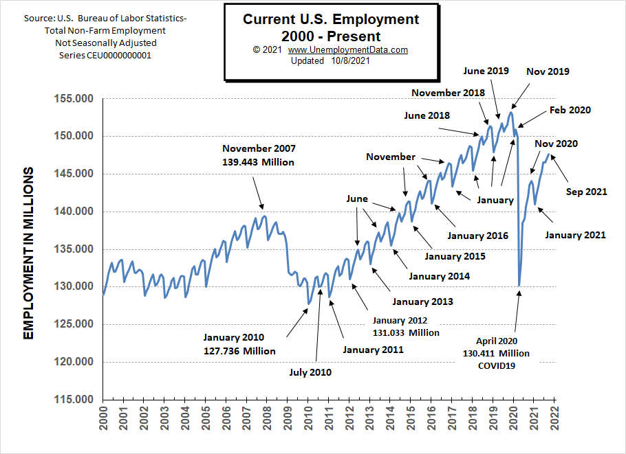
September employment ticked up, but overall, employment is still well below peak levels of November 2019 despite the population growing by roughly 1.6 million.
See Current Employment for more info.
Unemployment Normalizing
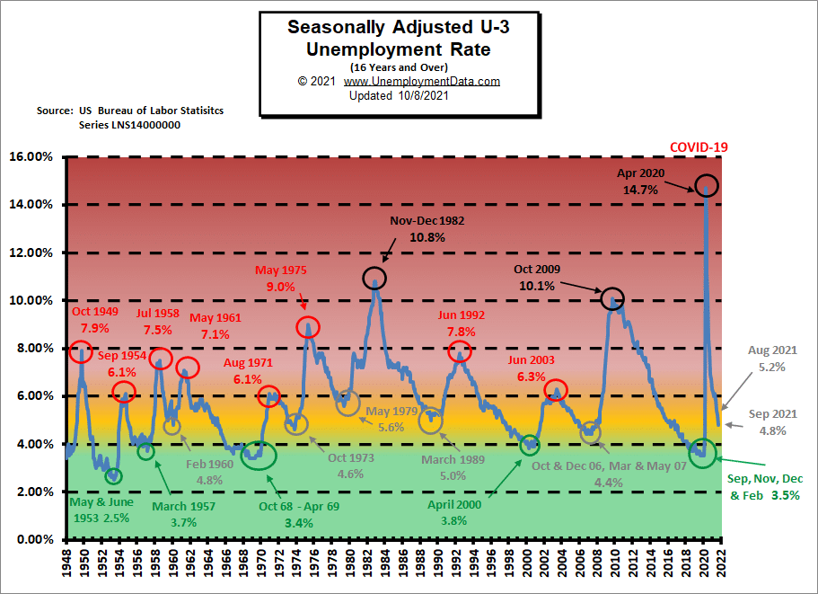
In the chart below, the “red zone” indicates things are really bad. Historically “Bad” for the U-3 usually starts at around 6.5%-7% and stops at about 10%, with only three occasions getting above 10%. In 2020 COVID sent unemployment from really good (green zone) to really bad virtually overnight.
The yellow zone (from about 4% to 6%) is the normal operating range, and when unemployment stays in this range, the economy is generally doing OK. Below 4%, the economy is doing great and above 7%, and the economy is in trouble. Currently, the adjusted U-3 unemployment rate has fallen from the horrendous 14.7% of April 2020 down to 4.8% in September.
Historical Employment
A high unemployment rate is a significant component of a recession. The blue bars in the chart below indicate official recessions, while the red line shows the Historical Employment Data. Several years after the 2008 crash, employment finally rose above the 2007 peak levels. Then in April 2020, COVID drove the number of people employed below the 2007 peak and approaching the lows of the 2008-2010 crash. By August 2020, employment had rebounded above the 2007 peak level, but it remains below the 2019 peak.
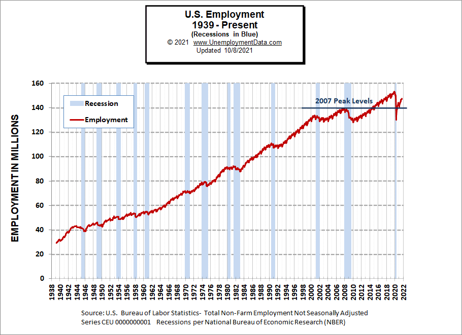
See Historical Employment Data for more info.
Current Seasonally Adjusted Unemployment
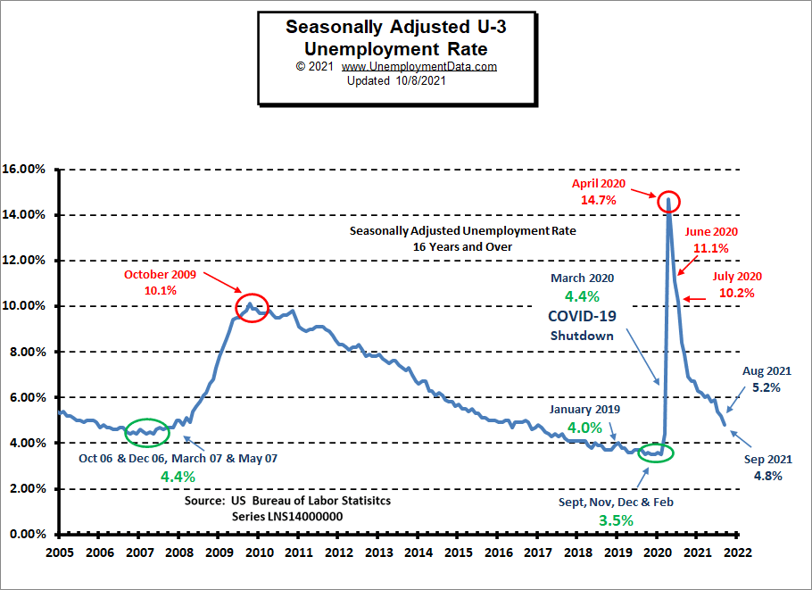 See Current Employment Commentary for more information.
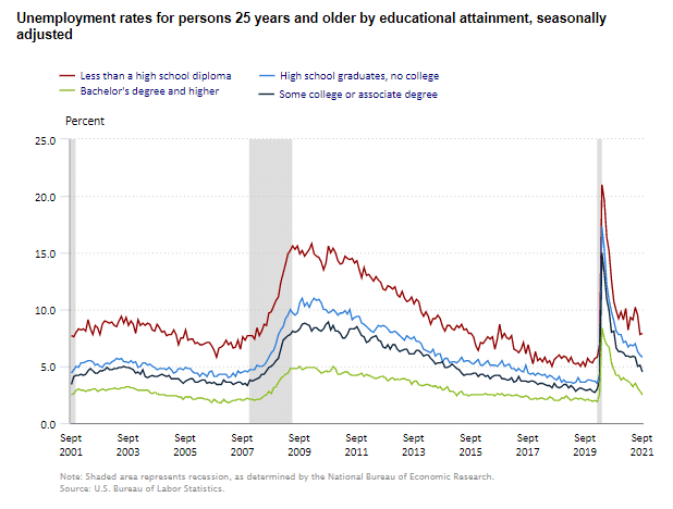
Unemployment by Education
Those with the least education always have the worst employment prospects and are the first to be laid off when the economy gets bad because they can easily be replaced later. Those with specialized knowledge and/or skills are retained at all costs. The unemployment rate for those with a Bachelors’s degree (or above) is typically between 2% and 3%, except when times are terrible. Currently, the rate for those with a Bachelors’s degree (or above) is 2.5%. At the same time, the unemployment rate for those with less than a High School diploma is 7.9% up from 7.8% in August.
Labor Force Participation Rate
The Labor Force Participation Rate (LFPR) appears to be bouncing between 61.4% and 61.7%.
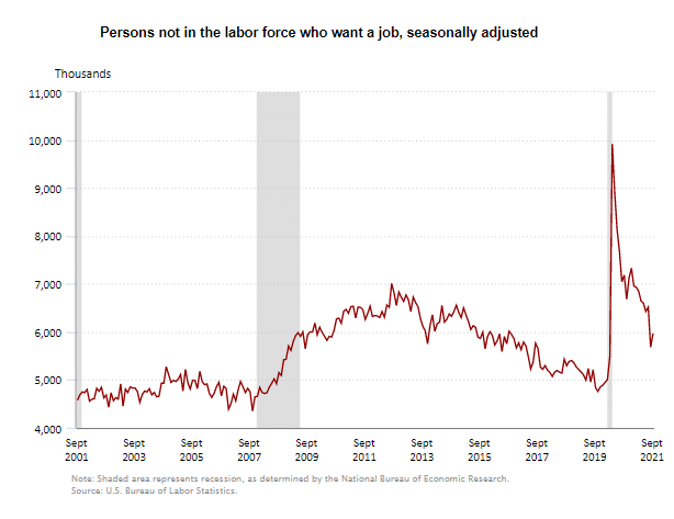
As we explain in the page on the Labor Force Participation Rate, the BLS has a strange definition of Labor Force Participation, and so if you “want a job” but don’t look, you aren’t in the Labor Force. But they still track people in this category. The following chart shows that the number of people in this category ticked up in September after falling fairly consistently over the last year.
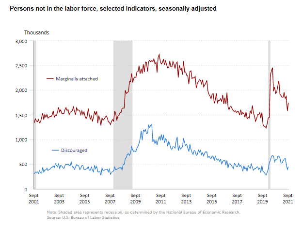
 Marginally Attached and Discouraged Workers
Among those NOT in the Labor Force are those that the BLS considers marginally attached and discouraged.
- Marginally Attached Workers- Persons not in the labor force who want and are available for work, and who have looked for a job sometime in the prior 12 months (or since the end of their last job if they held one within the past 12 months), but were not counted as unemployed because they had not searched for work in the 4 weeks preceding the survey. Discouraged workers are a subset of the marginally attached.
- Discouraged workers (Current Population Survey)
Persons not in the labor force who want and are available for a job and who have looked for work sometime in the past 12 months (or since the end of their last job if they held one within the past 12 months), but who are not currently looking because they believe there are no jobs available or there are none for which they would qualify.
So the primary difference between marginally attached and discouraged workers is their belief that there are no jobs available. An uptick in discouraged workers could indicate a worsening job market.
If you would like to receive this monthly report and other article updates, click here. You can unsubscribe at any time.
Here are some articles you might enjoy in case you missed them:
Read more on UnemploymentData.com.
- Great Careers: No College Degree Necessary
- Blue State Unemployment is 33.33% Higher Than Red States
- 6 Reasons to Know Your Rights as an Employee
- New Careers in Workforce Management
- What To Do If an Injury is Keeping You From Working
From InflationData.com
- Why is a Little Bit of Inflation Considered Good for the Economy?
- FED Issues September 2021 Statement
- August 2021 Inflation Down Slightly
- How to Prepare for Inflation
- Safe-Haven Investments that Protect Your Capital From Rising Inflation
- 9 Inflation Books You Must Read
- Hyperinflation Strikes Lebanon… Again
From Financial Trend Forecaster
- Moore Inflation Predictor
- NYSE ROC
- NASDAQ ROC
- From Pandemic To 2021 Supply Chain Disruption
- Batteries: New Sea-Water Based Battery to Replace Lithium
- Farming: Discovering New Ways to Feed the Planet
- Fintech: The New Financial Management Disruptive Technology
- Record Credit Card Debt Reduction
- Why a Financial “Panic” May Be Just Around the Corner
- “Kiss of Death” Stock Market Indicator
- Will Oil Prices Skyrocket in the Aftermath of Hurricane Ida?
- Be Prepared “Or Else”
- The Maniacal Residential Real Estate Market
From OptioMoney.com
- How to Prepare for a Severe Storm
- Is Downsizing Right for You?
- The Best Investment Advice for Beginners
- Secrets for Lucrative Investment Properties
From Your Family Finances