
![]()
Employment Increased by 1.25 Million in September
The U.S. Bureau of Labor Statistics (BLS) released its employment / unemployment report for September on October 2nd.
- Unadjusted U-3 was Down from 8.5% to 7.7%!
- Adjusted U-3 was Down from 8.4% to 7.9%!
- Unadjusted U-6 was Down from 14.3% to 12.4%!
- Labor Force Participation fell from 61.7% to 61.4%.
- Unadjusted Employment up from 140.718 million to 141.855 million.
According to the Commissioner of the U.S. Bureau of Labor Statistics:
“Nonfarm payroll employment increased by 661,000 in September, and the unemployment rate fell to 7.9 percent. These improvements reflect the continued resumption of economic activity that had been curtailed due to the coronavirus (COVID-19) pandemic and efforts to contain it.
In September, employment continued to increase in several industries, with the largest gains in leisure and hospitality, in retail trade, in health care and social assistance, and in professional and business services. By contrast, employment declined in government, mainly in state and local government education.”
Of course, he is talking about “Seasonally Adjusted Jobs” from the “Current Population Survey (CPS)” rather than looking at the results reported by actual companies in their “Current Employment Statistics survey (CES)”
But looking at the CES report we see…
Originally the BLS reported 140.598 million jobs for August, they added 120,000 jobs since that estimate.
So currently they are saying 140.718 million jobs for August and 141.855 million jobs for September which is actually an increase of 1,257,000 jobs based on their original estimates.
Employment by Sector
The employment “bubble chart” gives us a good representation of how each sector of the economy is doing (employment wise on a seasonally adjusted basis).
The best-performing sectors in September were Retail which gained 142,400 jobs, Leisure & Hospitality which gained 318,000 jobs, and Professional and Business Services with a gain of 89,000 jobs. Other big gainers were Financial Activities, Manufacturing, and Transportation.
The two sectors with the smallest gains were Mining & Logging which gained 1,000 jobs after losing -2,000 jobs last month, and Utilities which gained 2,800 jobs.
Average weekly wages rose slightly in September to $1,022.61 from August’s $1,019.66 and July’s $1,013.96.
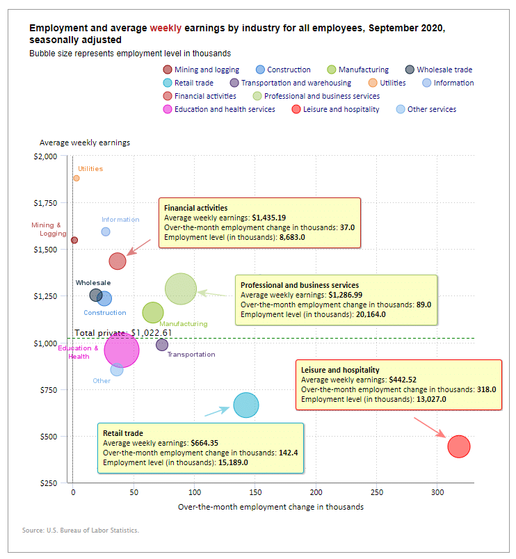
(See the table below for details.)
How to read this chart:
The bubbles location on the chart tell us two things:
- Change in Employment Levels over the most recent month.
- Average Weekly earnings.
- The further to the right the bubble the larger the increase in the number of jobs.
- The higher up on the chart the larger the average salary.
Bubble Size tells us:
- Total Employment for the sector.
- Larger bubbles mean more people are employed in that sector.
Employment and Average Weekly Earnings by Industry
September 2020, Seasonally Adjusted
| Industry | Monthly Increase | Average Weekly Earnings | Employment Level |
| Total Private Employment | 877,000 | $1,022.61 | 119,917,000 |
| Mining and Logging | 1,000 | $1,547.88 | 613,000 |
| Construction | 26,000 | $1,235.00 | 7,245,000 |
| Manufacturing | 66,000 | $1,159.77 | 12,205,000 |
| Wholesale trade | 18,700 | $1,253.56 | 5,622,500 |
| Retail trade | 142,400 | $664.35 | 15,189,000 |
| Transportation and Warehousing | 73,600 | $987.24 | 5,373,800 |
| Utilities | 2,800 | $1,879.65 | 541,800 |
| Information | 27,000 | $1,593.23 | 2,618,000 |
| Financial Activities | 37,000 | $1,435.19 | 8,683,000 |
| Professional and Business Services | 89,000 | $1,286.99 | 20,164,000 |
| Education and Health Services | 40,000 | $958.77 | 23,189,000 |
| Leisure and Hospitality | 318,000 | $442.52 | 13,027,000 |
| Other Services | 36,000 | $854.34 | 5,446,000 |
U1 through U6 Unemployment Rates
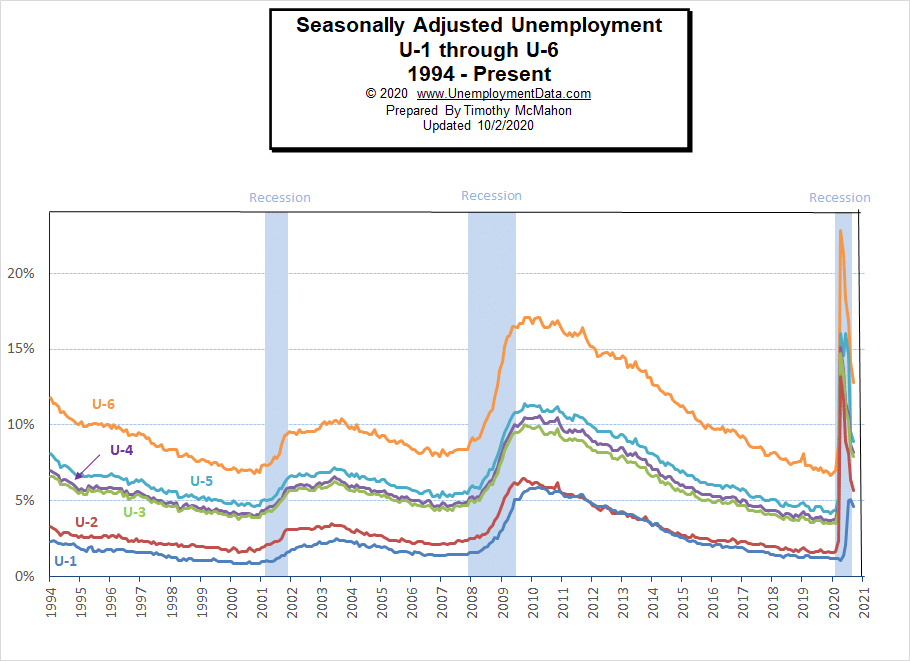
Due to COVID, all the various measurements of Seasonally Adjusted Unemployment from U-1 through U-6 spiked up sharply beginning in April except U1 which measures unemployment longer than 15 weeks. In August as in July, they all fell except U-1 indicating that unemployment for some people had lasted more than 15 weeks. In September they all fell including U-1.
For more information about the various measurements of unemployment see What Is U-6 Unemployment?
Previous Record Low Unemployment (Seasonally Adjusted U-3)
If we consider anything 4% or below as “low” we have had a few “low” stretches as we can see in the table below.
(4% or below in Green)
| Jan | Feb | Mar | Apr | May | Jun | Jul | Aug | Sep | Oct | Nov | Dec | |
| 1950 | 6.5% | 6.4% | 6.3% | 5.8% | 5.5% | 5.4% | 5.0% | 4.5% | 4.4% | 4.2% | 4.2% | 4.3% |
| 1951 | 3.7% | 3.4% | 3.4% | 3.1% | 3.0% | 3.2% | 3.1% | 3.1% | 3.3% | 3.5% | 3.5% | 3.1% |
| 1952 | 3.2% | 3.1% | 2.9% | 2.9% | 3.0% | 3.0% | 3.2% | 3.4% | 3.1% | 3.0% | 2.8% | 2.7% |
| 1953 | 2.9% | 2.6% | 2.6% | 2.7% | 2.5% | 2.5% | 2.6% | 2.7% | 2.9% | 3.1% | 3.5% | 4.5% |
| 1954 | 4.9% | 5.2% | 5.7% | 5.9% | 5.9% | 5.6% | 5.8% | 6.0% | 6.1% | 5.7% | 5.3% | 5.0% |
| 1955 | 4.9% | 4.7% | 4.6% | 4.7% | 4.3% | 4.2% | 4.0% | 4.2% | 4.1% | 4.3% | 4.2% | 4.2% |
| 1956 | 4.0% | 3.9% | 4.2% | 4.0% | 4.3% | 4.3% | 4.4% | 4.1% | 3.9% | 3.9% | 4.3% | 4.2% |
| 1957 | 4.2% | 3.9% | 3.7% | 3.9% | 4.1% | 4.3% | 4.2% | 4.1% | 4.4% | 4.5% | 5.1% | 5.2% |
| 1958 | 5.8% | 6.4% | 6.7% | 7.4% | 7.4% | 7.3% | 7.5% | 7.4% | 7.1% | 6.7% | 6.2% | 6.2% |
| … | … | … | … | … | … | … | … | … | … | … | … | … |
| 1965 | 4.9% | 5.1% | 4.7% | 4.8% | 4.6% | 4.6% | 4.4% | 4.4% | 4.3% | 4.2% | 4.1% | 4.0% |
| 1966 | 4.0% | 3.8% | 3.8% | 3.8% | 3.9% | 3.8% | 3.8% | 3.8% | 3.7% | 3.7% | 3.6% | 3.8% |
| 1967 | 3.9% | 3.8% | 3.8% | 3.8% | 3.8% | 3.9% | 3.8% | 3.8% | 3.8% | 4.0% | 3.9% | 3.8% |
| 1968 | 3.7% | 3.8% | 3.7% | 3.5% | 3.5% | 3.7% | 3.7% | 3.5% | 3.4% | 3.4% | 3.4% | 3.4% |
| 1969 | 3.4% | 3.4% | 3.4% | 3.4% | 3.4% | 3.5% | 3.5% | 3.5% | 3.7% | 3.7% | 3.5% | 3.5% |
| 1970 | 3.9% | 4.2% | 4.4% | 4.6% | 4.8% | 4.9% | 5.0% | 5.1% | 5.4% | 5.5% | 5.9% | 6.1% |
| … | … | … | … | … | … | … | … | … | … | … | … | … |
| 1999 | 4.3% | 4.4% | 4.2% | 4.3% | 4.2% | 4.3% | 4.3% | 4.2% | 4.2% | 4.1% | 4.1% | 4.0% |
| 2000 | 4.0% | 4.1% | 4.0% | 3.8% | 4.0% | 4.0% | 4.0% | 4.1% | 3.9% | 3.9% | 3.9% | 3.9% |
| 2001 | 4.2% | 4.2% | 4.3% | 4.4% | 4.3% | 4.5% | 4.6% | 4.9% | 5.0% | 5.3% | 5.5% | 5.7% |
| … | … | … | … | … | … | … | … | … | … | … | … | … |
| 2018 | 4.1% | 4.1% | 4.1% | 3.9% | 3.8% | 4.0% | 3.9% | 3.9% | 3.7% | 3.7% | 3.7% | 3.9% |
| 2019 | 4.0% | 3.8% | 3.8% | 3.6% | 3.6% | 3.7% | 3.7% | 3.7% | 3.5% | 3.6% | 3.5% | 3.5% |
| 2020 | 3.6% | 3.5% | 4.4% | 14.7% | 13.3% | 11.1% | 10.2% | 8.4% | 7.9% |
Historical Employment
Historically employment is closely tied to recessions and that is no accident. One of the primary factors in calculating whether the economy is officially in a recession is an increase in the unemployment rate. The chart below provides the Historical Employment Data overlaid on blue bars showing periods of official recessions. In April, the number of people employed fell below the 2007 peak, near the lows of the 2008-2010 crash. In August it rebounded back above the 2007 peak level. According to the National Bureau of Economic Research (NBER) we have officially been in a recession since February. Since they measure a recession beginning from the peak, that just means the economy is no longer growing, which is pretty obvious due to the virus.
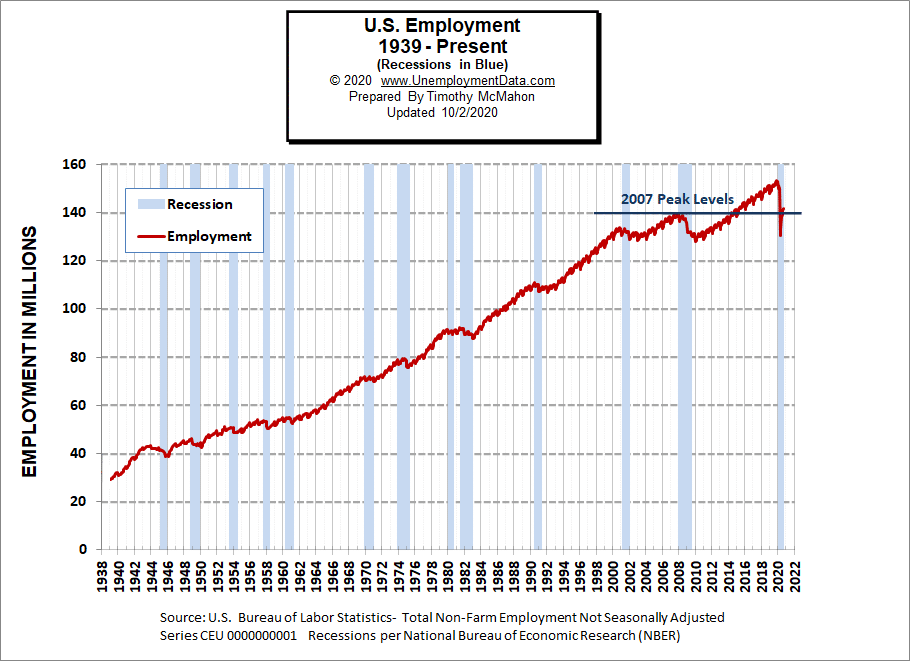
See Historical Employment Data for more info.
Current Employment
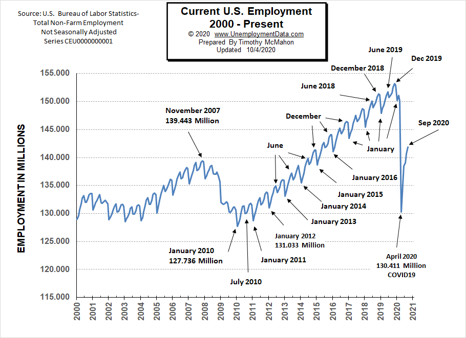
Typically the low point for each year occurs in January and then it moves almost straight up to a small peak around June with a slight drop around July and then the highest peak in employment happens in November/December.
But the COVID virus has shortcircuited the normal trend and we saw a drop which began in March and by April it took employment back down to approximately the level of July 2010. June saw employment rebound to approximately the January 2015 level. Fortunately, July did not follow the traditional pattern but instead rose (although only slightly) rather than falling. August’s employment rose to roughly the January 2016 level. September’s Employment was 141.855 million.
See Current Employment for more info.
Current Seasonally Adjusted Unemployment
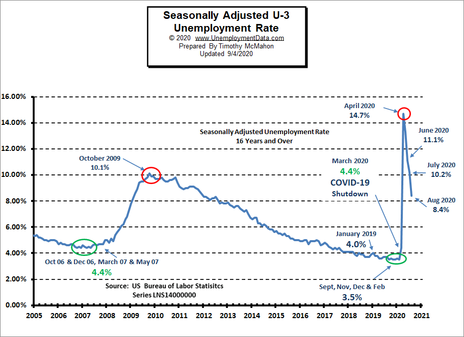 See Current Employment Commentary for more info.
Unemployment by Education
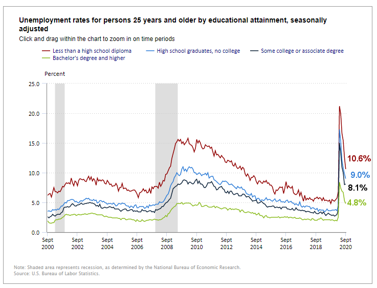 Those unemployed with less than a High School Diploma fell from 21.2% in April to 15.4% in July and 10.6% in September. After bottoming at 4.8% in September 2019.
At the other end of the spectrum, those with a Bachelor’s degree or higher fell from 8.4% in April to 4.8% in September.
Typically those with a Bachelor’s degree are relatively immune to unemployment. Although during the 2008 recession college grads unemployment rose to slightly above 4%.
Source: Bureau of Labor Statistics
Layoff Status
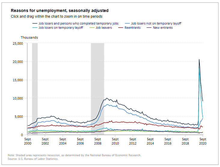 Job losers who completed temporary jobs continued to fall as did those on temporary layoff (i.e. people who were laid off due to the virus are returning to work) but the troubling number on this chart is the job losers NOT on temporary layoff this number continues increasing meaning that the number of jobs that are going away permanently is increasing.
Source: BLS
Net Change in Employment
In the following chart, we can see the net change in employment levels over the last year. All are still below year-ago levels with the greatest disparity in the Leisure and Hospitality sector. It still employs roughly 3.6 million LESS than a year ago… a net loss of -21.7%.
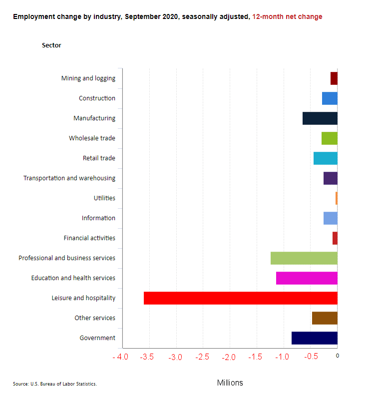
Source: BLS
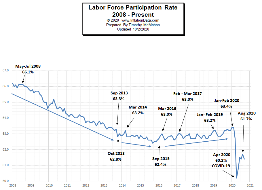
Labor Force Participation Rate
Even though Unemployment was in record low territory for quite some time, it wasn’t until January and February 2020, that the LFPR was finally able to claw its way back to 63.4%, its highest level since 2013.
Then COVID decimated all those gains dropping the LFPR down to 60.2% in April. In May it began to rebound and in June the LFPR was able to bounce back a little more to 61.5%, it fell slightly in July but this was probably due to people returning to the labor force rather than other factors. In August the LFPR rose to 61.7% but fell back to July levels in September.
See Labor Force Participation Rate for more information.
If you would like to receive this monthly report and other article updates click here you can unsubscribe at any time.
Here are some articles you might enjoy in case you missed them:
Read more on UnemploymentData.com.
- How to Appear Highly Professional in an Interview
- Simple Steps to Planning a Successful Conference
- Is Being a Call Center Agent Right For You?: The Pros and Cons to Consider
- How to Turn Losing a Job Into Gaining Your Own Business
- Latino Unemployment Lower than Asian Unemployment for First Time
From InflationData.com
- The Price of Oil Denominated in Bitcoin
- How has Venezuela’s Bitcoin experiment Fared?
- A Guide for Business Owners: How to Prepare Your Organization for Inflation
- August Inflation Rises
- Gold vs. Dollar vs. BitCoin Revisited
From Financial Trend Forecaster
- Speed and Affordability: Cost of Internet Access Over Time
- New Technologies in the Oil and Gas Industry
- Oil Majors That Bet Big On Renewables
- Oil Demand Impacts Foreign Exchange Rates
From Elliott Wave University
- Does the Stock Market Really “See” the Future?
- Gold: See What This Fibonacci Ratio Says About the Trend
- Forecasting Markets by Looking at Chart Patterns
- Seeking Certainty in Uncertain Times?
- Emerging Markets and Epidemics
From OptioMoney.com
- Should You Buy a Second Home?
- Learning to Trade from Video Tutorials
- Five Business Tips to Help Your Company Thrive
From Your Family Finances