
![]() The U.S. Bureau of Labor Statistics (BLS) released their monthly unemployment survey results for May on June 7th. Although Unemployment is still at record lows job creation is less than expected.
The U.S. Bureau of Labor Statistics (BLS) released their monthly unemployment survey results for May on June 7th. Although Unemployment is still at record lows job creation is less than expected.
According to the U.S. Bureau of Labor Statistics:
The U.S. economy created 75,000 jobs in May and the seasonally adjusted unemployment rate held steady at 3.6 percent. However, economists projected a 175,000 jobs gain and instead only got 75,000 so they were disappointed but that didn’t stop the stock market with the DOW gaining over 1% in a single day.
According to the BLS Commissioner’s report for this month:
“ Nonfarm payroll employment edged up in May (+75,000), and the unemployment rate remained at 3.6 percent.
Employment continued to trend up in professional and business services and in health care…
In May, 4.4 million people were working part time for economic reasons (also referred to as involuntary part-time workers),
down by 299,000 from the previous month and by 565,000 over the year.”
Key factors in the report were:
Employment in professional and business services increased by 33,000…
Health Care employment rose by 16,000…
Construction employment increased by 4,000…
Seasonally Adjusted U-3 Unemployment remains at its lowest rate since December 1969.
Of course the Commissioner is talking about “Seasonally Adjusted” jobs. In unadjusted terms April had 150.942 million jobs and May had 151.629 million for an actual increase of 687,000 jobs.
For more info see our Current Unemployment Chart and Current U.S. Employment Chart commentary:
Key May Employment and Unemployment Numbers
- Adjusted U-3 Unemployment- 3.6% unchanged from April
- Unadjusted U-3 Unemployment- 3.4% up from 3.3% in April but down from 3.9% in March and 4.1% in February, and 4.4% in January.
- Unadjusted U-6 Unemployment- 6.7% down from 6.9% in April and 7.5% in March, 7.7% in February and 8.8% in January.
- Unadjusted Employment (Establishment Survey)- 151.629 million up from 150.988 million in April, 149.862 million in March, 149.143 million in February and 148.295 million in January.
- Labor Force Participation Rate- 62.8% unchanged from April.
Current Seasonally Adjusted U-3 levels are below the 3.8% lows of 2000. Prior to that we have to go all the way back to 1969 to see better unemployment levels than we have currently. If we break below 3.4% we have to go all the way back to 1953 to find lower levels and remember that was during the boom that followed WWII with a massive loss of the workforce due to the war so we probably won’t see levels that low again.
The 1969 lows occurred during the Vietnam war. Prior to 1969 was a low of 3.7% in 1957.
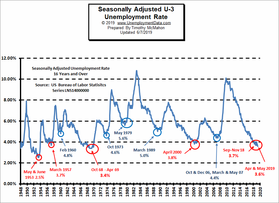
See Current Unemployment Chart for more info.
Previous Record Low Unemployment (Seasonally Adjusted U-3)
If we consider anything 4% or below as “low” we have had a few “low” stretches as we can see in the table below.
(4% or below in Blue)
| Jan | Feb | Mar | Apr | May | Jun | Jul | Aug | Sep | Oct | Nov | Dec | |
| 1950 | 6.5% | 6.4% | 6.3% | 5.8% | 5.5% | 5.4% | 5.0% | 4.5% | 4.4% | 4.2% | 4.2% | 4.3% |
| 1951 | 3.7% | 3.4% | 3.4% | 3.1% | 3.0% | 3.2% | 3.1% | 3.1% | 3.3% | 3.5% | 3.5% | 3.1% |
| 1952 | 3.2% | 3.1% | 2.9% | 2.9% | 3.0% | 3.0% | 3.2% | 3.4% | 3.1% | 3.0% | 2.8% | 2.7% |
| 1953 | 2.9% | 2.6% | 2.6% | 2.7% | 2.5% | 2.5% | 2.6% | 2.7% | 2.9% | 3.1% | 3.5% | 4.5% |
| 1954 | 4.9% | 5.2% | 5.7% | 5.9% | 5.9% | 5.6% | 5.8% | 6.0% | 6.1% | 5.7% | 5.3% | 5.0% |
| 1955 | 4.9% | 4.7% | 4.6% | 4.7% | 4.3% | 4.2% | 4.0% | 4.2% | 4.1% | 4.3% | 4.2% | 4.2% |
| 1956 | 4.0% | 3.9% | 4.2% | 4.0% | 4.3% | 4.3% | 4.4% | 4.1% | 3.9% | 3.9% | 4.3% | 4.2% |
| 1957 | 4.2% | 3.9% | 3.7% | 3.9% | 4.1% | 4.3% | 4.2% | 4.1% | 4.4% | 4.5% | 5.1% | 5.2% |
| 1958 | 5.8% | 6.4% | 6.7% | 7.4% | 7.4% | 7.3% | 7.5% | 7.4% | 7.1% | 6.7% | 6.2% | 6.2% |
| … | … | … | … | … | … | … | … | … | … | … | … | … |
| 1965 | 4.9% | 5.1% | 4.7% | 4.8% | 4.6% | 4.6% | 4.4% | 4.4% | 4.3% | 4.2% | 4.1% | 4.0% |
| 1966 | 4.0% | 3.8% | 3.8% | 3.8% | 3.9% | 3.8% | 3.8% | 3.8% | 3.7% | 3.7% | 3.6% | 3.8% |
| 1967 | 3.9% | 3.8% | 3.8% | 3.8% | 3.8% | 3.9% | 3.8% | 3.8% | 3.8% | 4.0% | 3.9% | 3.8% |
| 1968 | 3.7% | 3.8% | 3.7% | 3.5% | 3.5% | 3.7% | 3.7% | 3.5% | 3.4% | 3.4% | 3.4% | 3.4% |
| 1969 | 3.4% | 3.4% | 3.4% | 3.4% | 3.4% | 3.5% | 3.5% | 3.5% | 3.7% | 3.7% | 3.5% | 3.5% |
| 1970 | 3.9% | 4.2% | 4.4% | 4.6% | 4.8% | 4.9% | 5.0% | 5.1% | 5.4% | 5.5% | 5.9% | 6.1% |
| … | … | … | … | … | … | … | … | … | … | … | … | … |
| 1999 | 4.3% | 4.4% | 4.2% | 4.3% | 4.2% | 4.3% | 4.3% | 4.2% | 4.2% | 4.1% | 4.1% | 4.0% |
| 2000 | 4.0% | 4.1% | 4.0% | 3.8% | 4.0% | 4.0% | 4.0% | 4.1% | 3.9% | 3.9% | 3.9% | 3.9% |
| 2001 | 4.2% | 4.2% | 4.3% | 4.4% | 4.3% | 4.5% | 4.6% | 4.9% | 5.0% | 5.3% | 5.5% | 5.7% |
| … | … | … | … | … | … | … | … | … | … | … | … | … |
| 2018 | 4.1% | 4.1% | 4.1% | 3.9% | 3.8% | 4.0% | 3.9% | 3.9% | 3.7% | 3.7% | 3.7% | 3.9% |
| 2019 | 4.0% | 3.8% | 3.8% | 3.6% | 3.6% |
Employment
Historically employment is closely tied to recessions and that is no accident. One of the primary factors in calculating whether the economy is officially in a recession is an increase in the unemployment rate. The chart below provides the Historical Employment Data overlaid on blue bars showing periods of official recessions.
In May 2019 employment reached 151.629 million up from 150.988 million in April, 149.862 million in March, 149.143 million in February and 148.295 million in January. That was 2.269 million more than the previous May. As we can from the chart the largest loss in numbers of jobs occurred during the “Great Recession” of 2008 and it took several years before employment levels once again reached 2007 levels.
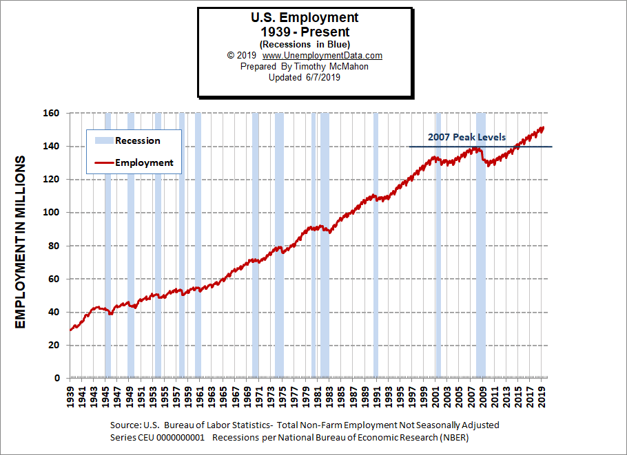 As we can see from the table below from November 2007 to January 2008 there were over 3 million jobs lost but that actually wasn’t all that surprising. Typically January suffers from a reduction in Seasonal workers. Even good years like 2005-2006 saw a reduction of 3 million workers and January 2008 employment levels were still above January 2007 levels. But by January 2009 year over year losses exceeded 4 million. By 2010 the economy had lost another 4.2 million. 2011 showed almost a million jobs improvement but the economy was still on shaky ground. It wasn’t until January 2014 that the economy reached January 2007 levels and January 2015 exceeded January 2008 levels.
| Date | Employment in Millions |
| January 2007 | 135.335 |
| November 2007 (Peak) | 139.510 |
| January 2008 | 136.268 |
| January 2009 | 132.042 |
| January 2010 | 127.820 |
| January 2011 | 128.778 |
| January 2012 | 131.113 |
| January 2013 | 133.081 |
| January 2014 | 135.488 |
| January 2015 | 138.511 |
| January 2016 | 141.088 |
| January 2017 | 143.393 |
| January 2018 | 145.428 |
| January 2019 | 148.295 |
| February 2019 | 149.148 |
| March 2019 | 149.864 |
| April 2019 | 150.942 |
| May 2019 | 151.629 |
Employment Numbers are “Preliminary” for two months before the BLS considers them finalized due to late coming data.
See Historical Employment and Current Employment for more info.
Employment by Sector
The employment “bubble chart” gives us a good representation of how each sector of the economy is doing (employment wise). As we can see from the chart below there are four sectors to the left of the vertical zero line this month, meaning that they lost employees. The biggest loser is retail with a loss of -7,600 jobs. Other losers are Information at -5,000, Other Services -1,000 and Transportation and Warehousing -200.
The biggest gainer (furthest to the right on the chart) was Professional and Business Services adding 33,000 jobs (on top of the 76,000 jobs gained last month) this is an above average paid sector earning $1,213.15 on average per week. This far outweighs the loss of lower paid retail jobs.
Education and Health Services added 27,000 moderate paying jobs with an average weekly earning of $906.84. Leisure and Hospitality added 26,000 low paid jobs at an average of $427.35/wk.
Average weekly wages rose slightly $955.29 in April to $957.35 in May.

(See the table below for average weekly earnings and other details.)
How to read this chart:
Bubbles location on the chart tell us two things:
- Change in Employment Levels over the most recent month.
- Average Weekly earnings.
- The further to the right the bubble the larger the increase in the number of jobs.
- The higher up on the chart the larger the average salary.
Bubble Size tells us:
- Total Employment for the sector.
- Larger bubbles mean more people are employed in that sector.
Employment and Average Weekly Earnings by Industry
May 2019, Seasonally Adjusted
| Industry | Monthly Increase | Average Weekly Earnings | Employment Level |
| Total Private Employment | 90,000 | $957.35 | 128,581,000 |
| Mining and Logging | 1,000 | $1,551.51 | 757,000 |
| Construction | 4,000 | $1,199.59 | 7,482,000 |
| Manufacturing | 3,000 | $1,119.34 | 12,839,000 |
| Wholesale trade | 7,100 | $1,220.68 | 5,939,600 |
| Retail trade | -7,600 | $597.73 | 15,780,600 |
| Transportation and Warehousing | -200 | $957.50 | 5,538,100 |
| Utilities | 400 | $1,761.46 | 552,400 |
| Information | -500 | $1,515.33 | 2,797,000 |
| Financial Activities | 2,000 | $1,350.59 | 8,652,000 |
| Professional and Business Services | 33,000 | $1,213.15 | 21,427,000 |
| Education and Health Services | 27,000 | $906.84 | 24,171,000 |
| Leisure and Hospitality | 26,000 | $427.35 | 16,721,000 |
| Other Services | -1,000 | $792.46 | 5,924,000 |
Note: Based on this table by the BLS there was a seasonally adjusted gain of 90,000 jobs not the 75,000 mentioned by the Commissioner.
The Differential between U3 and U6
The differential between the unadjusted U3 and U6 (reached by subtracting U3 from U6) bottomed at 3.5% during late 2018 but then it spiked up culminating in a 4.4% differential in January. But in February it fell back to 3.6% where it remained in March and April. But fell to 3.3% in May indicating a tightening labor market.
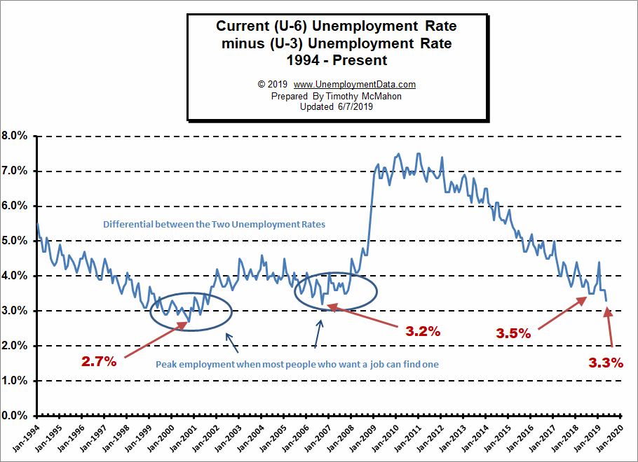
See Current U-6 Unemployment Rate for more info.
U-6 Unemployment
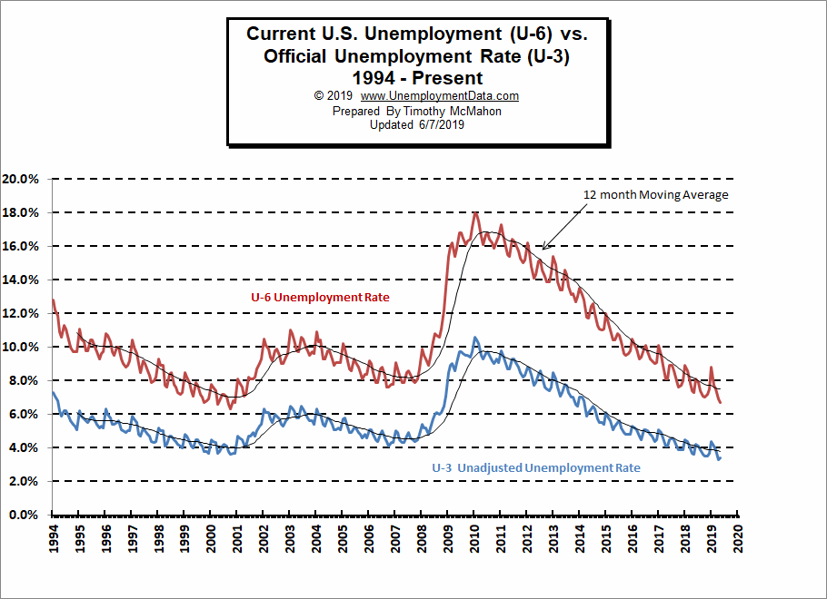
Current U-6 Unadjusted Unemployment Rate for May fell to 6.7% from 6.9% in April
It was 7.5% in March and 7.7% in February. January 2019 was 8.8% and it was 7.5% in December 2018.
See Unadjusted U-6 unemployment for more info.
Labor Force Participation Rate
The Labor Force Participation Rate (LFPR) for May was unchanged from April’s 62.8% but down from March’s 63.0%, and down from it’s January and February peak at 63.2%.
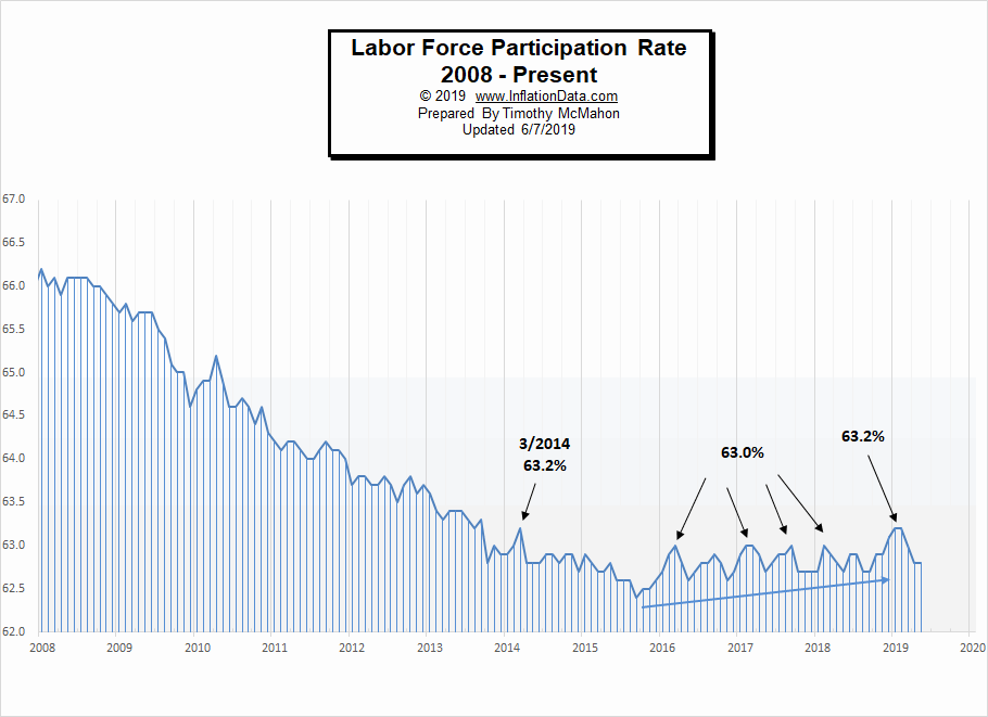
See Labor Force Participation Rate for more information.
Employment Population Ratio
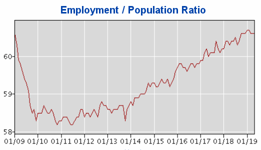
The index many people think of when they hear the term Labor Force Participation Rate might be better described by the Employment Population Ratio. This index shows the percentage of the entire population that is working. In many ways it is a better index than the LFPR or the Unemployment rate. Current levels are back in the range of where they were in 2009 even though the population has drastically increased.
Here are some articles you might enjoy in case you missed them:
Read more on UnemploymentData.com.
- Finding Fulfillment in Your Career
- Could Landscape Architecture Be the Career for You?
- 9-to-5 Freedom! 4 Careers that Don’t Keep You behind a Desk
- How to Remain Productive During Your Time out of Work
- Starting Your Own Business and Keeping It Successful
From InflationData.com
- How Does Inflation Affect Foreign Exchange Rates
- Oil Price Inflation Charts and Tables Updated
- Health Insurance Inflation Over the Last 10 Years
- Are Deflationary Forces Taking Hold Again?
- Gold as an Investment
- How Inflation and Interest Rates Relate
From Financial Trend Forecaster
- U.S. Develops New “Humanitarian” Missile That Doesn’t Kill People
- U.S.-China Trade War: Who will Win?
- Is Saudi Arabia Still an 800 Pound Gorilla
- Smart Money Is Piling Into Oil
- Merger Mania: The World’s Largest Oil Company And Petrochemical Company Merge
- Is War Good for Stocks?
- The Long-Term Message from the VIX
- Is the Falling Trade Deficit Good for Stocks?
- NASDAQ Signal Has Only Occurred 15 Times In Last 42 Years
From OptioMoney.com
- 4 Hidden Car Costs
- Buying and Selling Ranch Land: A Beginner’s Guide
- 4 Tips to Cover the Bills When Your Disability Keeps You Home
- Investments You’ll Thank Yourself for in Twenty Years
From Your Family Finances