
![]() The U.S. Bureau of Labor Statistics (BLS) released their monthly unemployment survey results for January on February 1st. “Seasonally Adjusted” Unemployment U-3 is 4.0% up from 3.9% in December. Unadjusted U-3 was 4.4% up from 3.7% in December and 3.5% in November.
The U.S. Bureau of Labor Statistics (BLS) released their monthly unemployment survey results for January on February 1st. “Seasonally Adjusted” Unemployment U-3 is 4.0% up from 3.9% in December. Unadjusted U-3 was 4.4% up from 3.7% in December and 3.5% in November.
Looking back, Seasonally Adjusted U-3 started 2017 at 4.8% then it bounced around between 4.3% and 4.4% from April through October 2017, then it stayed at 4.1% from October 2017 through March 2018. It bounced between 3.8% and 4.0% from April through August 2018 before falling to 3.7% in September – November. So unemployment is currently at the same level as it was from April through August 2018.
Key January Employment and Unemployment Numbers
- Adjusted U-3 Unemployment- 4.0% up from 3.9% in December and 3.7% in November.
- Unadjusted U-3 Unemployment- 4.4% up from 3.7% in December and 3.5% in November.
- Unadjusted U-6 Unemployment- 8.8% up from 7.5% in December and 7.2% in November.
- Unadjusted Employment- 148.201 million down from 151.190 million in December and 151.244 million in November.
- January Labor Force Participation Rate- 63.2% up from 63.1% in December and LFPR 62.9%.
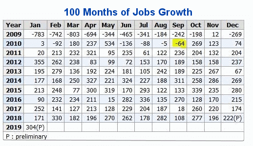
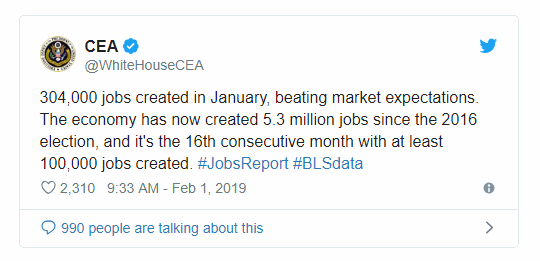
- 100th straight gain in Seasonally Adjusted Employment
As I have been saying for a while typically unemployment doesn’t stay below 4% for very long. As we can see from the chart below the dip in 2006-7 didn’t even get below 4%. The 2000 dip only spent a couple of months below 4%. The 1960, 1973, ’79 and ’89 dips didn’t get below 4% at all. We have to go all the way to the 1950’s and 1960’s to see longer periods of unemployment below 4% and that was a time when wars eliminated a large chunk of the workforce.
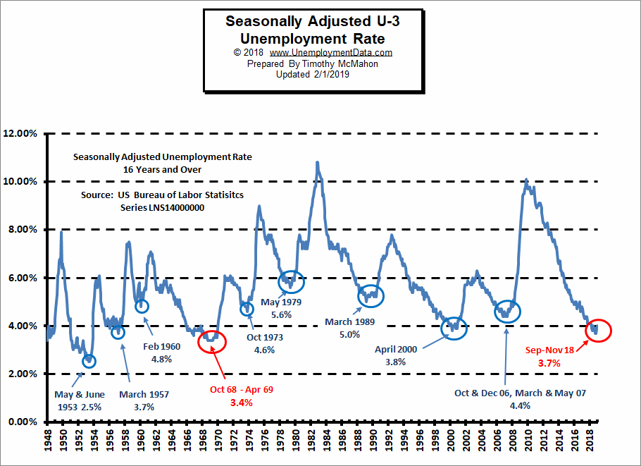
See Current Unemployment Chart for more info.
Previous Record Low Unemployment (Seasonally Adjusted U-3)
(4% or below in Blue)
| Jan | Feb | Mar | Apr | May | Jun | Jul | Aug | Sep | Oct | Nov | Dec | |
| 1950 | 6.5% | 6.4% | 6.3% | 5.8% | 5.5% | 5.4% | 5.0% | 4.5% | 4.4% | 4.2% | 4.2% | 4.3% |
| 1951 | 3.7% | 3.4% | 3.4% | 3.1% | 3.0% | 3.2% | 3.1% | 3.1% | 3.3% | 3.5% | 3.5% | 3.1% |
| 1952 | 3.2% | 3.1% | 2.9% | 2.9% | 3.0% | 3.0% | 3.2% | 3.4% | 3.1% | 3.0% | 2.8% | 2.7% |
| 1953 | 2.9% | 2.6% | 2.6% | 2.7% | 2.5% | 2.5% | 2.6% | 2.7% | 2.9% | 3.1% | 3.5% | 4.5% |
| 1954 | 4.9% | 5.2% | 5.7% | 5.9% | 5.9% | 5.6% | 5.8% | 6.0% | 6.1% | 5.7% | 5.3% | 5.0% |
| 1955 | 4.9% | 4.7% | 4.6% | 4.7% | 4.3% | 4.2% | 4.0% | 4.2% | 4.1% | 4.3% | 4.2% | 4.2% |
| 1956 | 4.0% | 3.9% | 4.2% | 4.0% | 4.3% | 4.3% | 4.4% | 4.1% | 3.9% | 3.9% | 4.3% | 4.2% |
| 1957 | 4.2% | 3.9% | 3.7% | 3.9% | 4.1% | 4.3% | 4.2% | 4.1% | 4.4% | 4.5% | 5.1% | 5.2% |
| 1958 | 5.8% | 6.4% | 6.7% | 7.4% | 7.4% | 7.3% | 7.5% | 7.4% | 7.1% | 6.7% | 6.2% | 6.2% |
| … | … | … | … | … | … | … | … | … | … | … | … | … |
| 1965 | 4.9% | 5.1% | 4.7% | 4.8% | 4.6% | 4.6% | 4.4% | 4.4% | 4.3% | 4.2% | 4.1% | 4.0% |
| 1966 | 4.0% | 3.8% | 3.8% | 3.8% | 3.9% | 3.8% | 3.8% | 3.8% | 3.7% | 3.7% | 3.6% | 3.8% |
| 1967 | 3.9% | 3.8% | 3.8% | 3.8% | 3.8% | 3.9% | 3.8% | 3.8% | 3.8% | 4.0% | 3.9% | 3.8% |
| 1968 | 3.7% | 3.8% | 3.7% | 3.5% | 3.5% | 3.7% | 3.7% | 3.5% | 3.4% | 3.4% | 3.4% | 3.4% |
| 1969 | 3.4% | 3.4% | 3.4% | 3.4% | 3.4% | 3.5% | 3.5% | 3.5% | 3.7% | 3.7% | 3.5% | 3.5% |
| 1970 | 3.9% | 4.2% | 4.4% | 4.6% | 4.8% | 4.9% | 5.0% | 5.1% | 5.4% | 5.5% | 5.9% | 6.1% |
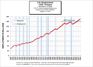
Employment
According to the Bureau of Labor Statistics Commissioner’s report:
“Total nonfarm payroll employment increased by 304,000 in January, and the unemployment rate edged up to 4.0 percent. Job gains occurred in several industries. including leisure and hospitality, construction, health care, and transportation and warehousing.”
Note: These are Seasonally adjusted numbers. Actual employment decreased for January by 2.98 million. Final employment numbers for December were 151.182 million. This month’s preliminary employment numbers are 148.201 million. But the Commissioner is saying that it fell 304,000 less than average for the month of January.
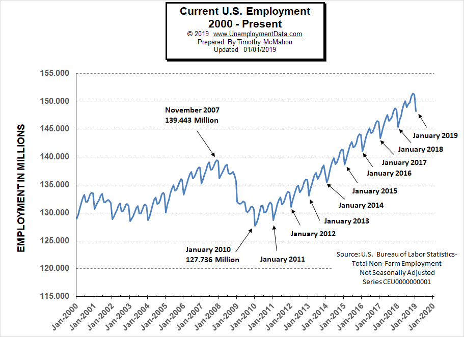
Typically January is the short term cyclical low for the year as you can see from this chart.
The media is making a big deal of the fact that this is the 100th month in a row of Jobs growth (on a seasonally adjusted basis). But as I’ve said many times I prefer the unadjusted numbers.
See Current Employment for more info.
The White House Council of Economic Advisors Tweeted:
Employment by Sector
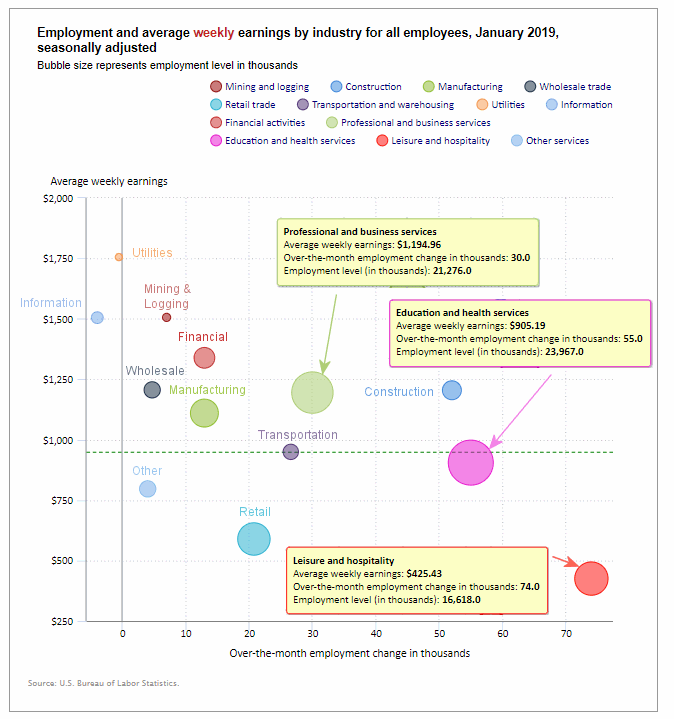
The employment “bubble chart” gives us a good representation of how each sector of the economy is doing (employment wise). As we can see from the chart below there are only two sectors that are to the left of the zero line this month (i.e. Information and Utilities) losing -4000 and -500 employees respectively i.e. very small losses compared to the gains in other industries.
The biggest gainer (furthest to the right on the chart) was Leisure and Hospitality adding 74,000 jobs unfortunately it is also the lowest paid sector (closest to the bottom of the chart) with an average weekly earning of only $425.43. The next largest gainer was Education and Health Services with an increase of 55,000 jobs followed by Construction with 52,000 jobs. Manufacturing jobs continue to increase (up 13,000 this month).
Average weekly wages rose from $948.06 in December and $940.84 in November to $950.82 in January.
(See the table below for average weekly earnings and other details.)
How to read this chart:
Bubbles location on the chart tell us two things:
- Change in Employment Levels over the most recent month.
- Average Weekly earnings.
- The further to the right the bubble the larger the increase in the number of jobs.
- The higher up on the chart the larger the average salary.
Bubble Size tells us:
- Total Employment for the sector.
- Larger bubbles mean more people are employed in that sector.
Employment and Average Weekly Earnings by Industry
January 2019, Seasonally Adjusted
| Industry | Monthly Increase | Average Weekly Earnings | Employment Level |
| Total Private Employment | 296,000 | $950.82 | 128,068,000 |
| Mining and Logging | 7,000 | $1,506.09 | 760,000 |
| Construction | 52,000 | $1,204.58 | 7,464,000 |
| Manufacturing | 13,000 | $1,110.17 | 12,822,000 |
| Wholesale trade | 4,700 | $1,206.27 | 5,904,400 |
| Retail trade | 20,800 | $589.26 | 15,835,700 |
| Transportation and Warehousing | 26,600 | $949.70 | 5,533,800 |
| Utilities | -500 | $1,755.68 | 554,100 |
| Information | -4,000 | $1,504.93 | 2,821,000 |
| Financial Activities | 13,000 | $1,338.73 | 8,631,000 |
| Professional and Business Services | 30,000 | $1,194.96 | 21,276,000 |
| Education and Health Services | 55,000 | $905.19 | 23,967,000 |
| Leisure and Hospitality | 74,000 | $425.43 | 16,618,000 |
| Other Services | 4,000 | $796.54 | 5,881,000 |
The Differential between U3 and U6
For the last several months the differential between the unadjusted U3 and U6 (reached by subtracting U3 from U6) was at 3.5% but last month it jumped up to 3.7% and this month it is at 4.4% due to an increase in the U6 to 8.8%.
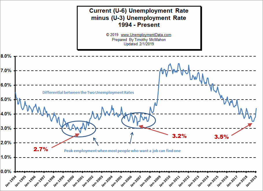
See Current U-6 Unemployment Rate for more info.
U-6 Unemployment
 Current U-6 Unadjusted Unemployment Rate for January 2019 is: 8.8%
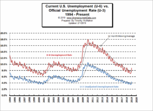 Current U-6 Unadjusted Unemployment Rate for January 2019 is: 8.8%
Up from 7.5% in December
See Unadjusted U-6 unemployment for more info.
Employment
According to the BLS Commissioner’s report for this month:
“Total nonfarm payroll employment increased by 304,000 in January, and the unemployment rate edged up to 4.0 percent. Job gains occurred in several industries. including leisure and hospitality, construction, health care, and transportation and warehousing.”
Note: These are Seasonally adjusted numbers. Actual employment decreased for January by 2.98 million. Final employment numbers for December were 151.182 million. This month’s preliminary employment numbers are 148.201 million. But the Commissioner is saying that it fell 304,000 less than average for the month of January.
Labor Force Participation Rate
The Labor Force Participation Rate (LFPR) for January was the major bright spot for the Jobs report as the LFPR climbed back to 63.2% for the first time since 2014. (Higher is better). A falling LFPR makes unemployment numbers look better than they actually are because people are dropping out of the labor force so they are no longer counted as “unemployed”. A climbing LFPR means people are re-entering the Labor Force (so they are more optimistic) but they are temporarily unemployed until they find a job making the unemployment numbers look worse than they actually are.
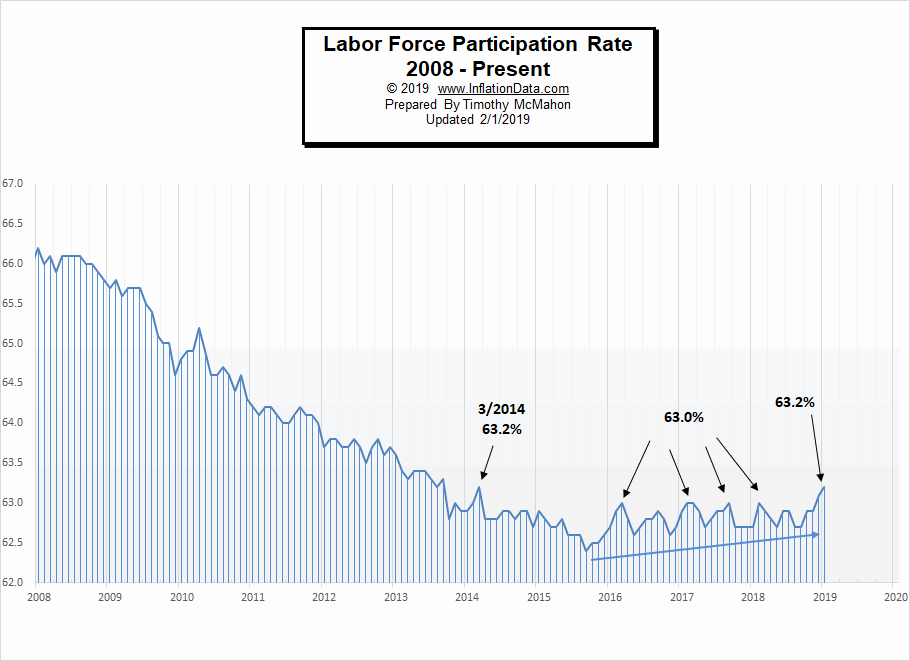
See Labor Force Participation Rate for more information.
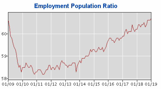
Employment Population Ratio
The index many people think of when they hear the term Labor Force Participation Rate might be better described by the Employment Population Ratio. This index shows the percentage of the entire population that is working. In many ways it is a better index than the LFPR or the Unemployment rate.
Here are some articles you might enjoy in case you missed them:
Read more on UnemploymentData.com.
- Joining the Workforce: 9 Licenses and Certifications that Don’t Require a College Degree
- College Not for You? 4 Promising Alternatives to Earning a Four-Year Degree
- Organize Your Home Office for Better Productivity
- Unique Position: 4 Career Options for Adventurous Individuals
- Eat Your Way Into the Job: 5 Dining Tips for a Lunch Interview
From InflationData.com
- Health Insurance Inflation Over the Last 10 Years
- Are Deflationary Forces Taking Hold Again?
- Gold as an Investment
- 2018 Ends with More Disinflation
- How Inflation and Interest Rates Relate
- Why Inflation Matters to Small Businesses
- November was Deflationary
- Cryptocurrencies and Inflation
- October Inflation Up Slightly
From Financial Trend Forecaster
- Renewable Energy Trends in 2019
- Huge Backlog Could Trigger New Wave Of Shale Oil
- Move Aside Lithium – Vanadium Is The New Super-Metal
- U.S. Shale Has A Glaring Problem
- How Free is Your State?
From Elliott Wave University
- How to Build Consistent Trading Success
- Reversals And Counter-trend Moves Typically Take Time To Develop
- Interest Rates Win Again as Fed Follows Market
- Watch This Indicator for Approaching Volatility
From OptioMoney.com
- Home Repairs You Should Think about Saving up For
- How to Teach Your Children to Save Money from a Young Age
- Money-Saving Upgrades: 3 Home Investments to Help Your Wallet
- Want to Boost Your FICO Score? 4 Easy Steps to Help Make That Happen
- Big Family Getting Expensive? 4 Ways to Stay in the Green
From Your Family Finances