
![]()
Typically July is one of the worst months for employment second only to January. But this obviously isn’t a typical year.
More than a Half-Million People Return to Work in July as COVID restrictions relax.
The U.S. Bureau of Labor Statistics (BLS) released its employment / unemployment report for July on August 7th.
- Unadjusted U-3 was Down from 11.2% to 10.5%!
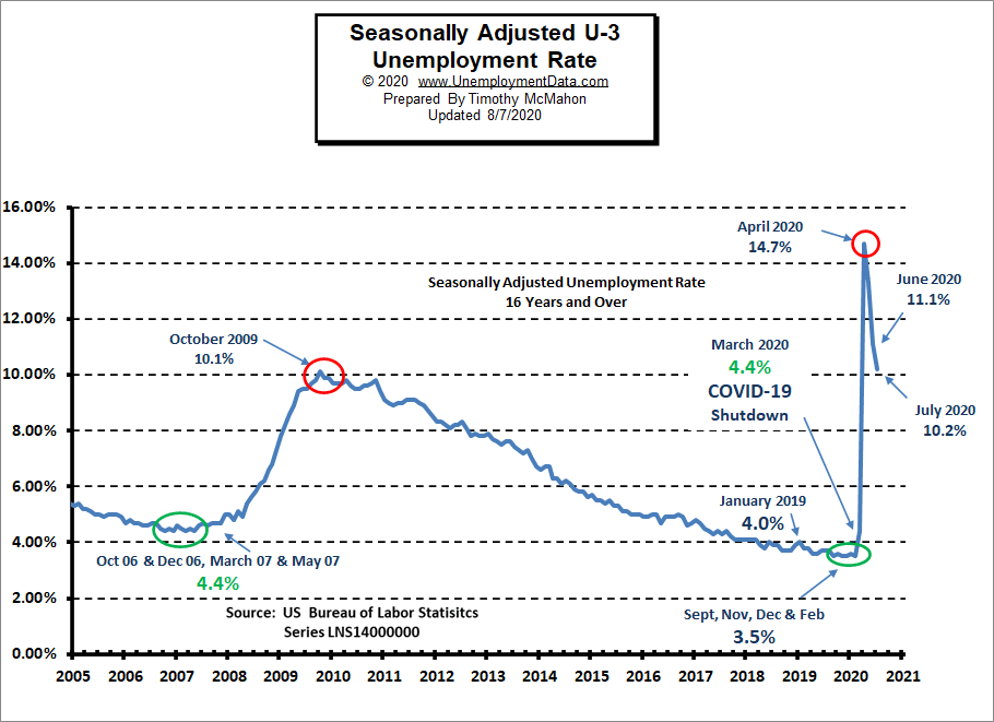
- Adjusted U-3 was Down from 11.1% to 10.2%!
- Unadjusted U-6 was Down from 18.3% to 16.8%!
- Labor Force Participation fell from 61.5% to 61.4%.
- Unadjusted Employment up from 138.509 to 139.100 million.
According to the Commissioner of the U.S. Bureau of Labor Statistics:
“Non-farm payroll employment increased by 1.8 million in July, and the unemployment rate declined by 0.9 percentage point to 10.2 percent. These improvements reflect the continued resumption of economic activity that had been curtailed due to the Coronavirus (COVID-19) pandemic and efforts to contain it. In July, employment rose in several major industries, with the largest gains in leisure and hospitality, government, retail trade, professional and business services, other services, and health care.”
“The rate of recovery in the labor market slowed in July, as job growth over the month was less than half that for June. As of July, total non-farm employment is 12.9 million, or 8.4 percent, lower than in February, before the pandemic crisis unfolded in many parts of the United States. Similarly, although unemployment continued to fall in July, the unemployment rate and the number of unemployed people are up by 6.7 percentage points and 10.6 million, respectively, since February.”
Of course, he is talking about “Seasonally Adjusted Jobs” from the “Current Population Survey (CPS)” rather than looking at the results reported by actual companies in their “Current Employment Statistics survey (CES)”
Looking at the CES report we see…
Originally the BLS reported 138.513 million jobs for June, they subtracted 4,000 jobs from that estimate.
So currently they are saying 138.509 million jobs for June and 139.100 million jobs for July which is an increase of 591,000 jobs based on their updated estimates.
Current Seasonally Adjusted Unemployment
 See Current Employment Commentary for more info.
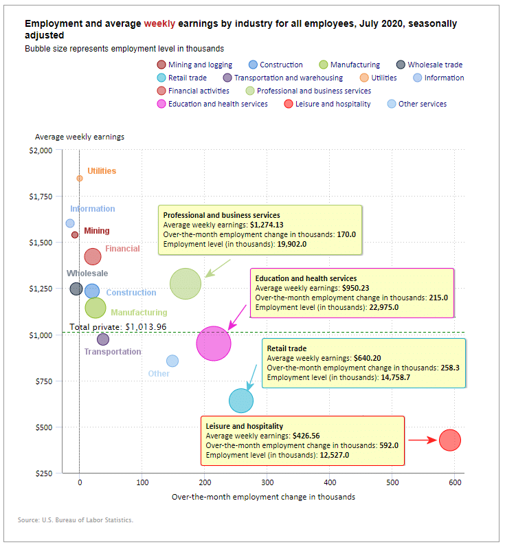
Employment by Sector
The employment “bubble chart” gives us a good representation of how each sector of the economy is doing (employment wise on a seasonally adjusted basis).
In July retail gained 258,000 jobs, in May it gained 739,800 jobs after losing roughly -2 million jobs in April. Professional and business services gained 170,000, Education and Health Services gained 215,000 and Leisure and Hospitality gained another 592,000 in addition to the 2,088,000 jobs gained in June and over a million jobs gained in May but they had lost over -7 million jobs in April.
On the other hand, Information, Mining and Logging, and Wholesale were net losers for the month.
Average weekly wages rose slightly in July to $1,013.96 from $1,013.27 in June.
(See the table below for details.)
How to read this chart:
Bubbles location on the chart tell us two things:
- Change in Employment Levels over the most recent month.
- Average Weekly earnings.
- The further to the right the bubble the larger the increase in the number of jobs.
- The higher up on the chart the larger the average salary.
Bubble Size tells us:
- Total Employment for the sector.
- Larger bubbles mean more people are employed in that sector.
Employment and Average Weekly Earnings by Industry
July 2020, Seasonally Adjusted
| Industry | Monthly Increase | Average Weekly Earnings | Employment Level |
| Total Private Employment | 1,462,000 | $1,013.96 | 117,962,000 |
| Mining and Logging | -7,000 | $1,539.13 | 621,000 |
| Construction | 20,000 | $1,234.30 | 7,195,000 |
| Manufacturing | 26,000 | $1,143.76 | 12,112,000 |
| Wholesale trade | -5,300 | $1,246.46 | 5,618,100 |
| Retail trade | 258,300 | $640.20 | 14,758,700 |
| Transportation and Warehousing | 37,900 | $972.82 | 5,208,200 |
| Utilities | 300 | $1,845.35 | 537,800 |
| Information | -15,000 | $1,601.56 | 2,564,000 |
| Financial Activities | 21,000 | $1,421.28 | 8,629,000 |
| Professional and Business Services | 170,000 | $1,274.13 | 19,902,000 |
| Education and Health Services | 215,000 | $950.23 | 22,975,000 |
| Leisure and Hospitality | 592,000 | $426.56 | 12,527,000 |
| Other Services | 149,000 | $855.88 | 5,314,000 |
Unemployment by Education
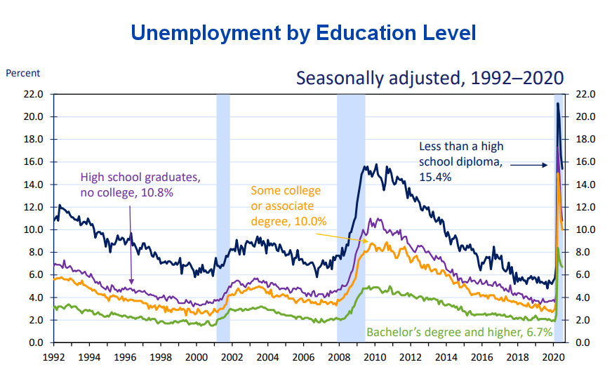 Those unemployed with less than a High School Diploma fell from 21.2% in April to 15.4% in July. At the other end of the spectrum, those with a Bachelor’s degree or higher fell from 8.4% in April to 6.7% in July.
Typically those with a Bachelor’s degree are relatively immune to unemployment. Although during the 2008 recession college grads unemployment rose to slightly above 4%.
Source: Bureau of Labor Statistics
U1 through U6 Unemployment Rates
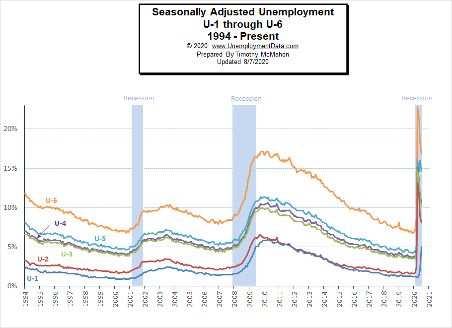
In April all the various measurements of Seasonally Adjusted Unemployment from U-1 through U-6 spiked up sharply except U1 which measures unemployment longer than 15 weeks. In July they all fell except U1 indicating that unemployment for some people has now lasted more than 15 weeks.
For more information about the various measurements of unemployment see What Is U-6 Unemployment?
Previous Record Low Unemployment (Seasonally Adjusted U-3)
If we consider anything 4% or below as “low” we have had a few “low” stretches as we can see in the table below.
(4% or below in Green)
| Jan | Feb | Mar | Apr | May | Jun | Jul | Aug | Sep | Oct | Nov | Dec | |
| 1950 | 6.5% | 6.4% | 6.3% | 5.8% | 5.5% | 5.4% | 5.0% | 4.5% | 4.4% | 4.2% | 4.2% | 4.3% |
| 1951 | 3.7% | 3.4% | 3.4% | 3.1% | 3.0% | 3.2% | 3.1% | 3.1% | 3.3% | 3.5% | 3.5% | 3.1% |
| 1952 | 3.2% | 3.1% | 2.9% | 2.9% | 3.0% | 3.0% | 3.2% | 3.4% | 3.1% | 3.0% | 2.8% | 2.7% |
| 1953 | 2.9% | 2.6% | 2.6% | 2.7% | 2.5% | 2.5% | 2.6% | 2.7% | 2.9% | 3.1% | 3.5% | 4.5% |
| 1954 | 4.9% | 5.2% | 5.7% | 5.9% | 5.9% | 5.6% | 5.8% | 6.0% | 6.1% | 5.7% | 5.3% | 5.0% |
| 1955 | 4.9% | 4.7% | 4.6% | 4.7% | 4.3% | 4.2% | 4.0% | 4.2% | 4.1% | 4.3% | 4.2% | 4.2% |
| 1956 | 4.0% | 3.9% | 4.2% | 4.0% | 4.3% | 4.3% | 4.4% | 4.1% | 3.9% | 3.9% | 4.3% | 4.2% |
| 1957 | 4.2% | 3.9% | 3.7% | 3.9% | 4.1% | 4.3% | 4.2% | 4.1% | 4.4% | 4.5% | 5.1% | 5.2% |
| 1958 | 5.8% | 6.4% | 6.7% | 7.4% | 7.4% | 7.3% | 7.5% | 7.4% | 7.1% | 6.7% | 6.2% | 6.2% |
| … | … | … | … | … | … | … | … | … | … | … | … | … |
| 1965 | 4.9% | 5.1% | 4.7% | 4.8% | 4.6% | 4.6% | 4.4% | 4.4% | 4.3% | 4.2% | 4.1% | 4.0% |
| 1966 | 4.0% | 3.8% | 3.8% | 3.8% | 3.9% | 3.8% | 3.8% | 3.8% | 3.7% | 3.7% | 3.6% | 3.8% |
| 1967 | 3.9% | 3.8% | 3.8% | 3.8% | 3.8% | 3.9% | 3.8% | 3.8% | 3.8% | 4.0% | 3.9% | 3.8% |
| 1968 | 3.7% | 3.8% | 3.7% | 3.5% | 3.5% | 3.7% | 3.7% | 3.5% | 3.4% | 3.4% | 3.4% | 3.4% |
| 1969 | 3.4% | 3.4% | 3.4% | 3.4% | 3.4% | 3.5% | 3.5% | 3.5% | 3.7% | 3.7% | 3.5% | 3.5% |
| 1970 | 3.9% | 4.2% | 4.4% | 4.6% | 4.8% | 4.9% | 5.0% | 5.1% | 5.4% | 5.5% | 5.9% | 6.1% |
| … | … | … | … | … | … | … | … | … | … | … | … | … |
| 1999 | 4.3% | 4.4% | 4.2% | 4.3% | 4.2% | 4.3% | 4.3% | 4.2% | 4.2% | 4.1% | 4.1% | 4.0% |
| 2000 | 4.0% | 4.1% | 4.0% | 3.8% | 4.0% | 4.0% | 4.0% | 4.1% | 3.9% | 3.9% | 3.9% | 3.9% |
| 2001 | 4.2% | 4.2% | 4.3% | 4.4% | 4.3% | 4.5% | 4.6% | 4.9% | 5.0% | 5.3% | 5.5% | 5.7% |
| … | … | … | … | … | … | … | … | … | … | … | … | … |
| 2018 | 4.1% | 4.1% | 4.1% | 3.9% | 3.8% | 4.0% | 3.9% | 3.9% | 3.7% | 3.7% | 3.7% | 3.9% |
| 2019 | 4.0% | 3.8% | 3.8% | 3.6% | 3.6% | 3.7% | 3.7% | 3.7% | 3.5% | 3.6% | 3.5% | 3.5% |
| 2020 | 3.6% | 3.5% | 4.4% | 14.7% | 13.3% | 11.1% | 10.2% |
Employment
Historically employment is closely tied to recessions and that is no accident. One of the primary factors in calculating whether the economy is officially in a recession is an increase in the unemployment rate. The chart below provides the Historical Employment Data overlaid on blue bars showing periods of official recessions. In April, the number of people employed fell below the 2007 peak, near the lows of the 2008-2010 crash. In July it rebounded back almost to the 2007 peak level. According to the National Bureau of Economic Research (NBER) we have officially been in a recession since February. Since they measure a recession beginning from the peak that just means the economy is no longer growing, which is pretty obvious due to the virus.
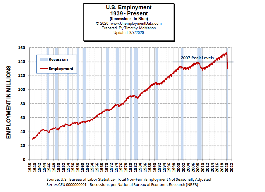
See Historical Employment Data for more info.
Current Employment
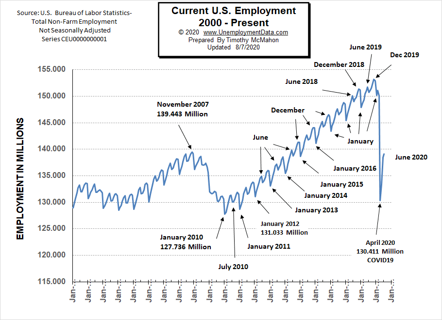
Typically the low point for each year occurs in January and then it moves almost straight up to a small peak around June with a slight drop around July and then the highest peak in employment happens in November/December.
But the COVID virus has shortcircuited the normal trend and we saw a drop which began in March and by April it took employment back down to approximately the level of July 2010. June saw employment rebound to approximately the January 2015 level. July continued to rise although slightly which is not typical but this year is not typical.
See Current Employment for more info.
Layoff Status
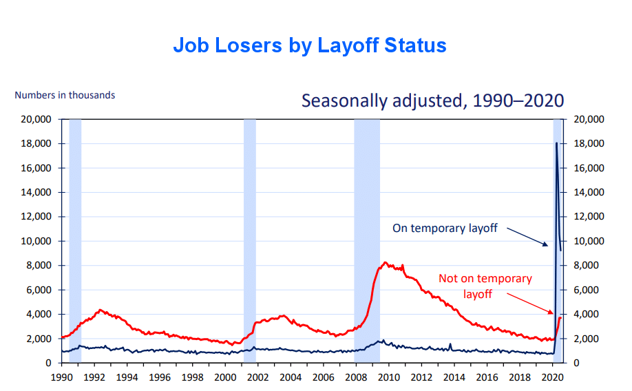
Last month we considered this chart to be one of the most troubling of all the charts. Because temporary lay-offs dropped as you would expect as people return to work but permanent job losses increased. But this month, temporary layoffs continued to fall and permanent layoffs were flat. So, it may not be as bad as we thought possible last month.
Unemployment by Age and Gender
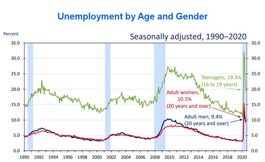
Teenage Unemployment spiked to 31.9% in April and fell to 19.3% by July. Adult woman unemployment fell from 15.5% in April to 10.5% in July, and unemployment among adult men was 13.0% in April and 9.4% in July.
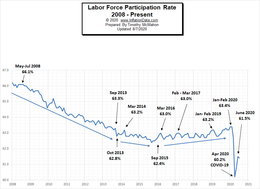
Labor Force Participation Rate
Even though Unemployment was in record low territory for quite some time, it wasn’t until January and February 2020, that the LFPR was finally able to claw its way back to 63.4%, its highest level since 2013.
Then COVID decimated all those gains dropping the LFPR down to 60.2% in April. In May it began to rebound and in June the LFPR was able to bounce back a little more to 61.5% it fell slightly in July but this was probably due to people returning to the labor force rather than other factors.
See Labor Force Participation Rate for more information.
Part-time Workers as a Percent of Total
The percentage of the workforce that is part-time has returned to very near pre-COVID levels. Which may indicate we are getting closer to normal but isn’t really significant from an employment standpoint. 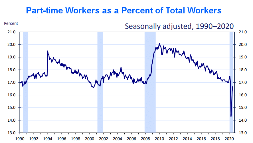
If you would like to receive this monthly report and other article updates click here you can unsubscribe at any time.
Here are some articles you might enjoy in case you missed them:
Read more on UnemploymentData.com.
- 4 Jobs with Higher Job Security
- Wrongful Termination: Can You Get Fired for Being Disabled?
- Save Money By Downsizing After Losing Your Job
- 5 Things You Can Do to Improve Your Employment Opportunities
- Remodeling a Commercial Property
From InflationData.com
- 3 Factors Causing the Current Gold Rally
- Inflation Quintuples… Still Below 1%
- Is the FED Tightening or Is Hyperinflation on the Horizon?
- 5 Countries Most at Risk for Deflation
From Financial Trend Forecaster
- Saudi Arabia Eyes Total Dominance In Oil And Gas
- 4 Investments Making Waves in the Technology Sector
- Mutual Funds
- Bulls Beware: A Dark Cloud Is Forming Over Oil Markets
From Elliott Wave University
- Forecasting Markets by Looking at Chart Patterns
- Seeking Certainty in Uncertain Times?
- Emerging Markets and Epidemics
- Deflationary Psychology Versus the Fed: Here’s the Likely Winner
- Crude Oil’s 2020 Crash: See What Helped (Some) Traders Pivot Just in Time
From OptioMoney.com
- Should You Buy a Second Home?
- Learning to Trade from Video Tutorials
- Five Business Tips to Help Your Company Thrive
From Your Family Finances
- Practical Budgeting Tips for Big Families
- How to Make a New Car Affordable
- Teach Your Kids About Money Management
- 4 Ways to Save on Internet Expenses
- 4 Types of Trusts That Can Protect Your Assets