
![]() The U.S. Bureau of Labor Statistics (BLS) released its employment / unemployment report for October on November 1st.
The U.S. Bureau of Labor Statistics (BLS) released its employment / unemployment report for October on November 1st.
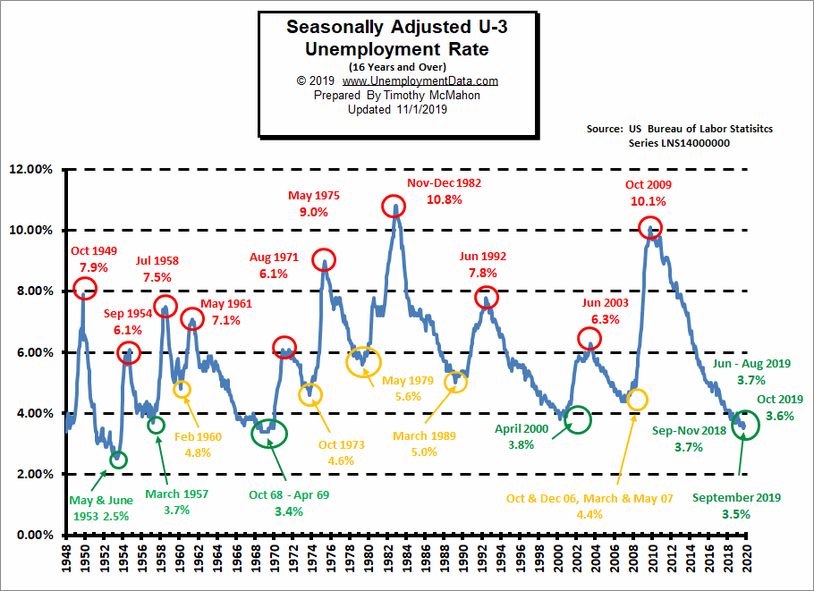
Unemployment is still near record lows. Although the “Seasonally Adjusted” Unemployment Rate for October ticked up from 3.5% in September to 3.6%. However, the unadjusted U-3 Unemployment rate was unchanged at 3.3%. This Jobs report was unexpectedly good despite counting 30,000 “unemployed” strikers at auto manufacturers.
According to the Commissioner of the U.S. Bureau of Labor Statistics:
“Nonfarm payroll employment increased by 128,000 in October, and the unemployment rate was little changed at 3.6 percent. Notable employment gains occurred in food services and drinking places, social assistance, and financial activities. Within manufacturing, employment declined in motor vehicles and parts due to strike activity. Federal government employment was down, reflecting a drop in the number of temporary jobs for the 2020 Census.”
Experts had been predicting that the economy would add no more than 75,000 jobs. In fact, MarketWatch on Thursday told readers that
the report would be “a big dud” due to the impact of the General Motors strike on the overall numbers.
If it hadn’t been for the strike the October numbers would have been even better.
Of course, the Commissioner is talking about “Seasonally Adjusted Jobs” from the “Current Population Survey (CPS)”
rather than looking at the results reported by actual companies in the BLS’ “Current Employment Statistics survey (CES)”
in reality, the BLS has done a lot of “Adjusting” over the last few months.
The original CES numbers the BLS reported for August was 151.517 million people employed in August
then later they adjusted it up to 151.607 million. And for September they originally reported there were 151.949 million employed
and currently they are reporting 152.962 million employed so that is an actual increase of 1.013 million NOT and adjusted increase of 128,000!
But in addition to “Seasonal Adjustment”, they adjusted September’s number up to 152.015 million
so the difference between September and October appears to be less than it actually was.
For more info see our Current Unemployment Chart and Current U.S. Employment Chart commentary:
October Jobs Report Smashes Expectations
- Unadjusted U-3 was Unchanged at 3.3%!
- Adjusted U-3 was up slightly from 3.5% to 3.6%!
- Unadjusted U-6 was Unchanged at 6.5%!
- Labor Force Participation hits levels not seen since 2013 at recent peak levels of 63.3%.
- Unadjusted Employment Up
- The unemployment rate for black Americans nudged lower to 5.4 percent, setting a new record,
Key factors in the BLS report were:
Employment in food services and drinking places rose by 48,000 over the month.
Financial activities employment rose by 15,000, with nearly half of the gain occurring in insurance carriers and related activities (+7,000).
Social assistance added 20,000 jobs in October, with most of the gain occurring in individual and family services.
Financial activities added 16,000 jobs.
Professional and business services added 22,000 jobs.
Health care added 15,000 jobs.
Manufacturing employment declined by 36,000 in October.
Employment in motor vehicles and parts manufacturing decreased
by 42,000, reflecting strike activity.
See Current Unemployment Chart for more info.
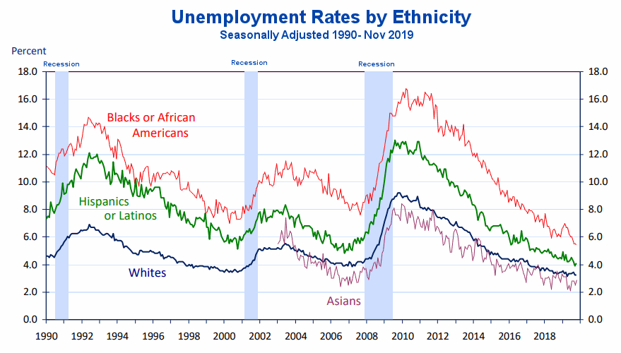
Unemployment by Ethnicity
The unemployment rate among Blacks has reached a record low at 5.4% as we can see from this chart. Previous lows occurred in 2000 and 2007 just below 8%. Hispanic unemployment is also well below 2001 and 2007 lows at just above 4%.
 Source: Bureau of Labor Statistics Charts
U1 through U6 Unemployment Rates
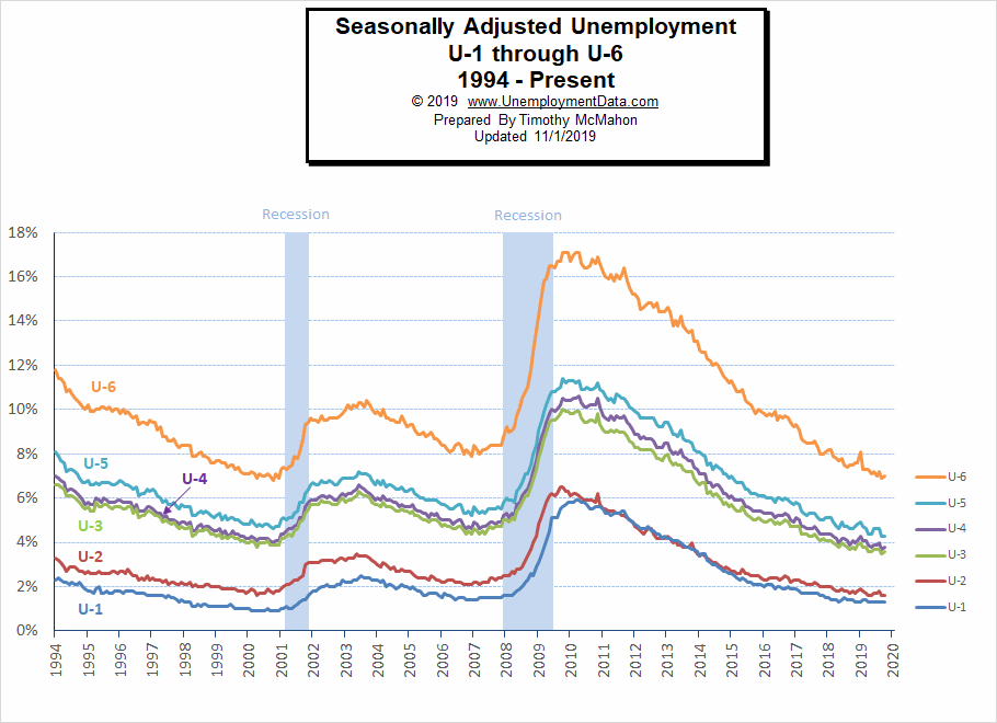
As we can see from the above chart all the various measurements of Unemployment from U-1 through U-6 are near or below record lows. For more information about the various measurements of unemployment see What Is U-6 Unemployment?
Duration of Unemployment
How long people stay unemployed is a good indication of the health of an economy. At any given time people are unemployed due to a variety of reasons not necessarily because jobs are unavailable. On the contrary when jobs are plentiful people often quit one job in order to get a better job. But the amount of time that it takes them to find it is a good indicator of the health of the economy. In this chart, we can see that those who are “long term unemployed” has fallen drastically since the last recession. We can also see that most people are now unemployed less than 5 weeks (i.e. the red line is above all the other lines).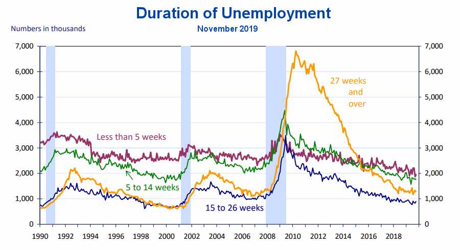
Source: Bureau of Labor Statistics Charts
Labor Productivity
Labor productivity has increased by about 21% in the last 7 years. This is partially due to an increase in the number of hours worked but also due to an increase in output per hour. However, in 2019 we can see an obvious flattening of hours worked but output has continued upward resulting in a significant uptick in Labor Productivity (output per hour).
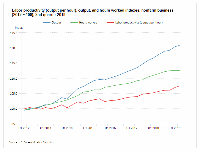
Data Source: BLS Labor Productivity
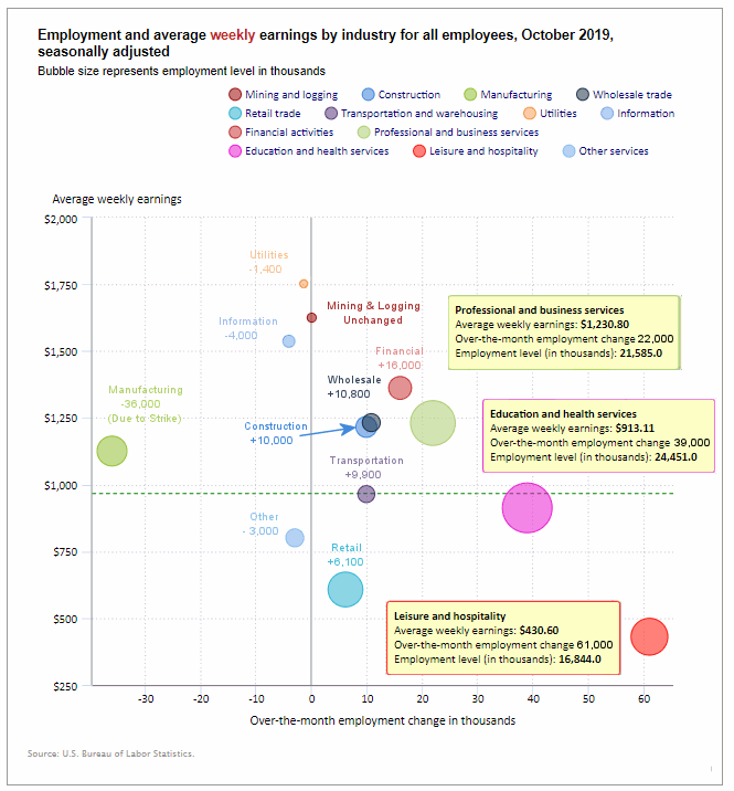
Employment by Sector
The employment “bubble chart” gives us a good representation of how each sector of the economy is doing (employment wise). As we can see from the chart below, the biggest gainer (furthest to the right on the chart) was Leisure and Hospitality adding a whopping 61,000 jobs. Education and Health Services added 39,000, Professional and Business Services added 22,000 jobs, Financial Services added 16,000 jobs, Construction added 10,000 jobs, Manufacturing temporarily lost -30,000 jobs due to a strike.
There are three other sectors to the left of the vertical zero line this month, besides manufacturing, meaning that they lost employees (plus one other that was exactly on the line). Information lost -4,100 seasonally adjusted jobs. Utilities lost -1,400 jobs and Other lost -3,000 jobs. Mining and Logging was unchanged neither gaining nor losing any jobs.
Average weekly wages rose. It was $969.39 in October up from $959.76 in June and $966.98 in August.
(See the table below for details.)
How to read this chart:
Bubbles location on the chart tell us two things:
- Change in Employment Levels over the most recent month.
- Average Weekly earnings.
- The further to the right the bubble the larger the increase in the number of jobs.
- The higher up on the chart the larger the average salary.
Bubble Size tells us:
- Total Employment for the sector.
- Larger bubbles mean more people are employed in that sector.
Employment and Average Weekly Earnings by Industry
October 2019, Seasonally Adjusted
| Industry | Monthly Increase | Average Weekly Earnings | Employment Level |
| Total Private Employment | 131,000 | $969.39 | 129,306,000 |
| Mining and Logging | 0 | $1,625.39 | 747,000 |
| Construction | 10,000 | $1,216.34 | 7,527,000 |
| Manufacturing | -30,000 (Strike) | $1,125.98 | 12,811,000 |
| Wholesale trade | 10,800 | $1,232.35 | 5,959,600 |
| Retail trade | 6,100 | $607.41 | 15,772,300 |
| Transportation and Warehousing | 9,900 | $964.61 | 5,571,500 |
| Utilities | -1,400 | $1,752.20 | 550,200 |
| Information | -4,000 | $1,537.17 | 2,822,000 |
| Financial Activities | 16,000 | $1,362.25 | 8,719,000 |
| Professional and Business Services | 22,000 | $1,230.80 | 21,585,000 |
| Education and Health Services | 39,000 | $913.11 | 24,451,000 |
| Leisure and Hospitality | 61,000 | $430.60 | 16,844,000 |
| Other Services | -3,000 | $800.72 | 5,946,000 |
Previous Record Low Unemployment (Seasonally Adjusted U-3)
If we consider anything 4% or below as “low” we have had a few “low” stretches as we can see in the table below.
(4% or below in Green)
| Jan | Feb | Mar | Apr | May | Jun | Jul | Aug | Sep | Oct | Nov | Dec | |
| 1950 | 6.5% | 6.4% | 6.3% | 5.8% | 5.5% | 5.4% | 5.0% | 4.5% | 4.4% | 4.2% | 4.2% | 4.3% |
| 1951 | 3.7% | 3.4% | 3.4% | 3.1% | 3.0% | 3.2% | 3.1% | 3.1% | 3.3% | 3.5% | 3.5% | 3.1% |
| 1952 | 3.2% | 3.1% | 2.9% | 2.9% | 3.0% | 3.0% | 3.2% | 3.4% | 3.1% | 3.0% | 2.8% | 2.7% |
| 1953 | 2.9% | 2.6% | 2.6% | 2.7% | 2.5% | 2.5% | 2.6% | 2.7% | 2.9% | 3.1% | 3.5% | 4.5% |
| 1954 | 4.9% | 5.2% | 5.7% | 5.9% | 5.9% | 5.6% | 5.8% | 6.0% | 6.1% | 5.7% | 5.3% | 5.0% |
| 1955 | 4.9% | 4.7% | 4.6% | 4.7% | 4.3% | 4.2% | 4.0% | 4.2% | 4.1% | 4.3% | 4.2% | 4.2% |
| 1956 | 4.0% | 3.9% | 4.2% | 4.0% | 4.3% | 4.3% | 4.4% | 4.1% | 3.9% | 3.9% | 4.3% | 4.2% |
| 1957 | 4.2% | 3.9% | 3.7% | 3.9% | 4.1% | 4.3% | 4.2% | 4.1% | 4.4% | 4.5% | 5.1% | 5.2% |
| 1958 | 5.8% | 6.4% | 6.7% | 7.4% | 7.4% | 7.3% | 7.5% | 7.4% | 7.1% | 6.7% | 6.2% | 6.2% |
| … | … | … | … | … | … | … | … | … | … | … | … | … |
| 1965 | 4.9% | 5.1% | 4.7% | 4.8% | 4.6% | 4.6% | 4.4% | 4.4% | 4.3% | 4.2% | 4.1% | 4.0% |
| 1966 | 4.0% | 3.8% | 3.8% | 3.8% | 3.9% | 3.8% | 3.8% | 3.8% | 3.7% | 3.7% | 3.6% | 3.8% |
| 1967 | 3.9% | 3.8% | 3.8% | 3.8% | 3.8% | 3.9% | 3.8% | 3.8% | 3.8% | 4.0% | 3.9% | 3.8% |
| 1968 | 3.7% | 3.8% | 3.7% | 3.5% | 3.5% | 3.7% | 3.7% | 3.5% | 3.4% | 3.4% | 3.4% | 3.4% |
| 1969 | 3.4% | 3.4% | 3.4% | 3.4% | 3.4% | 3.5% | 3.5% | 3.5% | 3.7% | 3.7% | 3.5% | 3.5% |
| 1970 | 3.9% | 4.2% | 4.4% | 4.6% | 4.8% | 4.9% | 5.0% | 5.1% | 5.4% | 5.5% | 5.9% | 6.1% |
| … | … | … | … | … | … | … | … | … | … | … | … | … |
| 1999 | 4.3% | 4.4% | 4.2% | 4.3% | 4.2% | 4.3% | 4.3% | 4.2% | 4.2% | 4.1% | 4.1% | 4.0% |
| 2000 | 4.0% | 4.1% | 4.0% | 3.8% | 4.0% | 4.0% | 4.0% | 4.1% | 3.9% | 3.9% | 3.9% | 3.9% |
| 2001 | 4.2% | 4.2% | 4.3% | 4.4% | 4.3% | 4.5% | 4.6% | 4.9% | 5.0% | 5.3% | 5.5% | 5.7% |
| … | … | … | … | … | … | … | … | … | … | … | … | … |
| 2018 | 4.1% | 4.1% | 4.1% | 3.9% | 3.8% | 4.0% | 3.9% | 3.9% | 3.7% | 3.7% | 3.7% | 3.9% |
| 2019 | 4.0% | 3.8% | 3.8% | 3.6% | 3.6% | 3.7% | 3.7% | 3.7% | 3.5% | 3.6% |
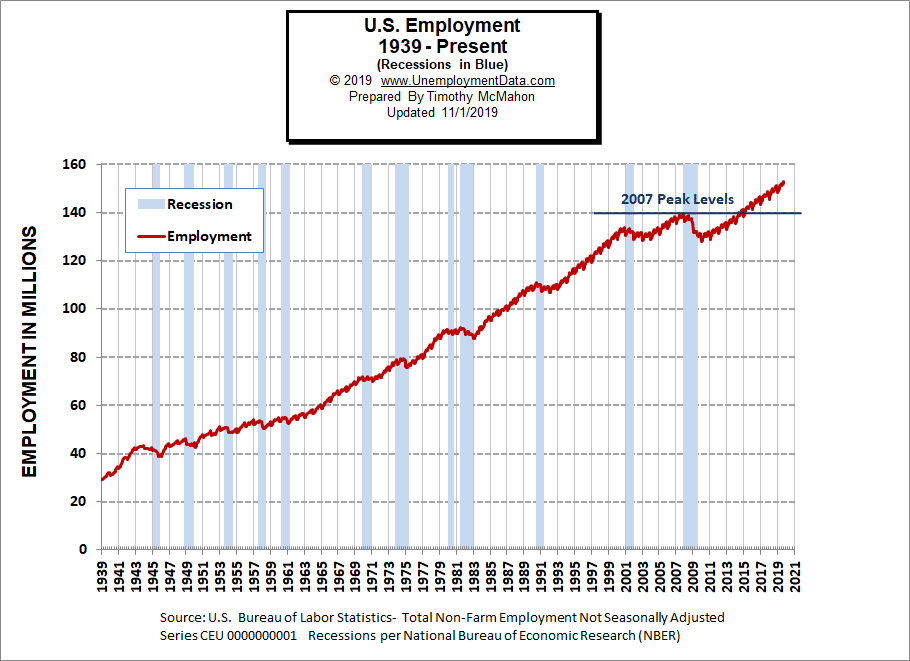
Employment
Historically employment is closely tied to recessions and that is no accident. One of the primary factors in calculating whether the economy is officially in a recession is an increase in the unemployment rate. The chart below provides the Historical Employment Data overlaid on blue bars showing periods of official recessions.
In October employment rose to 152.962 million. This month they “adjusted” August employment from the originally released 151.517 million to 151.607 million basically adding 90,000 jobs that get added without anyone noticing because the August report is “old news”. September employment went from 151.949 million to 152.015 million adding another hidden 66,000 jobs.
As we can see from the table below from November 2007 to January 2008 there were over 3 million jobs lost but that actually wasn’t all that surprising. Typically January suffers from a reduction in Seasonal workers. Even good years like 2005-2006 saw a reduction of 3 million workers and January 2008 employment levels were still above January 2007 levels. But by January 2009, year-over-year losses exceeded 4 million. By 2010 the economy had lost another 4.2 million. 2011 showed almost a million jobs improvement but the economy was still on shaky ground. It wasn’t until January 2014 that the economy reached January 2007 levels and January 2015 exceeded January 2008 levels.
| Date | Employment in Millions |
| January 2007 | 135.335 |
| November 2007 (Peak) | 139.510 |
| January 2008 | 136.268 |
| January 2009 | 132.042 |
| January 2010 | 127.820 |
| January 2011 | 128.778 |
| January 2012 | 131.113 |
| January 2013 | 133.081 |
| January 2014 | 135.488 |
| January 2015 | 138.511 |
| January 2016 | 141.088 |
| January 2017 | 143.393 |
| January 2018 | 145.428 |
| January 2019 | 148.295 |
| February 2019 | 149.148 |
| March 2019 | 149.864 |
| April 2019 | 150.938 |
| May 2019 | 151.610 |
| June 2019 | 152.243 |
| July 2019 | 151.169 |
| August 2019 | 151.607 |
| September 2019 | 152.015 |
| October 2019 | 152.962 |
Employment Numbers are “Preliminary” for two months before the BLS considers them finalized due to late coming data.
Current Employment
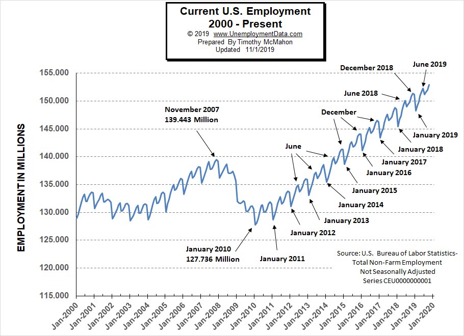
From the above current employment chart, we can see that the low point for each year occurs in January and then a small peak occurs around June with a slight drop around July and then the highest peak in employment happens in November/December. So the current drop in July is entirely normal.
See Historical Employment and Current Employment for more info.
The Differential between U3 and U6
The previous lows on this chart are at 2.7% in October 2000 and 3.2% in September 2006. In August, September, and October of 2018, the differential between unadjusted U-3 and unadjusted U-6 dropped to 3.5% indicating that we were getting closer to “full employment” but then in December, the U-6 ticked up to 7.5% from 7.2% a month earlier and the differential ticked back up to 3.8%.
Typically the differential peaks in January and this year was no exception. In January 2019 U-6 shot up to 8.8% and U-3 was 4.4% for a differential of 4.4%. In February the differential fell back to 3.6%. From there we saw it fall to 3.3% in May rise in June and then fall back to 3.3% in July and then rose again in August.
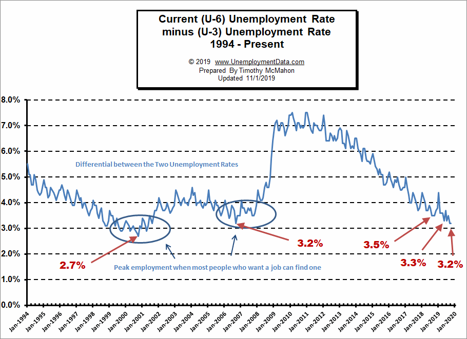
See Current U-6 Unemployment Rate for more info.
U-6 Unemployment
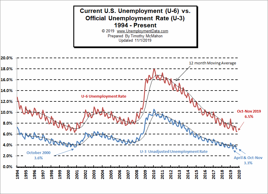
Current U-6 Unemployment Rate for October is 6.5% Unchanged from September, August 2019 is 7.3%, it was 7.3% in July, 7.5% in June, 6.7% in May, and 8.8% in January.
See Unadjusted U-6 unemployment for more info.
Labor Force Participation Rate
The Current Labor Force Participation Rate for October 2019 is up from 63.2% to 63.3%
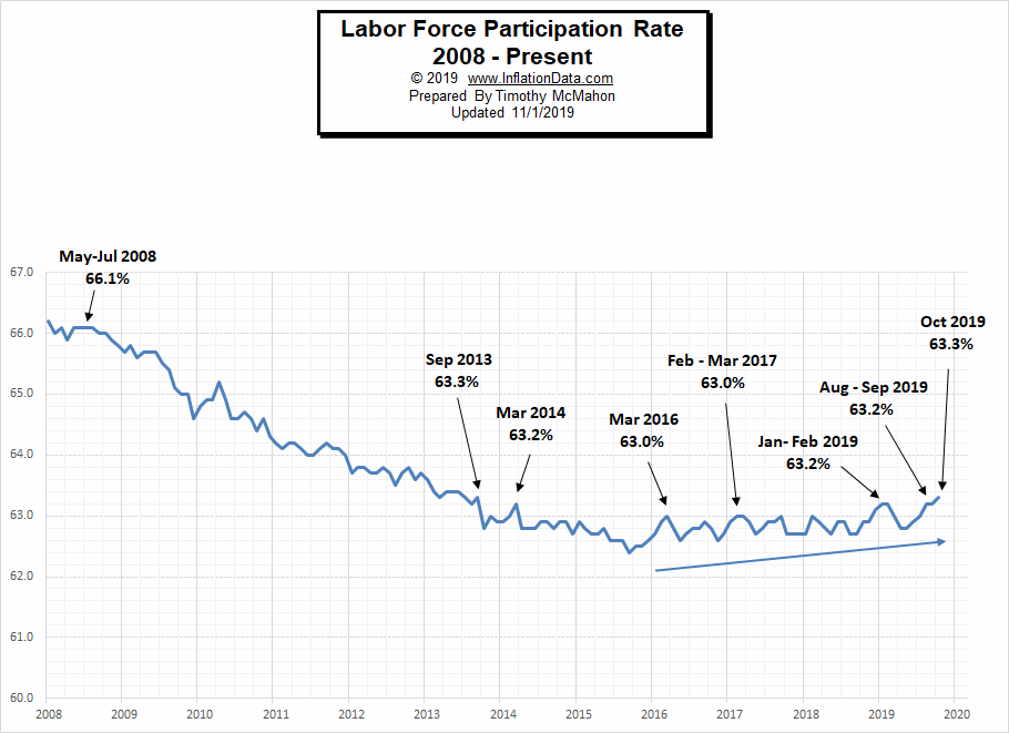
See Labor Force Participation Rate for more information.
If you would like to receive this monthly report and other article updates click here unsubscribe at any time.
Here are some articles you might enjoy in case you missed them:
Read more on UnemploymentData.com.
- Are You Considering a Career as a Police Officer?
- Benefits of Going Back to School Before Making a Big Career Change
- Information Technology (IT) Jobs to Consider
- Consider Becoming a Social Media Influencer
From InflationData.com
- Cumulative Inflation By Category 1996-2016
- If Everything Big is Increasing in Cost at Some Rate Faster than Inflation Why Hasn’t Inflation Risen to Match?
- September Inflation Virtually Unchanged
- How Does Inflation Affect Businesses?
From Financial Trend Forecaster
- Is Bill Gates Right On Energy Investing?
- The Oil Crisis Saudi Arabia Can’t Solve
- Weakening Shale Productivity “VERY Bullish” For Oil Prices
- 5 Ways Automation Has Changed the Financial World
- Asteroid Mining: Science Fiction or Science?
- Spotting a 178-Year-Old Firm’s Collapse… 2 Years in Advance
- Trade, Impeachment, and the Conviction of Buyers and Sellers
- Spotting High-Confidence Trading Opportunities
- History Says Stocks Can Perform Well After Big Oil Shocks
From OptioMoney.com
- Have Minimal Car Insurance? What to Do in Case of an Accident
- How to Choose a Residential Roofing Contractor
- Avoid a Money Pit: 4 Vital Inspection Items before Buying an Older Home
- 3 Benefits of Finding a Reliable Family Lawyer
- 4 Hidden Car Costs
From Your Family Finances