
![]() The U.S. Bureau of Labor Statistics (BLS) released its employment / unemployment report for September released on October 4th. Unemployment is at record lows. According to the BLS, the “Seasonally Adjusted” Unemployment Rate for September fell to 3.5% after spending 3 months at 3.7%. The last time unemployment was this low was in December 1969 almost exactly 50 years ago.
The U.S. Bureau of Labor Statistics (BLS) released its employment / unemployment report for September released on October 4th. Unemployment is at record lows. According to the BLS, the “Seasonally Adjusted” Unemployment Rate for September fell to 3.5% after spending 3 months at 3.7%. The last time unemployment was this low was in December 1969 almost exactly 50 years ago.
According to the Commissioner of the U.S. Bureau of Labor Statistics:
“The unemployment rate declined by 0.2 percentage point to 3.5 percent in September, and nonfarm payroll employment increased by 136,000. Employment continued to trend up in health
care and in professional and business services… Health care employment rose by +39,000 in September… employment continued to trend up in professional and business services +34,000… Employment in transportation and warehousing edged up by +16,000… Government employment also continued to trend up in September +22,000…”Of course, he is talking about “Seasonally Adjusted Jobs” in reality last month the BLS reported there were 151.517 million people employed in August and this month they are reporting there are 151.949 million employed in September, so that is an increase of 432,000 jobs.
For more info see our Current Unemployment Chart and Current U.S. Employment Chart commentary:
Key September Employment and Unemployment Numbers
This month’s Unemployment report was full of positive news.
- Adjusted U-3 Unemployment- 3.5% down from 3.7% June through August.
- Unadjusted U-3 Unemployment- 3.3% down from 3.8% in August and 4.0% in July, it was 4.4% in January.
- Unadjusted U-6 Unemployment- 6.5% down a whopping -0.8% from 7.3% in August.
- Unadjusted Employment (Establishment Survey)- 151.949 up from the 151.517 million the BLS reported in August.
- Labor Force Participation Rate- 63.2% unchanged from August but up from 63.0% in July, and 62.9% June.
Key factors in the BLS report were:
Health care employment increased by 39,000
Professional and business services increased by 34,000
Transportation and warehousing increased by 16,000
Government employment increased by 22,000 approximately 1,000 of those were related to the upcoming census.
Hispanic and African American unemployment are both at the lowest levels on record.
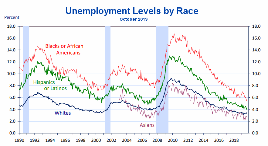
Unemployment Levels by Race
As we can see from the chart below unemployment among African Americans has fallen below 6%. The previous low was in 1999 at around 7% and at the peak employment in 2007 it was closer to 8%. Hispanic unemployment is at 4% while previous lows were closer to 5%,
Unemployment Rates by Educational Attainment
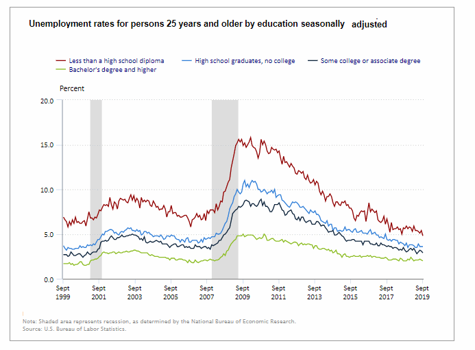
As we can see from the above chart whether it is during a recessionary period (grey shaded areas) or during more normal periods your education plays a major part in whether you are unemployed. At the peak of the recession in June of 2009, those with a Bachelor’s Degree suffered a 4.8% unemployment rate while those with some college or an Associate’s Degree had an 8.1% Unemployment Rate. Worse off were those with only a High School Degree who had a 10% unemployment rate and those who did not finish High School suffered the worst with 15.6% unemployment. But even today with one of the lowest unemployment rates in history education still makes a difference. Unfortunately, the chart does not include a category for individuals with a trade school degree. I find it hard to believe that people stop needing plumbers just because the economy is in a slump. Although during a recession building construction like all commerce will slack off causing a decrease in the need for those who work in new construction.
Data Source: BLS Unemployment by Education
Seasonally Adjusted U-3 Unemployment
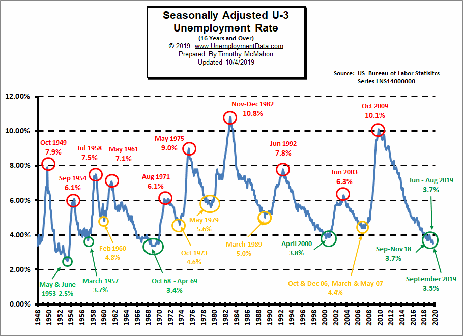
As we can see from the (red yellow green) above chart at 3.5% current Seasonally Adjusted U-3 unemployment levels are just a hair above the 1969 lows of 3.4%. If we break below 3.4% we have to go all the way back to 1953 (during the Korean War) to find lower levels. And we must remember that there was a massive loss of the workforce due to the war, and a higher percentage of the population was not counted due to “farming”, so we probably won’t see levels that low again. The 1969 lows occurred during the Vietnam war. Prior to 1969 was a low of 3.7% in 1957 so we are currently at that level. As we can see from the above chart we are in one of only 5 “green zones” where unemployment levels are below 4%. Not even the “boom” period 2006-2007 reached such low levels.
See Current Unemployment Chart for more info.
Labor Productivity
Labor productivity (red line) increased gradually since 2016 but beginning in 2019 it ticked up sharply while the number of hours worked per employee (green line) has leveled off. This has resulted in a massive increase in actual output (blue line).
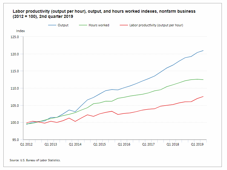
Data Source: BLS Labor Productivity
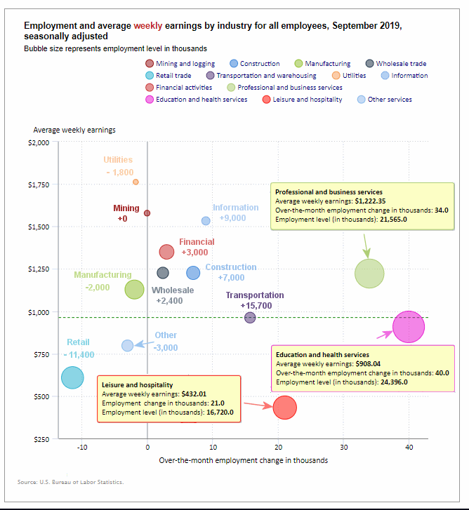
Employment by Sector
The employment “bubble chart” gives us a good representation of how each sector of the economy is doing (employment wise). As we can see from the chart below, the biggest gainer (furthest to the right on the chart) was Education and Health Services which added 40,000 jobs on top of last month’s 32,000 jobs, Professional and Business Services adding 34,000 jobs. Leisure and Hospitality added 21,000 jobs, Transportation and warehousing added 15,700 jobs and Financial Services added 3,000 jobs.
There are four sectors to the left of the vertical zero line this month, meaning that they lost employees (plus one other that was exactly on the line). The biggest loser is retail with a loss of -11,400 on top of last month’s -11,100 jobs. Manufacturing lost -2,000 jobs. Utilities lost -1,800 jobs and “Other” lost -3,000 jobs. Mining and Logging was unchanged.
Average weekly wages were virtually unchanged in September at $966.30
(See the table below for details.)
Data Source: BLS Employment by Industry
How to read this chart:
Bubbles location on the chart tell us two things:
- Change in Employment Levels over the most recent month.
- Average Weekly earnings.
- The further to the right the bubble the larger the increase in the number of jobs.
- The higher up on the chart the larger the average salary.
Bubble Size tells us:
- Total Employment for the sector.
- Larger bubbles mean more people are employed in that sector.
Employment and Average Weekly Earnings by Industry
September 2019, Seasonally Adjusted
| Industry | Monthly Increase | Average Weekly Earnings | Employment Level |
| Total Private Employment | 114,000 | $966.30 | 129,081,000 |
| Mining and Logging | 0 | $1,578.65 | 746,000 |
| Construction | 7,000 | $1,226.24 | 7,510,000 |
| Manufacturing | -2,000 | $1,128.33 | 12,850,000 |
| Wholesale trade | 2,400 | $1,226.52 | 5,941,700 |
| Retail trade | -11,400 | $608.47 | 15,743,400 |
| Transportation and Warehousing | 15,700 | $962.30 | 5,574,500 |
| Utilities | -1,800 | $1,762.73 | 551,100 |
| Information | 9,000 | $1,533.00 | 2,837,000 |
| Financial Activities | 3,000 | $1,350.14 | 8,696,000 |
| Professional and Business Services | 34,000 | $1,222.35 | 21,565,000 |
| Education and Health Services | 40,000 | $908.04 | 24,396,000 |
| Leisure and Hospitality | 21,000 | $432.01 | 16,720,000 |
| Other Services | -3,000 | $797.26 | 5,950,000 |
Previous Record Low Unemployment (Seasonally Adjusted U-3)
If we consider anything 4% or below as “low” we have had a few “low” stretches as we can see in the table below.
(4% or below in Green)
| Jan | Feb | Mar | Apr | May | Jun | Jul | Aug | Sep | Oct | Nov | Dec | |
| 1950 | 6.5% | 6.4% | 6.3% | 5.8% | 5.5% | 5.4% | 5.0% | 4.5% | 4.4% | 4.2% | 4.2% | 4.3% |
| 1951 | 3.7% | 3.4% | 3.4% | 3.1% | 3.0% | 3.2% | 3.1% | 3.1% | 3.3% | 3.5% | 3.5% | 3.1% |
| 1952 | 3.2% | 3.1% | 2.9% | 2.9% | 3.0% | 3.0% | 3.2% | 3.4% | 3.1% | 3.0% | 2.8% | 2.7% |
| 1953 | 2.9% | 2.6% | 2.6% | 2.7% | 2.5% | 2.5% | 2.6% | 2.7% | 2.9% | 3.1% | 3.5% | 4.5% |
| 1954 | 4.9% | 5.2% | 5.7% | 5.9% | 5.9% | 5.6% | 5.8% | 6.0% | 6.1% | 5.7% | 5.3% | 5.0% |
| 1955 | 4.9% | 4.7% | 4.6% | 4.7% | 4.3% | 4.2% | 4.0% | 4.2% | 4.1% | 4.3% | 4.2% | 4.2% |
| 1956 | 4.0% | 3.9% | 4.2% | 4.0% | 4.3% | 4.3% | 4.4% | 4.1% | 3.9% | 3.9% | 4.3% | 4.2% |
| 1957 | 4.2% | 3.9% | 3.7% | 3.9% | 4.1% | 4.3% | 4.2% | 4.1% | 4.4% | 4.5% | 5.1% | 5.2% |
| 1958 | 5.8% | 6.4% | 6.7% | 7.4% | 7.4% | 7.3% | 7.5% | 7.4% | 7.1% | 6.7% | 6.2% | 6.2% |
| … | … | … | … | … | … | … | … | … | … | … | … | … |
| 1965 | 4.9% | 5.1% | 4.7% | 4.8% | 4.6% | 4.6% | 4.4% | 4.4% | 4.3% | 4.2% | 4.1% | 4.0% |
| 1966 | 4.0% | 3.8% | 3.8% | 3.8% | 3.9% | 3.8% | 3.8% | 3.8% | 3.7% | 3.7% | 3.6% | 3.8% |
| 1967 | 3.9% | 3.8% | 3.8% | 3.8% | 3.8% | 3.9% | 3.8% | 3.8% | 3.8% | 4.0% | 3.9% | 3.8% |
| 1968 | 3.7% | 3.8% | 3.7% | 3.5% | 3.5% | 3.7% | 3.7% | 3.5% | 3.4% | 3.4% | 3.4% | 3.4% |
| 1969 | 3.4% | 3.4% | 3.4% | 3.4% | 3.4% | 3.5% | 3.5% | 3.5% | 3.7% | 3.7% | 3.5% | 3.5% |
| 1970 | 3.9% | 4.2% | 4.4% | 4.6% | 4.8% | 4.9% | 5.0% | 5.1% | 5.4% | 5.5% | 5.9% | 6.1% |
| … | … | … | … | … | … | … | … | … | … | … | … | … |
| 1999 | 4.3% | 4.4% | 4.2% | 4.3% | 4.2% | 4.3% | 4.3% | 4.2% | 4.2% | 4.1% | 4.1% | 4.0% |
| 2000 | 4.0% | 4.1% | 4.0% | 3.8% | 4.0% | 4.0% | 4.0% | 4.1% | 3.9% | 3.9% | 3.9% | 3.9% |
| 2001 | 4.2% | 4.2% | 4.3% | 4.4% | 4.3% | 4.5% | 4.6% | 4.9% | 5.0% | 5.3% | 5.5% | 5.7% |
| … | … | … | … | … | … | … | … | … | … | … | … | … |
| 2018 | 4.1% | 4.1% | 4.1% | 3.9% | 3.8% | 4.0% | 3.9% | 3.9% | 3.7% | 3.7% | 3.7% | 3.9% |
| 2019 | 4.0% | 3.8% | 3.8% | 3.6% | 3.6% | 3.7% | 3.7% | 3.7% | 3.5% |
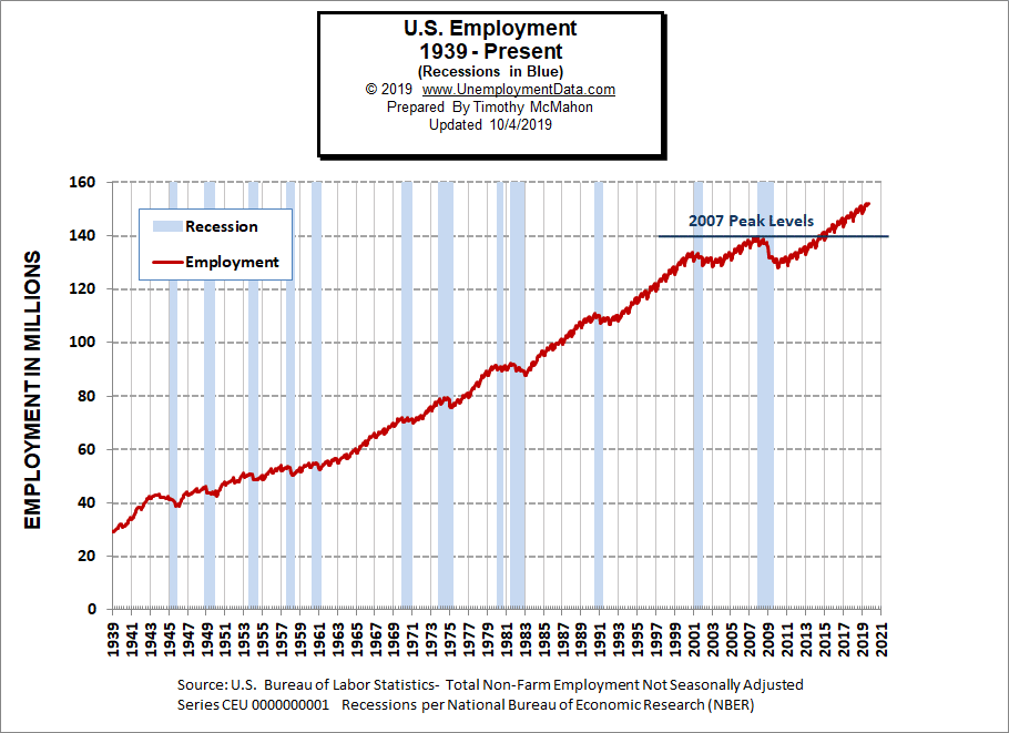
Employment
Historically employment is closely tied to recessions and that is no accident. One of the primary factors in calculating whether the economy is officially in a recession is an increase in the unemployment rate. The chart below provides the Historical Employment Data overlaid on blue bars showing periods of official recessions.
In September employment rose to 151.949 million from the originally reported 151.517 million in August (although the BLS has since adjusted the August numbers to 151.587 million).
As we can see from the table below from November 2007 to January 2008 there were over 3 million jobs lost but that actually wasn’t all that surprising. Typically January suffers from a reduction in Seasonal workers. Even good years like 2005-2006 saw a reduction of 3 million workers and January 2008 employment levels were still above January 2007 levels. But by January 2009, year-over-year losses exceeded 4 million. By 2010 the economy had lost another 4.2 million. 2011 showed almost a million jobs improvement but the economy was still on shaky ground. It wasn’t until January 2014 that the economy reached January 2007 levels and January 2015 exceeded January 2008 levels.
| Date | Employment in Millions |
| January 2007 | 135.335 |
| November 2007 (Peak) | 139.510 |
| January 2008 | 136.268 |
| January 2009 | 132.042 |
| January 2010 | 127.820 |
| January 2011 | 128.778 |
| January 2012 | 131.113 |
| January 2013 | 133.081 |
| January 2014 | 135.488 |
| January 2015 | 138.511 |
| January 2016 | 141.088 |
| January 2017 | 143.393 |
| January 2018 | 145.428 |
| January 2019 | 148.295 |
| February 2019 | 149.148 |
| March 2019 | 149.864 |
| April 2019 | 150.938 |
| May 2019 | 151.610 |
| June 2019 | 152.243 |
| July 2019 | 151.169 |
| August 2019 | 151.587 |
| September 2019 | 151.949 |
Employment Numbers are “Preliminary” for two months before the BLS considers them finalized due to late coming data.
Current Employment
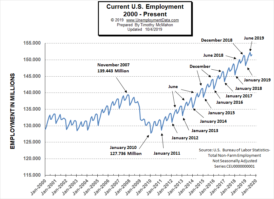
From the above current employment chart, we can see that the low point for each year occurs in January and then a small peak occurs around June with a slight drop around July and then the highest peak in employment happens in November/December.
See Historical Employment and Current Employment for more info.
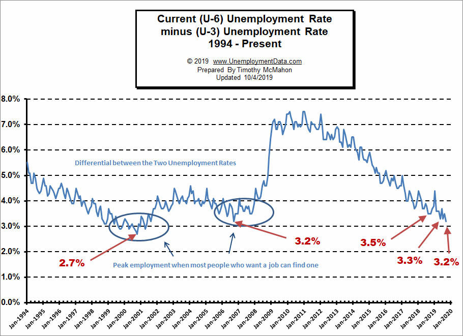
The Differential between U3 and U6
The differential between U3 and U6 has fallen to new lows not seen since September 2006 indicating that the employment market is getting much tighter. The next lower low on this chart was at 2.7% in October 2000. In August, September, and October of 2018, the differential between unadjusted U-3 and unadjusted U-6 dropped to 3.5% indicating that we were getting closer to “full employment” but then in December, the U-6 ticked up to 7.5% from 7.2% a month earlier and the differential ticked back up to 3.8%.
Typically the differential peaks in January and this year was no exception. In January 2019 U-6 shot up to 8.8% and U-3 was 4.4% for a differential of 4.4%. In February the differential fell back to 3.6%. From there we saw it fall to 3.3% in May rise in June and then fall back to 3.3% in July and then rose again in August.
See Current U-6 Unemployment Rate for more info.
U-6 Unemployment
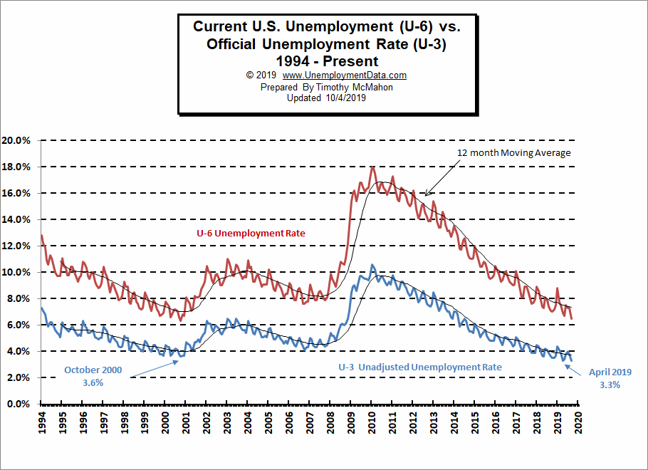
Current U-6 Unemployment Rate for September 2019 is down to 6.5% from 7.3% in August and 8.8% in January.
See Unadjusted U-6 unemployment for more info.
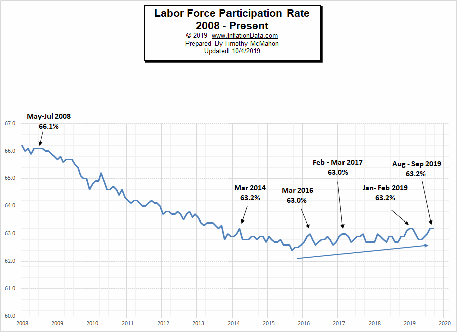
Labor Force Participation Rate
The Current Labor Force Participation Rate for September 2019 is 63.2% unchanged from August but up from 63.0% in July. For the last several years the LFPR has been unable to rise above this level.
See Labor Force Participation Rate for more information.
Employment-Population Ratio
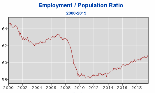
The index many people think of when they hear the term Labor Force Participation Rate might be better described by the Employment-Population Ratio. This index shows the percentage of the entire population that is working. In many ways, it is a better index than the LFPR or the Unemployment rate. Current levels are back in the range of where they were in 2009 even though the population has drastically increased.
Here are some articles you might enjoy in case you missed them:
Read more on UnemploymentData.com.
- Consider Becoming a Social Media Influencer
- Why Credit Risk Management Matters in a Post-Recession World
- Tips for Finding a Job that Meets Your Needs
- Great Employment Benefits You Should Look For
- Things You Need to Do Quickly if You’re Unemployed
From InflationData.com
- How Does Inflation Affect Businesses?
- August Inflation Report
- How Does Inflation Affect the Cost of Insurance?
- Why Does China Want to Lower the Value of Its Currency?
- How High Inflation Drives Countries Towards Crypto
- Gold Price and Its Relationship with Inflation
From Financial Trend Forecaster
- The Oil Crisis Saudi Arabia Can’t Solve
- Weakening Shale Productivity “VERY Bullish” For Oil Prices
- 5 Ways Automation Has Changed the Financial World
- Asteroid Mining: Science Fiction or Science?
- Trade, Impeachment, and the Conviction of Buyers and Sellers
- Spotting High-Confidence Trading Opportunities
- History Says Stocks Can Perform Well After Big Oil Shocks
- Almost Inverted Yield Dip Is Bullish for Stocks
From OptioMoney.com
- Avoid a Money Pit: 4 Vital Inspection Items before Buying an Older Home
- 3 Benefits of Finding a Reliable Family Lawyer
- 4 Hidden Car Costs
- Buying and Selling Ranch Land: A Beginner’s Guide
From Your Family Finances