
The U.S. Bureau of Labor Statistics (BLS) released its employment / unemployment report for April on May 8th.
COVID-19 Shutdowns Send Unemployment Rate Soaring
- Unadjusted U-3 was Up from 4.5% to 14.4%!
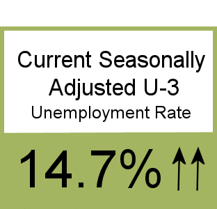
- Adjusted U-3 was Up from 4.4% to 14.7%!
- Unadjusted U-6 was Up from 8.9% to 22.4%!
- Labor Force Participation fell from 62.7% to 60.2%.
- Unadjusted Employment down by approx. -19.5 MILLION jobs.
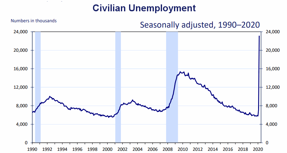
Civilian Unemployment
In April, the ranks of the unemployed swelled by almost 20 million bringing it up to approximately 23 million in total. Rather than looking at percentages, the following chart looks at the actual number of unemployed individuals. The current number of unemployed is considerably higher than at the peak of the 2008-2010 “great recession”.
According to the Commissioner of the U.S. Bureau of Labor Statistics:
Nonfarm payroll employment declined by 20.5 million in April, and the unemployment rate increased to 14.7 percent, reflecting the widespread impact on the job market of the coronavirus (COVID-19) pandemic and efforts to contain it. Employment fell sharply in all major industry sectors, with a
particularly large decline in the leisure and hospitality sector.
The response rate for the household survey continued to be adversely affected by pandemic-related issues, while that for the establishment survey returned to a normal range in April. In addition, there were changes to the estimation methods for the establishment survey to better account for the historic number of temporary or permanent business closures in April. The impacts of the pandemic on the household and payroll surveys are detailed in the April Employment Situation news release and accompanying materials (available on the BLS website)). For both surveys, we were able to obtain estimates that met BLS standards for accuracy and reliability.
The substantial job declines related to the coronavirus pandemic started in March, as payroll employment declined by 870,000, as revised. Job losses accelerated in April, as an additional 20.5 million jobs were lost. These April losses were pervasive across all industry sectors, and brought nonfarm employment to its lowest level since February 2011.
Of course, he is talking about “Seasonally Adjusted Jobs” from the “Current Population Survey (CPS)”
rather than looking at the results reported by actual companies in their “Current Employment Statistics survey (CES)”
Looking at the CES report we see…
Originally the BLS reported 150.804 million jobs for March and then they subtracted 221,000 jobs from that estimate.
So currently they are saying 150.583 million jobs for March and 131.071 million jobs for April which is actually a decrease of -19.733 million jobs compared to what they originally reported last month. Or -19.512 million jobs based on their current estimates of March’s employment.
Unemployment by Ethnicity
As we can see in this chart unemployment has hit the Hispanic Community especially hard with Hispanics at 18.9% unemployment. This could be a consequence of the types of jobs they are typically employed in since construction, retail, and hospitality have been especially hard hit by layoffs. (see employment by sector below).
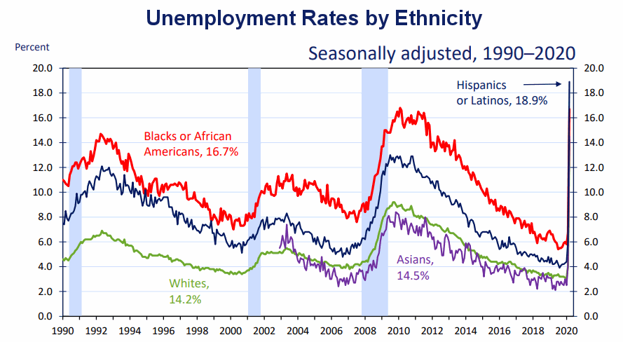 Somewhat surprisingly the black community has been less hard-hit than the Hispanic community with “only” 16.7% unemployment. Typically black unemployment is higher than Hispanic unemployment.
Unemployment by Education
Another surprise is the spike in unemployment of those with a Bachelor’s Degree.
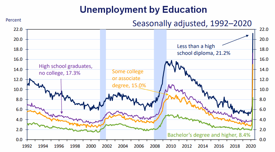
Typically those with a Bachelor’s degree are relatively immune to unemployment. Although during the 2008 recession college grads unemployment rose to slightly above 4% currently it is 8.4% while those with no High School diploma are suffering a 21.2% unemployment rate.
Current Employment
 See Current Employment Commentary for more info.
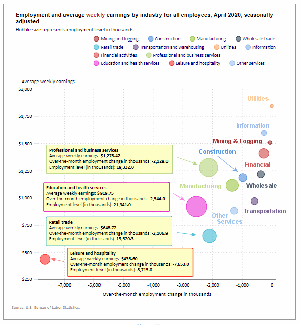
Employment by Sector
The employment “bubble chart” gives us a good representation of how each sector of the economy is doing (employment wise on a seasonally adjusted basis). This is the worst looking sector chart ever. Not a single sector had a gain (i.e. all sectors are to the left of the zero line).
As you would expect Leisure and Hospitality were down the most -7,653,000 jobs although they are the people who can least afford to be unemployed with the lowest average weekly earnings of only $435.60. But with an extra $600 per week from the Federal Government plus a couple hundred from state unemployment they could actually be making twice as much being unemployed as they did while working. Thus they have no incentive to return to work.
Utilities fared the least bad with a loss of “only” -3,300 employees. Mining and logging lost -50,000 employees, Information lost -254,000 employees, and Wholesale lost -362,800 employees.
Retail and professional and business services lost roughly -2 million jobs each while Manufacturing lost -1.3 million jobs.
Average weekly wages actually rose from $978.80 in March to $1,026.34 as lower-paid (non-essential) employees were laid off.
(See the table below for details.)
How to read this chart:
Bubbles location on the chart tell us two things:
- Change in Employment Levels over the most recent month.
- Average Weekly earnings.
- The further to the right the bubble the larger the increase in the number of jobs.
- The higher up on the chart the larger the average salary.
Bubble Size tells us:
- Total Employment for the sector.
- Larger bubbles mean more people are employed in that sector.
Employment and Average Weekly Earnings by Industry
April 2020, Seasonally Adjusted
| Industry | Monthly Increase | Average Weekly Earnings | Employment Level |
| Total Private Employment | -19,520,000 | $1,026.34 | 109,335,000 |
| Mining and Logging | -50,000 | $1,508.07 | 657,000 |
| Construction | -975,000 | $1,186.16 | 6,631,000 |
| Manufacturing | -1,330,000 | $1,114.91 | 11,488,000 |
| Wholesale trade | -362,800 | $1,217.49 | 5,568,500 |
| Retail trade | -2,106,900 | $648.72 | 13,520,300 |
| Transportation and Warehousing | -584,100 | $970.17 | 5,086,800 |
| Utilities | -3,300 | $1,843.73 | 543,100 |
| Information | -254,000 | $1,597.97 | 2,636,000 |
| Financial Activities | -262,000 | $1,407.74 | 8,580,000 |
| Professional and Business Services | -2,128,000 | $1,278.42 | 19,332,000 |
| Education and Health Services | -2,544,000 | $919.75 | 21,941,000 |
| Leisure and Hospitality | -7,653,000 | $435.60 | 8,715,000 |
| Other Services | -1,267,000 | $882.28 | 4,636,000 |
U1 through U6 Unemployment Rates
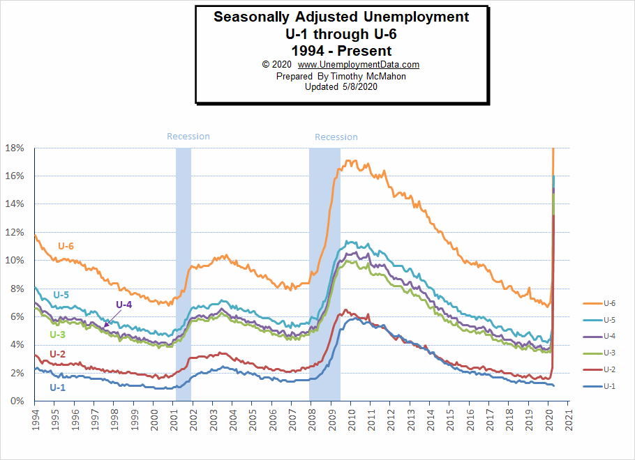
As we can see from the above chart all the various measurements of Seasonally Adjusted Unemployment from U-1 through U-6 spiked up sharply except U1 which measures unemployment over 15 weeks. We would expect to see that spike up as time goes on. For more information about the various measurements of unemployment see What Is U-6 Unemployment?
Employed Part-Time for Economic Reasons
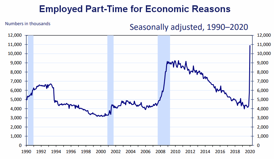
In addition to those who lost their jobs outright those forced to work part-time increased drastically. And unfortunately, these people are not eligible for the extra $600 a week from the Federal Government so they could be really hurting.
Source: Bureau of Labor Statistics
Duration of Unemployment
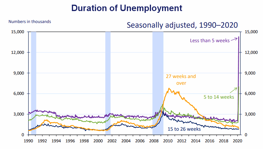
As we can see short term-unemployment spiked up even though the longer-term unemployment was still on a good trend. Depending on how long the crisis lasts we would expect longer-term unemployment to follow but hopefully once the crisis is over companies will be able to rehire their lost employees and things will quickly return to low pre-crisis levels.
Long-Term Unemployed
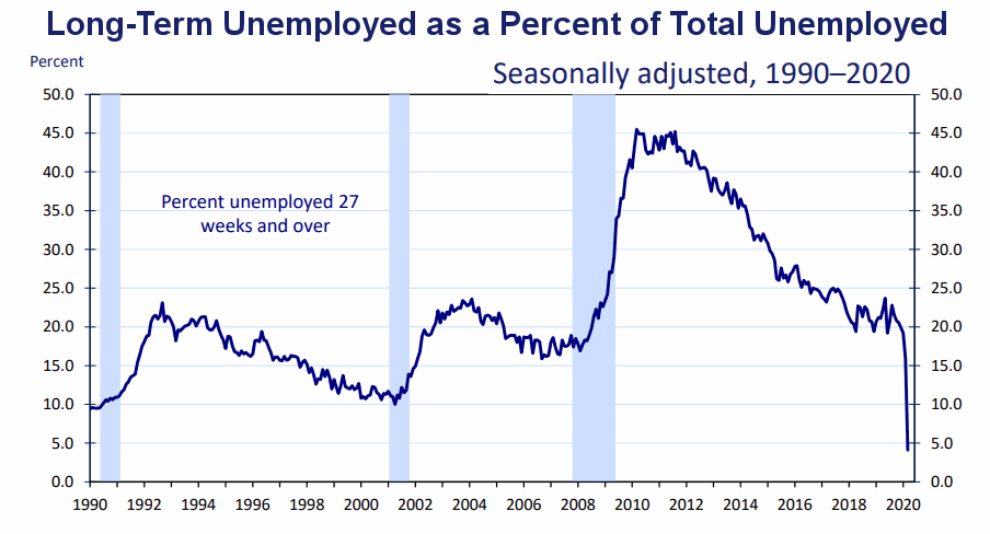
As the ranks of short-term unemployed swells, it causes the percentage of long-term unemployed to shrink so we see a sharp drop in this chart. Normally, as this chart falls it is good meaning that people can find jobs quickly and don’t spend a long time unemployed. But this time, as the number of short-term unemployed spiked, it drove the percentage of long-term unemployed down sharply i.e. everyone has only been unemployed for a short time (so far).
Data Source: BLS Labor Productivity
Reasons for Unemployment
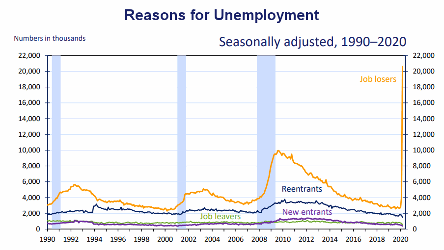 Here we can see the spike in unemployment is strictly due to people losing jobs, not new entrants, reentrants, or people changing jobs .
This chart has a hint of good news in that the majority of the job losses are “temporary”. However, if we look closely we can also see an upturn in the “not temporary” category.
 Teenage Unemployment spiked to 31.9%, Adult woman unemployment rose to 15.5% while adult men was at 13.0%.
Previous Record Low Unemployment (Seasonally Adjusted U-3)
If we consider anything 4% or below as “low” we have had a few “low” stretches as we can see in the table below.
(4% or below in Green)
| Jan | Feb | Mar | Apr | May | Jun | Jul | Aug | Sep | Oct | Nov | Dec | |
| 1950 | 6.5% | 6.4% | 6.3% | 5.8% | 5.5% | 5.4% | 5.0% | 4.5% | 4.4% | 4.2% | 4.2% | 4.3% |
| 1951 | 3.7% | 3.4% | 3.4% | 3.1% | 3.0% | 3.2% | 3.1% | 3.1% | 3.3% | 3.5% | 3.5% | 3.1% |
| 1952 | 3.2% | 3.1% | 2.9% | 2.9% | 3.0% | 3.0% | 3.2% | 3.4% | 3.1% | 3.0% | 2.8% | 2.7% |
| 1953 | 2.9% | 2.6% | 2.6% | 2.7% | 2.5% | 2.5% | 2.6% | 2.7% | 2.9% | 3.1% | 3.5% | 4.5% |
| 1954 | 4.9% | 5.2% | 5.7% | 5.9% | 5.9% | 5.6% | 5.8% | 6.0% | 6.1% | 5.7% | 5.3% | 5.0% |
| 1955 | 4.9% | 4.7% | 4.6% | 4.7% | 4.3% | 4.2% | 4.0% | 4.2% | 4.1% | 4.3% | 4.2% | 4.2% |
| 1956 | 4.0% | 3.9% | 4.2% | 4.0% | 4.3% | 4.3% | 4.4% | 4.1% | 3.9% | 3.9% | 4.3% | 4.2% |
| 1957 | 4.2% | 3.9% | 3.7% | 3.9% | 4.1% | 4.3% | 4.2% | 4.1% | 4.4% | 4.5% | 5.1% | 5.2% |
| 1958 | 5.8% | 6.4% | 6.7% | 7.4% | 7.4% | 7.3% | 7.5% | 7.4% | 7.1% | 6.7% | 6.2% | 6.2% |
| … | … | … | … | … | … | … | … | … | … | … | … | … |
| 1965 | 4.9% | 5.1% | 4.7% | 4.8% | 4.6% | 4.6% | 4.4% | 4.4% | 4.3% | 4.2% | 4.1% | 4.0% |
| 1966 | 4.0% | 3.8% | 3.8% | 3.8% | 3.9% | 3.8% | 3.8% | 3.8% | 3.7% | 3.7% | 3.6% | 3.8% |
| 1967 | 3.9% | 3.8% | 3.8% | 3.8% | 3.8% | 3.9% | 3.8% | 3.8% | 3.8% | 4.0% | 3.9% | 3.8% |
| 1968 | 3.7% | 3.8% | 3.7% | 3.5% | 3.5% | 3.7% | 3.7% | 3.5% | 3.4% | 3.4% | 3.4% | 3.4% |
| 1969 | 3.4% | 3.4% | 3.4% | 3.4% | 3.4% | 3.5% | 3.5% | 3.5% | 3.7% | 3.7% | 3.5% | 3.5% |
| 1970 | 3.9% | 4.2% | 4.4% | 4.6% | 4.8% | 4.9% | 5.0% | 5.1% | 5.4% | 5.5% | 5.9% | 6.1% |
| … | … | … | … | … | … | … | … | … | … | … | … | … |
| 1999 | 4.3% | 4.4% | 4.2% | 4.3% | 4.2% | 4.3% | 4.3% | 4.2% | 4.2% | 4.1% | 4.1% | 4.0% |
| 2000 | 4.0% | 4.1% | 4.0% | 3.8% | 4.0% | 4.0% | 4.0% | 4.1% | 3.9% | 3.9% | 3.9% | 3.9% |
| 2001 | 4.2% | 4.2% | 4.3% | 4.4% | 4.3% | 4.5% | 4.6% | 4.9% | 5.0% | 5.3% | 5.5% | 5.7% |
| … | … | … | … | … | … | … | … | … | … | … | … | … |
| 2018 | 4.1% | 4.1% | 4.1% | 3.9% | 3.8% | 4.0% | 3.9% | 3.9% | 3.7% | 3.7% | 3.7% | 3.9% |
| 2019 | 4.0% | 3.8% | 3.8% | 3.6% | 3.6% | 3.7% | 3.7% | 3.7% | 3.5% | 3.6% | 3.5% | 3.5% |
| 2020 | 3.6% | 3.5% | 4.4% | 14.7% |
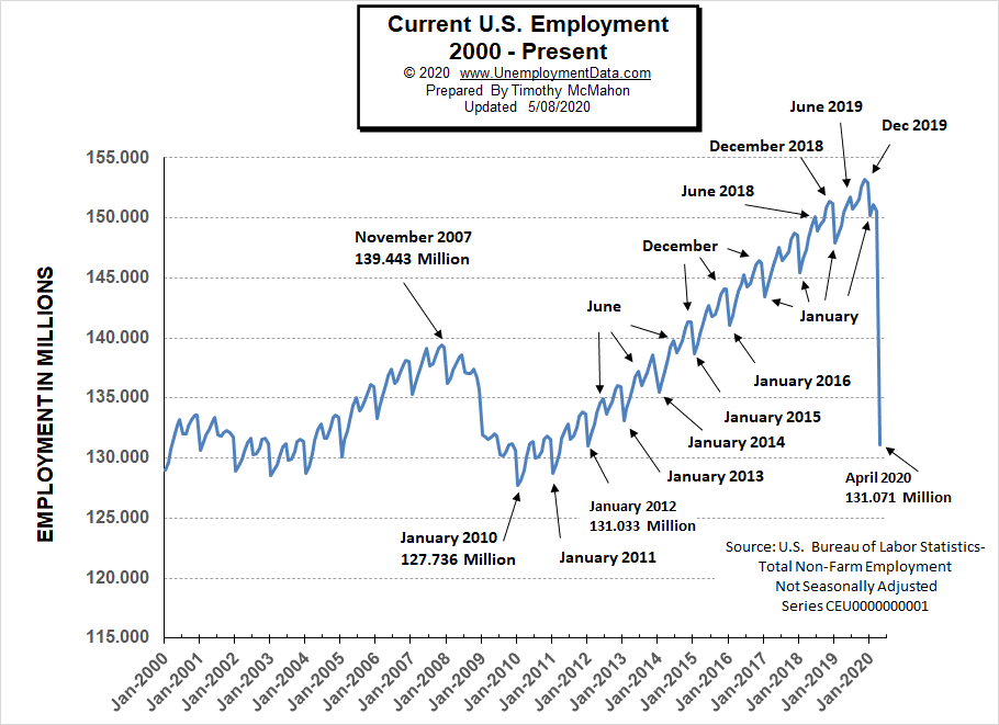
Employment
Historically employment is closely tied to recessions and that is no accident. One of the primary factors in calculating whether the economy is officially in a recession is an increase in the unemployment rate. The chart below provides the Historical Employment Data overlaid on blue bars showing periods of official recessions. We can see that the number of people employed has fallen below the 2007 peak and is nearing the lows of the 2008-2010 crash.
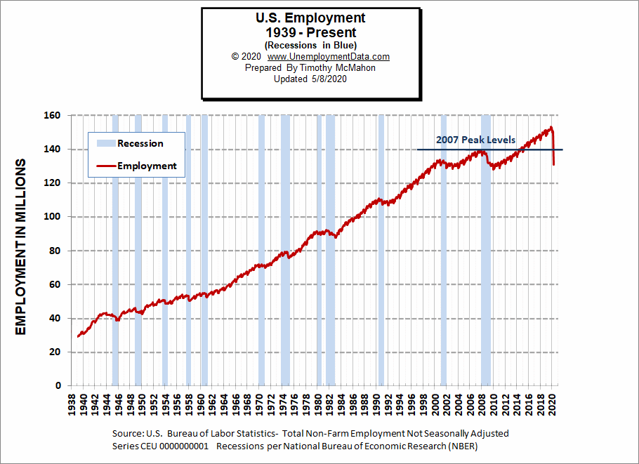
See Historical Employment Data for more info.
Current Employment
From the above current employment chart, we can see that the low point for each year occurs in January and then a small peak occurs around June with a slight drop around July and then the highest peak in employment happens in November/December. But the drop in March-April was unprecedented taking the number of employed down very close to the lows of January 2012.
See Current Employment for more info.
Labor Force Participation Rate
The Labor Force Participation Rate for April 2020 fell sharply breaking the slight upward trend that had been in place since October 2015.
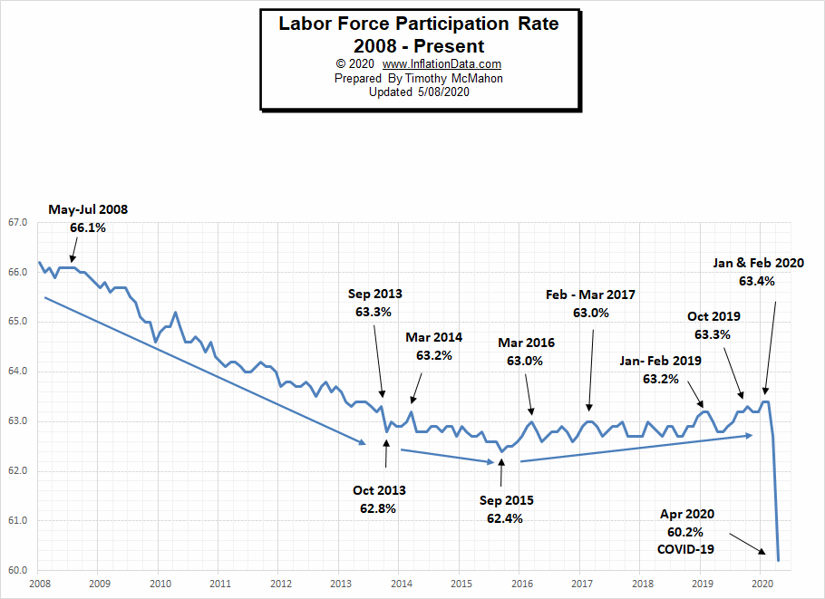
See Labor Force Participation Rate for more information.
If you would like to receive this monthly report and other article updates click here you can unsubscribe at any time.
Here are some articles you might enjoy in case you missed them:
Read more on UnemploymentData.com.
- 4 Industries That Are Urgently Hiring Essential Workers
- 7 Reasons to Consider a Career in Data Analytics
- How to Be a High Productivity Individual at Work
- Essential Jobs That Are in High Demand During Emergencies
- Dealing With Temporary Disability After a Workplace Injury
- 8 Reasons Why You Should Pursue Higher Education (Now!)
- 5 Jobs Every Company Needs and How You Can Get One
From InflationData.com
- What Causes Inflation? Rising Prices Explained
- The 2008 Financial Crisis
- What are Central Banks?
- March Inflation Crashes
- Inflation Expectations and the Massive Fed Stimulus
- What is the Federal Funds Rate?
- Will the $2 Trillion Covid-19 Stimulus Cause Inflation?
- Does the FED Control Mortgage Rates?
From Financial Trend Forecaster
- Top 5 Reasons Why 5G Will Change the Finance Industry
- How Can Oil Be Worth Less than Nothing?
- Saudi Arabia’s Oil Price War Is Backfiring
- Electricity Rates by State
- Oil Is Now More Volatile Than Bitcoin
- Deflationary Psychology Versus the Fed: Here’s the Likely Winner
- Crude Oil’s 2020 Crash: See What Helped (Some) Traders Pivot Just in Time
- Stocks: Is the Worst Over or is there Worse Yet to Come?
- Junk Bonds: 2 “Golden” Junctures
- Is the Buying Opportunity Here Yet?
From OptioMoney.com
- Learning to Trade from Video Tutorials
- How Saxo Bank Democratizes Trading and Investment
- Five Business Tips to Help Your Company Thrive
- Have Minimal Car Insurance? What to Do in Case of an Accident
- How to Choose a Residential Roofing Contractor
From Your Family Finances