
![]() On Friday December 8th the U.S. Bureau of Labor Statistics (BLS) released their monthly employment survey results for the month of November.
On Friday December 8th the U.S. Bureau of Labor Statistics (BLS) released their monthly employment survey results for the month of November.
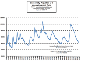
According to the BLS the Unemployment for November is virtually unchanged from October to November on both an Unadjusted and Seasonally Adjusted basis. Seasonally Adjusted U-3 was 4.1% for both months while Unadjusted U-3 was 3.9% for both months. Unadjusted U-6 unemployment which is a broader measure of Unemployment rose slightly from 7.6% in October to 7.7% in November. This is still significantly better than a year ago when in November 2016 Unadjusted U-6 was 9%.
Unemployment
 Over the last month, the actual number of people working has increased by 532,000 and the civilian non-institutional population (a fairly narrow measurement of population) has increased by a very low 183,000.
This means that not only has the increase in jobs kept up with the increase in the population but it was actually almost 3 times greater than the population growth! And since only about half of the population is working, job growth has far exceeded the level needed to keep things on a steady keel. See: Current Unemployment Rate Chart for more info.
Employment
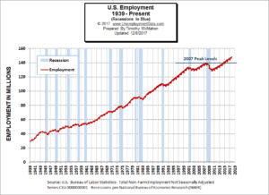 Employment was 147,975,000 in October (148,006,000 when the numbers were originally released in November) and the current numbers for employment are 148,507,000 in November for a net gain of 501,000 over the original October numbers or 532,000 increase over the new October numbers.
Although unemployment rates are virtually unchanged the Employment numbers tell a slightly different story. According to the BLS Commissioner’s report “Total nonfarm payroll employment increased by 228,000 in November. Employment continued to trend up in professional and business services, manufacturing, and health care… Employment in professional and business services continued on an upward trend in November (+46,000). Over the past 12 months, the industry has added 548,000 jobs… Health care added 30,000 jobs in November… Within construction, employment among specialty trade contractors increased by 23,000 in November and by 132,000 over the year… “
It’s interesting to think back a single year and to remember the collective gloom that covered the economy and remember that while on the campaign trail Trump was almost universally mocked for promising to “Bring back manufacturing jobs to the U.S.” I must admit that even I was skeptical. After all, manufacturing jobs were done and gone, what chance is there of bringing them back? So it is interesting to note that although they didn’t mention Trump specifically, this month’s BLS Commissioner’s report used these exact words, “Since a recent low in November 2016, manufacturing employment has increased by 189,000.” So, precisely since Trump’s election the U.S. has gained 189,000 manufacturing jobs. And 31,000 of them were added in November alone. And November 2016 was actually a “recent low“. From November 2015 to November 2016 the U.S. had actually lost -50,000 manufacturing jobs and at the time it seemed that losing manufacturing jobs was going to be the new reality.
A cynic might say, “Yeah, but aren’t Manufacturing jobs low paying grunt work better left to the uneducated masses in Asia?” Apparently not! According to the BLS’ “Bubble Chart”, Manufacturing jobs pay above average wages (i.e. the green manufacturing bubble is above the “average wage” dotted line) paying $1092.44 per week or almost $57,000 per year. And looking at the bubble size compared to the other bubbles (size represents total employment levels) manufacturing is once again the 5th largest employment category with roughly 12.5 million jobs compared to 23 million in Health and Education (which should be two separate categories in my opinion), almost 21 million in professional and business services, 16 million in Leisure and Hospitality, and 15.8 million in retail.
But because average wages are lower in other industries, you will find if you multiply number of jobs by average salary Professional and Business Services is the largest sector followed by Education and Health and Manufacturing is actually third based on dollars pumped into the wage economy.
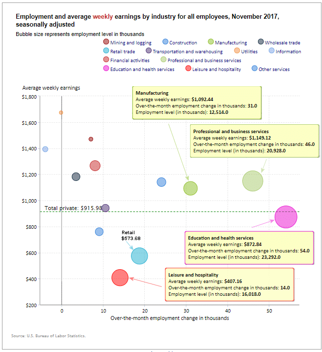
How to read this chart:
Bubbles location on the chart tell us two things:
- Change in Employment Levels over the most recent month.
- Average Weekly earnings.
Bubble Location tells us:
- The further to the right the bubble the larger the increase in the number of jobs.
- The higher up on the chart the larger the average salary.
Employment and Average Weekly Earnings by Industry for All Employees
November 2017, Seasonally Adjusted
| Industry | Monthly Increase | Average Weekly Earnings | Employment Level |
| Total Private Employment | 221,000 | $915.98 | 124,900,000 |
| Mining and Logging | 7,000 | $1,470.26 | 730,000 |
| Construction | 24,000 | $1,140.55 | 6,955,000 |
| Manufacturing | 31,000 | $1,092.44 | 12,514,000 |
| Wholesale trade | 3,400 | $1,181.99 | 5,948,100 |
| Retail trade | 18,700 | $573.68 | 15,845,000 |
| Transportation and Warehousing | 10,500 | $941.07 | 5,123,800 |
| Utilities | -200 | $1,673.81 | 553,300 |
| Information | -4000 | $1,393.10 | 2,703,000 |
| Financial Activities | 800 | $1,266.37 | 8,492,000 |
| Professional and Business Services | 46,000 | $1,149.12 | 20,928,000 |
| Education and Health Services | 54,000 | $872.84 | 23,292,000 |
| Leisure and Hospitality | 14,000 | $407.16 | 16,018,000 |
| Other Services | 9,000 | $759.85 | 5,798,000 |
Industry Size Sorted by Total Wages
| Industry | Total Wages (in Millions / week) |
| Professional and Business Services | $ 24,049 |
| Education and Health Services | $ 20,330 |
| Manufacturing | $ 13,671 |
| Financial Activities | $ 10,754 |
| Retail trade | $ 9,090 |
| Construction | $ 7,933 |
| Wholesale trade | $ 7,031 |
| Leisure and Hospitality | $ 6,522 |
| Transportation and Warehousing | $ 4,822 |
| Other Services | $ 4,406 |
| Information | $ 3,766 |
| Mining and Logging | $ 1,073 |
| Utilities | $ 926 |
Note: Industry size calculated by multiplying average weekly earnings times number of jobs, so the result is in Millions of Dollars per week.
Labor Force Participation Rate
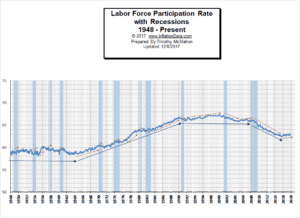 You might be wondering if recessions have any effect on the LFPR. It might make sense that the LFPR would fall during a recession. In the chart to the left we can see both LFPR vs. Recessions. And the results were a bit surprising. The red arrows indicate short term trends and the blue arrows indicate longer term trends.
See Labor Force Participation Rate for more information.
For more information See:
- Article: Employment vs. Unemployment how do they compare?
- Historical Employment Data Chart
- Current Unemployment Rate Chart
- Current Employment vs Unemployment Chart Are they really “two sides of the same coin”?
- What is U-6 Unemployment?
- The Misery index measures inflation plus unemployment and is a good measure of the discomfort of the country’s population.
- More Unemployment and Employment Charts