 September Employment Numbers Disappointing
Apparently U.S. employers cut back on hiring over the last two months. The expectation by economists polled by Reuters was that there would be a net gain of 203,000 jobs in September.
But when the BLS released their “preliminary estimates” for the employment situation for September non-farm employment rose by only 142,000 in September. And to make matters worse, August numbers were adjusted down resulting in the smallest Seasonally adjusted two month gain in over a year.
The BLS Commissioner’s report stated, “Job gains occurred in health care and information, while mining employment fell… The number of persons unemployed for less than 5 weeks increased by 268,000 to 2.4 million in September, partially offsetting a decline in August… Thus far in 2015, job growth has averaged 198,000 per month, compared with an average monthly gain of 260,000 in 2014.”
So 2015 has averaged only 76% the job growth that 2014 had and at 142,000 September was only 54% of 2014’s average. 34,000 new jobs were created by healthcare, 31,000 came from professional and business services, 24,000 from retail trade employment, and food services and drinking places added 21,000 jobs. On the other hand, mining and mining support lost -17,000 jobs. So it appears all the high paid mining workers are now working at either McDonald’s or Walmart. Not a good trend at all!
See Current Employment Commentary for more information.
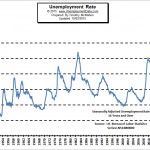
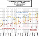
What is the “Real” Unemployment Rate?
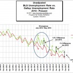
U3 vs. U6 Unemployment
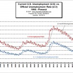
Historical Employment Levels Compared to Recessions
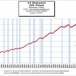
Generally, recessions correspond pretty well to declines in employment (i.e. increased Unemployment). This is especially true since unemployment is one of the major factors NBER uses to determine whether there is an official recession. This chart shows the actual number of jobs in addition to showing recessions shaded blue as per the official description of a “recession” by the National Bureau of Economic Research (NBER).See Employment During Recessions for more information.
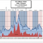
The two factors it uses are inflation and unemployment. High levels of price inflation (rapidly rising prices) will cause households to have difficulty affording the basic necessities while high unemployment will leave a high percentage of households without any income at all. High combined levels will cause havoc throughout the economy and a high level of distress, discomfort and political unrest. See Misery Index.
Seasonal Adjusting
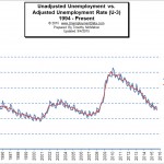
See Also:
- Monthly Historical Unemployment Rates from 1948 through the present.

 September Employment Numbers Disappointing