• About WordPress
    • WordPress.org
    • Documentation
    • Learn WordPress
    • Support
    • Feedback
  • Log In
  • Skip to primary navigation
  • Skip to main content
  • Skip to primary sidebar
  • Home
  • Contact us
  • Related Sites
    • InflationData.com
    • Financial Trend Forecaster
    • Your Family Finances
    • Elliott Wave University
    • Optio Money
  • About
    • Terms of Use
    • Disclaimer & Disclosure
    • Privacy Statement
  • Sitemap
    • 2009-2010 Posts
    • 2011 Posts

UnemploymentData.com

Your Source for Employment and Unemployment Data

Unemployment
  • Charts
    • Current Unemployment Rate Chart
    • Current Employment Rate (Chart and Data)
    • Current Employment vs Unemployment Chart
    • Historical Employment Data
    • Employment Population Ratio
    • Misery Index
  • Unemployment
    • Historical Unemployment Rate Tables
    • What Is U-6 Unemployment?
    • Unadjusted vs. Seasonally Adjusted U-3 Unemployment Rate
    • BLS vs. Gallup Unemployment Numbers
    • Current U-6 Unemployment Rate
    • What is the Labor Force Participation Rate?
    • What is the Real Unemployment Rate?
  • Employment
    • Current Employment Rate (Chart and Data)
    • Historical Employment Data
    • Contacting a Live Person at the State Employment Commission
      • How to Talk to a Live Person at the Virginia Unemployment Commission
      • Florida’s FLUID Unemployment Program
    • Benefits
      • Insurance
      • Retirement
    • Careers
    • Employment Costs
    • Experience
    • Government
    • Job Hunting
      • Interview
      • Resume
  • Find Articles
  • Education
    • Skills
  • General
    • Small Business
      • Outsourcing
    • Success
You are here: Home / BLS / May Employment and Unemployment Numbers

May Employment and Unemployment Numbers

June 2, 2017 by Tim McMahon

The U.S.Bureau of Labor Statistics (BLS) released the May unemployment numbers today. The BLS Commissioner says: Nonfarm payroll employment increased by 138,000 in May, but these are Seasonally Adjusted numbers. So since typically employment increases in May, what he is saying is that 138,000 more jobs than average were created. In unadjusted terms employment was 145.938 million in April and 146.748 in May for a net gain of  810,000 jobs. Adjusted U-3 Unemployment was 4.3% down from 4.4% in April. Unadjusted U-3 Unemployment was 4.1% unchanged from April.

Gallup Unadjusted U-3 was 5.2% down from 5.4% in April. Gallup’s unadjusted U-6 Unemployment was 8.1% unchanged from April. Gallup’s U-6 was 13.8% Down from 14.0% in April.

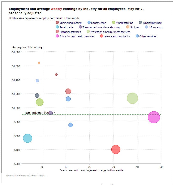
May Employment Gain and Loss Bubbles

In the following chart from the BLS we can see the biggest gainer is the pink Education and Health Services bubble with 47,000 new jobs over the month of May. Average weekly earnings are slightly below average at $861.65. Another big gainer was the light green bubble representing Professional and Business Services with 38,000 new jobs and an above average weekly salary of $1,133.64. Leisure and hospitality (red bubble) also gained 31,000 jobs in May but average weekly earnings are only $401.18. Other gainers were construction (11,000 jobs), Financial Activities (11,000 jobs) and transportation and warehousing (3,600 jobs). The biggest loser was Retail losing 6,100 low paying jobs averaging $561.72/wk. Other losers were Manufacturing losing 1,000 jobs @ $1,077.33/wk and Wholesale Trade losing 2,100 jobs @ $1,171.56/wk.

May Employment Bubbles


BLS vs. Gallup Unemployment Numbers

BLS Numbers  May April
Seasonally Adjusted U-3 4.3% 4.4%
Unadjusted U-3 4.1% 4.1%
Unadjusted U-6 8.1% 8.1%
Gallup Numbers
Unadjusted U-3 5.2% 5.4%
Unadjusted U-6 13.8% 14.0%

Labor Force Participation Rate (LFPR)

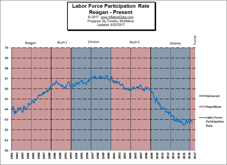
As the LFPR falls (bad) it appears that the unemployment rate is falling (good). So even though the ranks of the unemployed stays the same (or even grows) the numbers look like things are getting better. Conversely, as the LFPR rose under Reagan the unemployment could remain the same or even rise even though more people were actually working.

Read more about the Labor Force Participation Rate here.

LFPR vs P2P (Good Jobs Index)

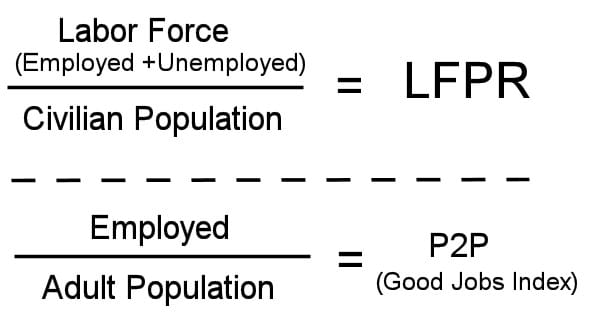
In contrast to the LFPR, Gallup uses the Payroll to Population ratio (P2P) now called the “good jobs index”. The LFPR includes both employed and unemployed people i.e. the “Labor Force” divided by the Civilian Non-Institutional Population. The P2P on the other hand uses the Employed divided by the  Adult population giving you a much easier way to see what percentage of the population is actually working (not counting self -employed people). Currently Gallup is saying that the Good jobs index is currently 45.3%.

So with a Good jobs index below 50% we can see that less than half the adults are working. Although with roughly 10% of the population self-employed the numbers climb to slightly above half.  Read more about comparing BLS numbers to Gallup…

Seasonally Adjusted Unemployment Rate Chart 1948-Present

The current “Unadjusted” rate is 4.1% which appears to be very low (equivalent to 2007) until you factor in the fact that the Labor force has declined drastically (see declining LFPR chart above). The population has increased by 22 million and the number of jobs has increased by only 7.3 million.
See: Current Unemployment Rate Chart here.

See Also:

  • Current  Employment Commentary
  • Current Employment vs Unemployment Chart
  • Historical Employment with Recessions
  • BLS vs Gallup Unemployment Numbers
  • Labor Force Participation Rate

Filed Under: BLS, Employment Tagged With: employment, Good Jobs Index, Labor Force, Labor Force Participation Rate, LFPR, P2P, unemployment

About Tim McMahon

Work by editor and author, Tim McMahon, has been featured in Bloomberg, CBS News, Wall Street Journal, Christian Science Monitor, Forbes, Washington Post, Drudge Report, The Atlantic, Business Insider, American Thinker, Lew Rockwell, Huffington Post, Rolling Stone, Oakland Press, Free Republic, Education World, Realty Trac, Reason, Coin News, and Council for Economic Education. Connect with Tim on Google+

Primary Sidebar

Search Site

Sponsored:

URGENT: These Stocks Stand Poised to Benefit from President Trump's Trade Wars!

As the Trump administration moves ahead with aggressive tariff policies on key imports, the mainstream media is scrambling.

This Free Report - which you can download now - reveals the names and ticker symbols of 5 Stock Poised to Benefit Most from President Trump's Tariff Wars.

Click Here to Download Your FREE Stock Report Now.

Recent Posts

  • April 2025 Employment / Unemployment Report
  • Would More Jobs Help Social Security?
  • March 2025- Employment / Unemployment Report
  • February 2025 Jobs Report
  • January 2025 BLS Employment Report

Resources

  • Bureau of Labor Statistics Current Population Survey Monthly survey of households conducted by the Bureau of Census for BLS. It provides data on the labor force, employment, unemployment, etc.
  • Capital Professional Services Providing web design and development and Internet marketing services
  • Elliott Wave University Using the Elliott Wave Principle to improve investment performance
  • Financial Trend Forecaster Featuring Moore Inflation Predictor, NYSE Rate of Change and NASDAQ Rate of change
  • InflationData.com Inflation calculators, databases, etc.
  • Intergalactic Web Designers Web design and development services
  • Your Family Finances

Articles by Category

Articles by Date

Disclaimer

At UnemploymentData.com we are not registered investment advisors and do not provide any individualized advice. Past performance is not necessarily indicative of future performance and future accuracy and profitable results cannot be guaranteed.

Privacy & Terms of Use

Privacy Statement & Terms of Use

Do Not Sell My Information

Copyright © 2025 · News Pro on Capital Professional Services, LLC. All rights reserved · Log in