
![]()
The U.S. Bureau of Labor Statistics (BLS) released their monthly employment survey results for the month of April on Friday May 4th .
At 3.9% the Seasonally Adjusted U-3 Unemployment Rate is at its lowest level since December 2000. The Unadjusted U-3 is at 3.7%.
Many Experts consider this to be the new “Full Employment” level i.e. everyone who wants a job has found one however with the Labor Force Participation rate still well below the average that is debatable. See Is the U.S. Really at “Full Employment”? for more information.
Key April Employment and Unemployment Numbers
- Adjusted U-3 Unemployment- 3.9% Down from 4.1% October – March.
- Unadjusted U-3 Unemployment- 3.7% down from 4.1% in March.
- Unadjusted U-6 Unemployment- 7.4% Down massively from 8.1% in March and 8.6% in February.
- Employment 148.367 million up from 147.369 million in March but still below the 148.783 million in November.
- Gallup has discontinued publishing U-6 & U-3 numbers.
See Current Unemployment Chart for more info.
Employment by Sector
The employment “bubble chart” gives us a good representation of how each sector of the economy is doing (employment wise). As we can see from the chart below only one sector is to the left of the zero line this month indicating that all other sectors gained employees in April except Wholesale Trade which lost -9,800 employees on a “Seasonally Adjusted” basis.
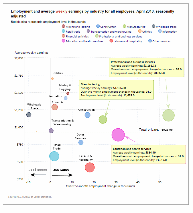 The biggest gainers were Professional and Business Services (bubble furthest to the right) which added 54,000 jobs, followed by Education and Health Services which gained 31,000 jobs and Manufacturing which gained 24,000 jobs. Interestingly all three were the top gainers last month as well with similar gains. Average weekly earnings for all industries increased from $925.29 to $925.98.
(See the table below the chart for average weekly earnings and other details.)
How to read this chart:
Bubbles location on the chart tell us two things:
- Change in Employment Levels over the most recent month.
- Average Weekly earnings.
- The further to the right the bubble the larger the increase in the number of jobs.
- The higher up on the chart the larger the average salary.
Bubble Size tells us:
- Total Employment for the sector.
- Larger bubbles mean more people are employed in that sector.
Employment and Average Weekly Earnings by Industry for All Employees
April 2018, Seasonally Adjusted
| Industry | Monthly Increase | Average Weekly Earnings | Employment Level |
| Total Private Employment | 168,000 | $925.98 | 126,106,000 |
| Mining and Logging | 8,000 | $1,483.82 | 730,000 |
| Construction | 17,000 | $1,170.39 | 7,174,000 |
| Manufacturing | 24,000 | $1,106.00 | 12,655,000 |
| Wholesale trade | -9,800 | $1,176.34 | 5,952,700 |
| Retail trade | 1,800 | $575.67 | 15,927,000 |
| Transportation and Warehousing | 400 | $943.71 | 5,285,400 |
| Utilities | 1,000 | $1,698.31 | 555,300 |
| Information | 7,000 | $1,416.93 | 2,772,000 |
| Financial Activities | 2,000 | $1,285.92 | 8,549,000 |
| Professional and Business Services | 54,000 | $1,166.73 | 20,869,000 |
| Education and Health Services | 31,000 | $884.40 | 23,517,000 |
| Leisure and Hospitality | 18,000 | $413.16 | 16,272,000 |
| Other Services | 14,000 | $773.69 | 5,848,000 |
U-6 Unemployment
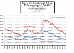 Looking at the broader measure of Unemployment which includes discouraged workers, we see that the U-6 unemployment rate fell steadily from 8.9% in January to 7.4% in April.
See Unadjusted U-6 unemployment for more info.
Employment
Over the last month, the actual number of people working (not seasonally adjusted) has increased by 998,000 jobs in April. The BLS Commissioner said:
“Nonfarm payroll employment increased by 164,000 in April, and the unemployment rate edged down to 3.9 percent. Over the month, job gains occurred in professional and business services, manufacturing, health care, and mining.“
Actual employment was 147.369 million in March and 148.367 million in April for an actual increase of 998,000 not the 164,000 spoken of by the Commissioner. The 164,000 is “Seasonally Adjusted” meaning that employment increased by that much more than average for this time of year.
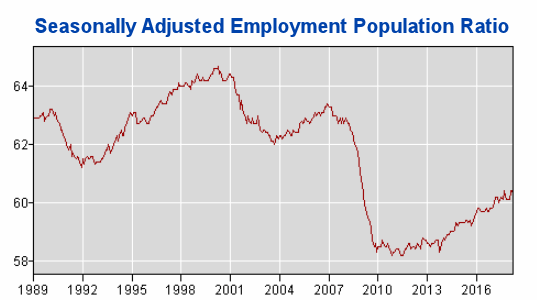
Employment / Population Ratio
If you take the number of jobs and divide it by the population you get what percentage of the population is working. You
would think this would be a much more accurate indicator than the unemployment rate. If we look at the current Employment Population Ratio chart you will see that it fell drastically beginning in 2008 and has since begun climbing but it is still nowhere near previous levels. As a matter of fact it isn’t even up to the previous lows of 1992 and 2003. So the fact that the “unemployment rate is the same” is a bit misleading since a much smaller percentage of the population is actually working. Bureau of Labor Statistics Series LNS12300000.
Labor Force Participation Rate
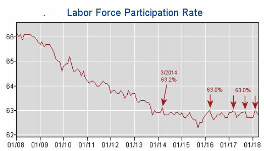
You might be wondering if recessions have any effect on the LFPR. It might make sense that the LFPR would fall during a recession.
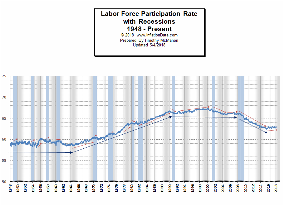
In the chart above we can see both LFPR vs. Recessions. And the results were a bit surprising. The red arrows indicate short term trends and the blue arrows indicate longer term trends.
See Labor Force Participation Rate for more information.
For more information See:
- Article: Employment vs. Unemployment how do they compare?
- Historical Employment Data Chart
- Current Unemployment Rate Chart
- Current Employment vs Unemployment Chart Are they really “two sides of the same coin”?
- What is U-6 Unemployment?
- The Misery index measures inflation plus unemployment and is a good measure of the discomfort of the country’s population.
- More Unemployment and Employment Charts