
![]()
The U.S. Bureau of Labor Statistics (BLS) released its employment / unemployment report for March on April 3rd.
COVID-19 Shutdowns Send Unemployment Rate Soaring
The BLS commissioner emphasized that even though the numbers are collected mid-month and the massive shutdown had just begun it was already having detrimental effects on the unemployment rate and we can expect worse to come.
- Unadjusted U-3 was Up from 3.8% to 4.5%!
- Adjusted U-3 was Up from 3.5% to 4.4%!
- Unadjusted U-6 was Up from 7.4% to 8.9%!
- Labor Force Participation fell from 63.4% to 62.7%.
- Unadjusted Employment down by approx. 193,000 jobs.
According to the Commissioner of the U.S. Bureau of Labor Statistics:
“Nonfarm payroll employment declined by 701,000 in March, and the unemployment rate increased to 4.4 percent, reflecting the broad impact on the job market of the coronavirus (COVID-19) and efforts to contain the illness. Employment fell by 459,000 in the leisure and hospitality industry, mainly in food services and drinking places. Notable employment decreases also occurred in health care and social assistance, professional and business services, retail trade, and construction.
It is important to keep in mind that the March survey reference periods for the establishment and household surveys (the pay period or week, respectively, that includes the 12th of the month) predated many business and school closures that occurred in the second half of the month. In addition, data collection for the two surveys was affected by the coronavirus.
Although response rates for both surveys were adversely affected by pandemic-related issues, we still were able to obtain estimates from our two surveys that met BLS standards for accuracy and reliability.”
Of course, he is talking about “Seasonally Adjusted Jobs” from the “Current Population Survey (CPS)”
rather than looking at the results reported by actual companies in their “Current Employment Statistics survey (CES)”
But looking at the CES report we see…
Originally the BLS reported 150.997 million jobs for February and then they added 58,000 jobs to that estimate.
So currently they are saying 151.055 million jobs for February and 150.804 million jobs for March
which is actually a decrease of 193,000 jobs compared to what they originally reported last month.
 See Current Employment Commentary for more info.
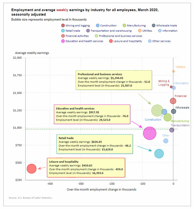
Employment by Sector
The employment “bubble chart” gives us a good representation of how each sector of the economy is doing (employment wise on a seasonally adjusted basis). This is one of the worst looking sector charts in a long time. Leisure and Hospitality were down by -459,000 jobs and they are the people who can least afford to be unemployed with the lowest average weekly earnings of only $410.65.
Although it is difficult to tell from the chart three sectors barely squeezed out a minor gain. They are Utilities which added 800 employees, Information which added 2,000 employees, and Wholesale which added 900 employees.
Although it is difficult to tell from the chart Financial Activities were down -1,000 employees. Transportation and Warehousing were down -4,900 employees, mining and logging lost -7,000 jobs. And from there thing get even worse. Other services (a fairly small sector) lost -24,000 jobs, manufacturing lost -18,000 jobs, Construction lost -29,000 jobs, retail lost -46,000 jobs, professional and business services lost -52,000 jobs and education and health services lost -76,000 jobs.
Average weekly wages fell slightly from $981.09 in February to $978.80 in March. This is still up from $951.50 in February 2019.
(See the table below for details.)
How to read this chart:
Bubbles location on the chart tell us two things:
- Change in Employment Levels over the most recent month.
- Average Weekly earnings.
- The further to the right the bubble the larger the increase in the number of jobs.
- The higher up on the chart the larger the average salary.
Bubble Size tells us:
- Total Employment for the sector.
- Larger bubbles mean more people are employed in that sector.
Employment and Average Weekly Earnings by Industry
March 2020, Seasonally Adjusted
| Industry | Monthly Increase | Average Weekly Earnings | Employment Level |
| Total Private Employment | -713,000 | $978.80 | 129,027,000 |
| Mining and Logging | -7,000 | $1,581.58 | 708,000 |
| Construction | -29,000 | $1,224.22 | 7,605,000 |
| Manufacturing | -18,000 | $1,145.34 | 12,839,000 |
| Wholesale trade | 900 | $1,231.43 | 5,936,500 |
| Retail trade | -46,200 | $626.03 | 15,624,000 |
| Transportation and Warehousing | -4,900 | $964.22 | 5,672,400 |
| Utilities | 800 | $1,804.13 | 547,900 |
| Information | 2,000 | $1,567.38 | 2,899,000 |
| Financial Activities | -1,000 | $1,380.30 | 8,853,000 |
| Professional and Business Services | -52,000 | $1,244.01 | 21,507,000 |
| Education and Health Services | -76,000 | $917.91 | 24,523,000 |
| Leisure and Hospitality | -459,000 | $410.65 | 16,393,000 |
| Other Services | -24,000 | $809.24 | 5,919,000 |
U1 through U6 Unemployment Rates
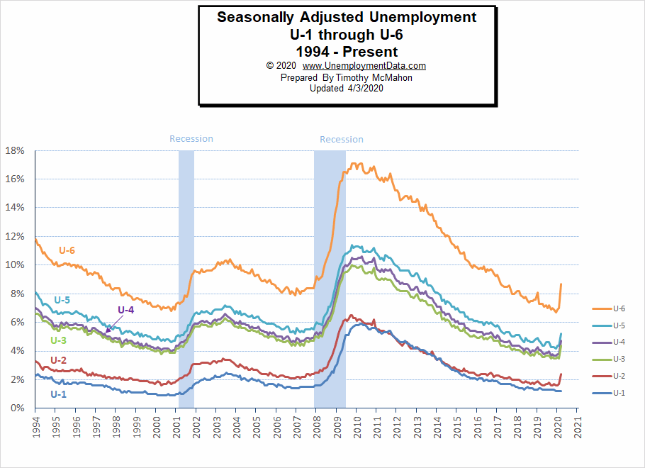
As we can see from the above chart all the various measurements of Seasonally Adjusted Unemployment from U-1 through U-6 spiked up sharply except U1 which measures unemployment over 15 weeks. We would expect to see that spike up as time goes on. For more information about the various measurements of unemployment see What Is U-6 Unemployment?
Employed Part-Time for Economic Reasons
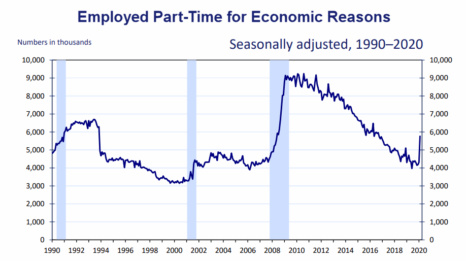
As you would expect, the unemployment rate for those who were reduced from full-time to part-time because of the crisis spiked sharply.
Source: Bureau of Labor Statistics
Duration of Unemployment
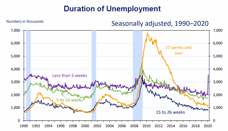
As we can see short term-unemployment spiked up even though the longer-term unemployment was still on a good trend. Depending on how long the crisis lasts we would expect longer-term unemployment to follow but hopefully once the crisis is over companies will be able to rehire their lost employees and things will quickly return to low pre-crisis levels.
Long-Term Unemployed
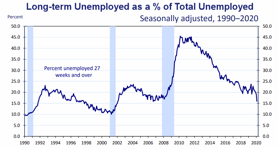 This chart is interesting simply because it is falling sharply. Normally, as this chart falls it is good meaning that people can find jobs quickly and don’t spend a long time unemployed. But this time, as the number of short-term unemployed spiked, it drove the percentage of long-term unemployed down sharply i.e. everyone was unemployed for a short time.
Data Source: BLS Labor Productivity
Reasons for Unemployment
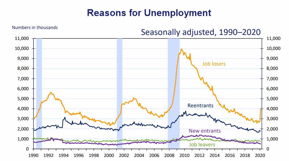 Here we can see the spike in unemployment is strictly due to people losing jobs, not new entrants or reentrants.
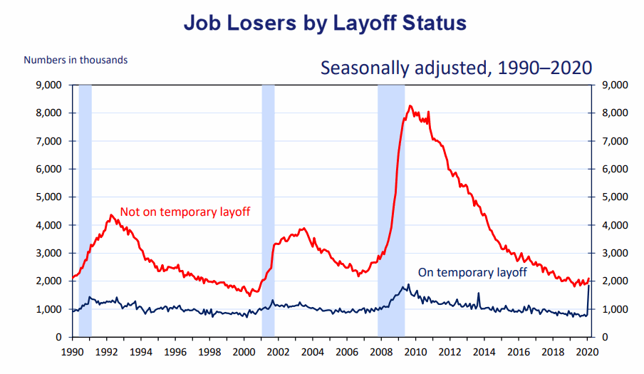
We can also see that at this point their status is temporary i.e. their companies are planning on rehiring them. Which is a good sign.
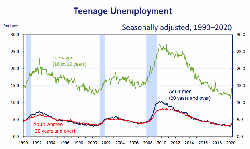 Teenage Unemployment which is always higher than Adult Unemployment spiked more sharply than for adults as well.
Previous Record Low Unemployment (Seasonally Adjusted U-3)
If we consider anything 4% or below as “low” we have had a few “low” stretches as we can see in the table below.
(4% or below in Green)
| Jan | Feb | Mar | Apr | May | Jun | Jul | Aug | Sep | Oct | Nov | Dec | |
| 1950 | 6.5% | 6.4% | 6.3% | 5.8% | 5.5% | 5.4% | 5.0% | 4.5% | 4.4% | 4.2% | 4.2% | 4.3% |
| 1951 | 3.7% | 3.4% | 3.4% | 3.1% | 3.0% | 3.2% | 3.1% | 3.1% | 3.3% | 3.5% | 3.5% | 3.1% |
| 1952 | 3.2% | 3.1% | 2.9% | 2.9% | 3.0% | 3.0% | 3.2% | 3.4% | 3.1% | 3.0% | 2.8% | 2.7% |
| 1953 | 2.9% | 2.6% | 2.6% | 2.7% | 2.5% | 2.5% | 2.6% | 2.7% | 2.9% | 3.1% | 3.5% | 4.5% |
| 1954 | 4.9% | 5.2% | 5.7% | 5.9% | 5.9% | 5.6% | 5.8% | 6.0% | 6.1% | 5.7% | 5.3% | 5.0% |
| 1955 | 4.9% | 4.7% | 4.6% | 4.7% | 4.3% | 4.2% | 4.0% | 4.2% | 4.1% | 4.3% | 4.2% | 4.2% |
| 1956 | 4.0% | 3.9% | 4.2% | 4.0% | 4.3% | 4.3% | 4.4% | 4.1% | 3.9% | 3.9% | 4.3% | 4.2% |
| 1957 | 4.2% | 3.9% | 3.7% | 3.9% | 4.1% | 4.3% | 4.2% | 4.1% | 4.4% | 4.5% | 5.1% | 5.2% |
| 1958 | 5.8% | 6.4% | 6.7% | 7.4% | 7.4% | 7.3% | 7.5% | 7.4% | 7.1% | 6.7% | 6.2% | 6.2% |
| … | … | … | … | … | … | … | … | … | … | … | … | … |
| 1965 | 4.9% | 5.1% | 4.7% | 4.8% | 4.6% | 4.6% | 4.4% | 4.4% | 4.3% | 4.2% | 4.1% | 4.0% |
| 1966 | 4.0% | 3.8% | 3.8% | 3.8% | 3.9% | 3.8% | 3.8% | 3.8% | 3.7% | 3.7% | 3.6% | 3.8% |
| 1967 | 3.9% | 3.8% | 3.8% | 3.8% | 3.8% | 3.9% | 3.8% | 3.8% | 3.8% | 4.0% | 3.9% | 3.8% |
| 1968 | 3.7% | 3.8% | 3.7% | 3.5% | 3.5% | 3.7% | 3.7% | 3.5% | 3.4% | 3.4% | 3.4% | 3.4% |
| 1969 | 3.4% | 3.4% | 3.4% | 3.4% | 3.4% | 3.5% | 3.5% | 3.5% | 3.7% | 3.7% | 3.5% | 3.5% |
| 1970 | 3.9% | 4.2% | 4.4% | 4.6% | 4.8% | 4.9% | 5.0% | 5.1% | 5.4% | 5.5% | 5.9% | 6.1% |
| … | … | … | … | … | … | … | … | … | … | … | … | … |
| 1999 | 4.3% | 4.4% | 4.2% | 4.3% | 4.2% | 4.3% | 4.3% | 4.2% | 4.2% | 4.1% | 4.1% | 4.0% |
| 2000 | 4.0% | 4.1% | 4.0% | 3.8% | 4.0% | 4.0% | 4.0% | 4.1% | 3.9% | 3.9% | 3.9% | 3.9% |
| 2001 | 4.2% | 4.2% | 4.3% | 4.4% | 4.3% | 4.5% | 4.6% | 4.9% | 5.0% | 5.3% | 5.5% | 5.7% |
| … | … | … | … | … | … | … | … | … | … | … | … | … |
| 2018 | 4.1% | 4.1% | 4.1% | 3.9% | 3.8% | 4.0% | 3.9% | 3.9% | 3.7% | 3.7% | 3.7% | 3.9% |
| 2019 | 4.0% | 3.8% | 3.8% | 3.6% | 3.6% | 3.7% | 3.7% | 3.7% | 3.5% | 3.6% | 3.5% | 3.5% |
| 2020 | 3.6% | 3.5% | 4.4% |
Employment
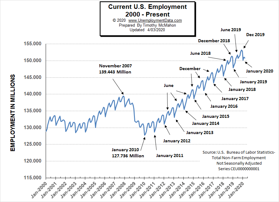
Historically employment is closely tied to recessions and that is no accident. One of the primary factors in calculating whether the economy is officially in a recession is an increase in the unemployment rate. The chart below provides the Historical Employment Data overlaid on blue bars showing periods of official recessions.
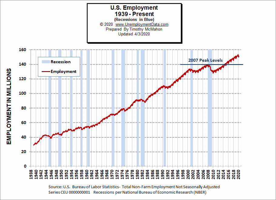
See Historical Employment Data for more info.
Current Employment
From the above current employment chart, we can see that the low point for each year occurs in January and then a small peak occurs around June with a slight drop around July and then the highest peak in employment happens in November/December. But the drop in March was unexpected.
See Current Employment for more info.
Labor Force Participation Rate
The Labor Force Participation Rate for March 2020 fell sharply breaking the slight upward trend that had been in place since October 2015.
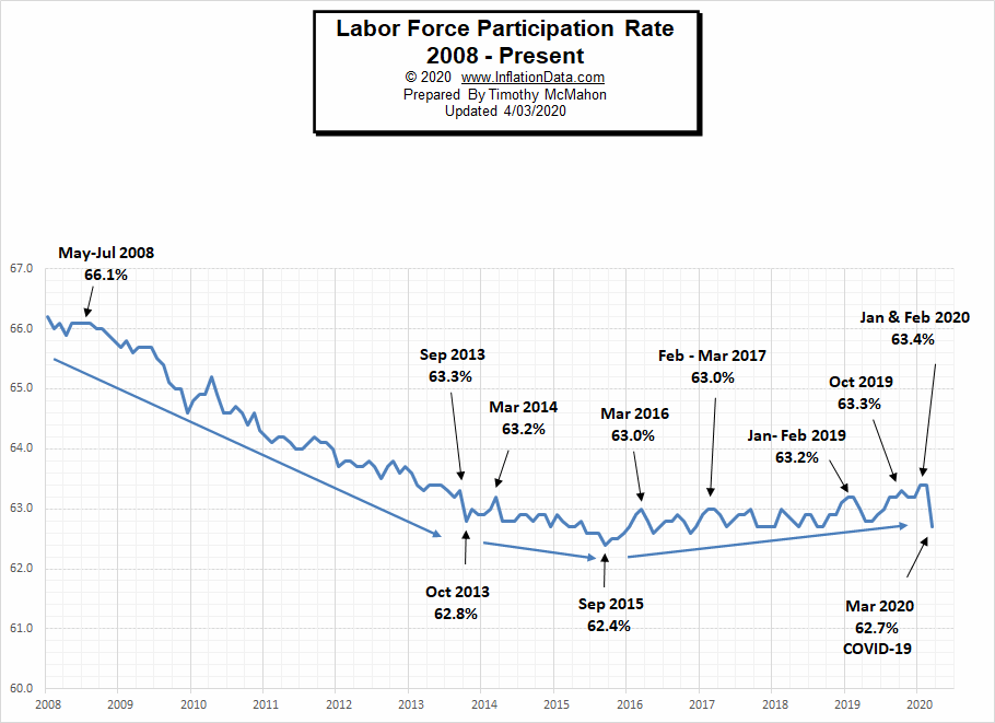
See Labor Force Participation Rate for more information.
If you would like to receive this monthly report and other article updates click here you can unsubscribe at any time.
Here are some articles you might enjoy in case you missed them:
Read more on UnemploymentData.com.
- Essential Jobs That Are in High Demand During Emergencies
- Dealing With Temporary Disability After a Workplace Injury
- 8 Reasons Why You Should Pursue Higher Education (Now!)
- Benefits of Working with a Staffing Agency
- 5 Jobs Every Company Needs and How You Can Get One
From InflationData.com
- What is the Federal Funds Rate?
- Will the $2 Trillion Covid-19 Stimulus Cause Inflation?
- Does the FED Control Mortgage Rates?
- 5 Reasons to Invest In Gold
- Imports, Exports, and Exchange Rates
- February Inflation Falls to 2.33%
- How the Economy Works
- What Impact Does Interest Rates and Inflation Targets Have on Stocks?
From Financial Trend Forecaster
- Saudi Arabia’s Oil Price War Is Backfiring
- Electricity Rates by State
- Oil Is Now More Volatile Than Bitcoin
- Financial Real Estate Trends Investors Should Understand for 2020
- Gold is Still King of the Investing Market
- Stocks: Is the Worst Over or is there Worse Yet to Come?
- Junk Bonds: 2 “Golden” Junctures
- Is the Buying Opportunity Here Yet?
- Did the Oil Crash Wreck the Stock Market?
- Repeating Patterns = Profit Potential
From OptioMoney.com
- Learning to Trade from Video Tutorials
- How Saxo Bank Democratizes Trading and Investment
- Five Business Tips to Help Your Company Thrive
- Have Minimal Car Insurance? What to Do in Case of an Accident
- How to Choose a Residential Roofing Contractor
From Your Family Finances