
![]()
On Friday November 3rd the U.S. Bureau of Labor Statistics (BLS) released their monthly employment survey results for the month of October.
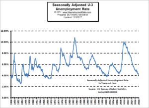
According to the BLS, the current “Seasonally Adjusted” Unemployment Rate for October is 4.1% DOWN from 4.2% in September and 4.4% in August. Seasonally Adjusted U-3 unemployment was 4.8% in January and 4.9% a year ago (October 2016).
The current “Unadjusted” rate is 3.9% down from 4.1% in September and 4.5% in August. Unadjusted U-3 was 5.1% in January and 4.7% a year ago (October 2016).
See: Current Unemployment Rate Chart for more info.
Seasonal adjustment provides something like a moving average leveling out the bumps due to normal seasonal variations. See: Unadjusted vs. Seasonally Adjusted Unemployment Rate for more information about Seasonal Adjustment.
According to the BLS Commissioner’s report for this month:
“In October, nonfarm payroll employment rose by 261,000, after changing little in September. The unemployment rate edged down to 4.1 percent in October. Employment rose sharply in food services and drinking places, mostly offsetting a decline in September that largely reflected the impact of Hurricanes Irma and Harvey. Job gains also occurred over the month in professional and business services, manufacturing, and health care. “
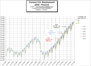 The commissioner is talking about “Seasonally Adjusted Employment” after they corrected for late arriving data the non-adjusted numbers show September Employment at 146,964,000 and 148,006,000 in October which is actually an increase of 1,042,000 jobs (yes over 1 million jobs) rather than only 261,000.
See: Current Employment Commentary for more info.
Labor Force Participation Rate (LFPR)
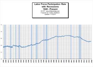 This month we had a bit of an “October Surprise” as theLabor Force Participation Rate fell drastically in spite of the fact that employment was up by so much. The LFPR is the percentage of the total population that is in the Labor Force. So in order for the LFPR to fall from 63.1% in September to 62.7% in October something must have happened to get a bunch of people to leave the labor force. The Civilian Non-Institutional Population (a rather narrow measure of the population) is 255,766,000 and 0.4% of that is 1,023,000. So why would over a million people leave the labor force when jobs are plentiful and over a million new jobs were created? Could it be seasonal? Well, last year the LFPR fell in October but only from 62.9% to 62.8%. If anyone has any ideas why this year would be so much higher please leave a comment below.
See Labor Force Participation Rate for more info.
Employment By Sectors
The following Bubble Chart from the Bureau of Labor Statistics shows employment gains and losses by sector. Sectors to the right of the vertical line gained jobs while those to the left lost jobs.
From the chart we can see that the only major loser was Retail Trade which lost -8,300 Jobs. Leisure and Hospitality regained 106,000 low paying jobs (of the 111,000 they lost in September) due to the hurricanes. Education and Health services gained +41,000 average paying jobs, Professional and Business Services (+50,000), Manufacturing (+24,000), Construction (+11,000), Financial Services (+5,000), and Wholesale (+5,700) all gained higher than average paying jobs. While information, Mining and Logging and Utilities all remained relatively stable with losses of -1,000, –2,000 and 0.0 respectively. The average weekly salary for all jobs was $912.63 in October.
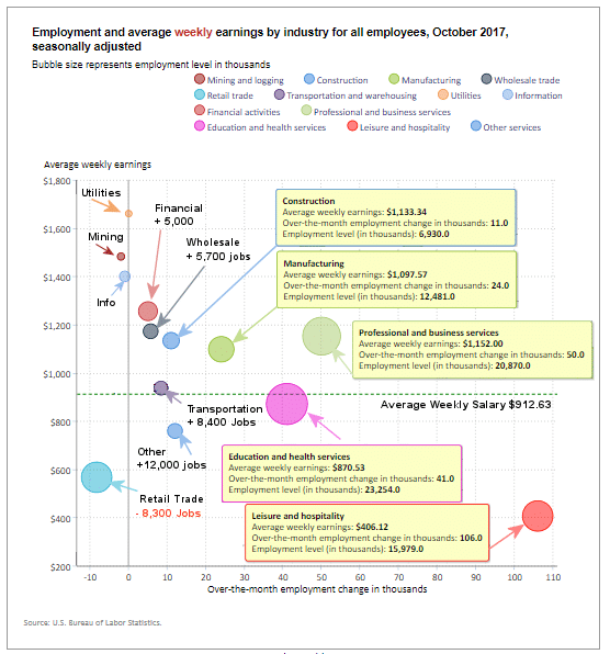
How to read this chart:
Bubbles location on the chart tell us two things:
Average Weekly earnings.
The further to the right the bubble the larger the increase in the number of jobs. The higher up on the chart the larger the average salary.
The dotted horizontal line tells us the average weekly salary of all categories.
The solid vertical “Zero” line tells us that bubbles to the left of this line actually lost jobs this month, while bubbles to the right gained jobs.
Employment and Average Weekly Earnings by Industry for All Employees,
October 2017, Seasonally Adjusted
| Industry | Monthly Change
in Employment |
Average Weekly
Earnings |
Employment
Level |
|---|---|---|---|
|
Total Private |
252,000 | $912.63 | 124,649,000 |
|
Mining and Logging |
-2,000 | $1,482.22 | 717,000 |
|
Construction |
11,000 | $1,133.34 | 6,930,000 |
|
Manufacturing |
24,000 | $1,097.57 | 12,481,000 |
|
Wholesale Trade |
5,700 | $1,172.22 | 5,944,200 |
|
Retail Trade |
-8,300 | $566.68 | 15,815,200 |
|
Transportation and Warehousing |
8,400 | $936.32 | 5,120,900 |
|
Utilities |
0.0 | $1,660.26 | 553,200 |
|
Information |
-1,000 | $1,399.58 | 2,716,000 |
|
Financial Activities |
5,000 | $1,255.52 | 8,483,000 |
|
Professional and Business Services |
50,000 | $1,152.00 | 20,870,000 |
|
Education and Health Services |
41,000 | $870.53 | 23,254,000 |
|
Leisure and Hospitality |
106,000 | $406.12 | 15,979,000 |
|
Other Services |
12,000 | $758.90 | 5,785,000 |
You might also like:
- Unemployment Rate Chart – The seasonally adjusted unemployment rate from 1948 to the present is one of the most watched statistics. Where is it now and should you trust it?
- U-6 Unemployment Rate– U-6 is the broadest measure of unemployment and includes all classes of Unemployed plus those ”marginally attached” and/or part-time for economic reasons.
- Current Employment Data – How many jobs are there actually? This chart shows Employment since Jan 2000 and what the current trend is.
- Historical Employment Data Chart– How Many People Are Actually Employed? This chart shows the actual employment rate without all the mumbo jumbo. It gives a clear picture of the employment level in the United States from 1939 to the Present. When employment is rising the economy is growing. When the employment rate levels off or declines times are not so good. Take a look and see how employment rates correspond to recessions over time.
- Labor Force Participation Rate