
Highlights from the Bureau of Labor Statistics (BLS) employment / unemployment report for March released on April 2nd.
![]()
- Unadjusted U-3 was Down from 6.6% to 6.2%
- Adjusted U-3 was Down from 6.2% to 6.0%
- Unadjusted U-6 was Down from 11.6% to 10.9%
- Labor Force Participation rose from 61.4% to 61.5%
- Unadjusted Employment rose from 142.077 million to 143.400 million
According to the Commissioner of the U.S. Bureau of Labor Statistics:
“Nonfarm payroll employment rose by 916,000 in March, and the unemployment rate edged down to 6.0 percent. These improvements in the labor market reflect the continued resumption of economic activity that had been curtailed due to the coronavirus (COVID-19) pandemic. Job growth was widespread, led by gains in leisure and hospitality, public and private education, and construction.”
Of course, they are talking about “Seasonally Adjusted Jobs” from the “Current Population Survey (CPS)” rather than looking at the results reported by actual companies in their “Current Employment Statistics survey (CES)”
But looking at the CES report we see…
Originally the BLS reported 141.926 million jobs for February, this month they adjusted that to 142.077.
So currently they are saying 142.077 for February and 143.400 for March.
which is actually an increase of 1,323,000 jobs based on their original estimates.
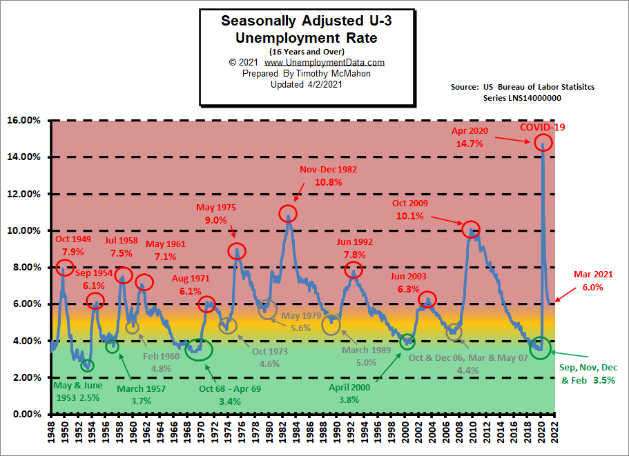
Unemployment Enters “Yellow Zone”
As we can see from the chart below when unemployment gets into the “red zone” things are really bad. But historically “Bad” for the U-3 usually starts at around 7% and stops at around 10% with only two previous occasions getting into the 10% range. But this time, due to COVID shutdowns, the U.S. economy went from really good (green zone) to really bad virtually overnight. The yellow zone is the normal operating range and it runs from about 4% to 6% and when unemployment stays in this range the economy is generally doing OK. Below 4% and the economy is doing great and above 7% and the economy is in for trouble. Currently, the U-3 unemployment rate has fallen from the horrendous 14.7% of April down to the normally bad 6.0%. We have to remember that the PEAKS in 1954, 1971, and 2003 were at 6.3% and that was the worst it got. The September 1954 and August 1971 peaks were at 6.1% so although current levels are slightly better than that, they were they still aren’t good.
Employment by Sector
The employment “bubble chart” shows how each sector of the economy is doing (employment-wise on a seasonally adjusted basis).
Typically January is the worst month with retailers and hospitality reducing seasonal staff. In January Leisure and Hospitality lost -61,000 jobs. As things begin to reopen, February saw Leisure and Hospitality GAIN a massive 355,000 jobs. In March it gained another 280,000 jobs on a seasonally adjusted basis.
Average weekly wages fell from $1,048.60 in January to $1,038.35 in February but rose to $1045.60 in March.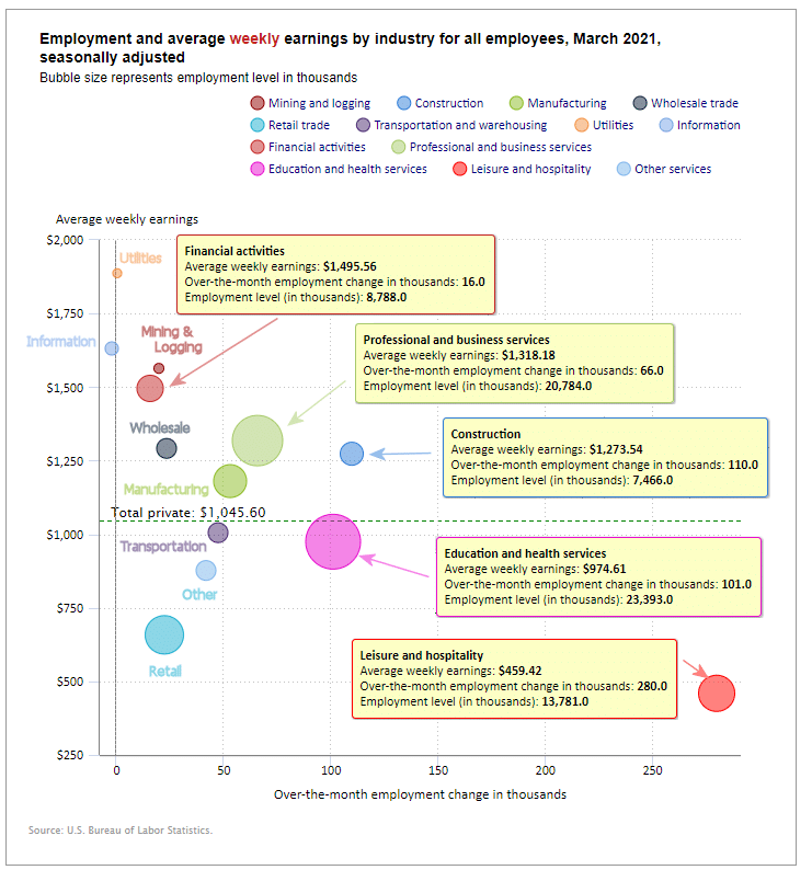
(See the table below for details.)
How to read this chart:
The bubbles location on the chart tell us two things:
- Change in Employment Levels over the most recent month.
- Average Weekly earnings.
- The further to the right the bubble the larger the increase in the number of jobs.
- The higher up on the chart the larger the average salary.
Bubble Size tells us:
- Total Employment for the sector.
- Larger bubbles mean more people are employed in that sector.
Employment and Average Weekly Earnings by Industry
March 2021, Seasonally Adjusted
| Industry | Monthly Increase | Average Weekly Earnings | Employment Level |
| Total Private Employment | 780,000 | $1,045.60 | 122,507,000 |
| Mining and Logging | 20,000 | $1,563.62 | 610,000 |
| Construction | 110,000 | $1,273.54 | 7,466,000 |
| Manufacturing | 53,000 | $1,180.58 | 12,284,000 |
| Wholesale trade | 23,700 | $1,291.68 | 5,661,300 |
| Retail trade | 22,500 | $658.28 | 15,228,800 |
| Transportation and Warehousing | 47,500 | $1005.26 | 5,757,000 |
| Utilities | 300 | $1,887.05 | 539,600 |
| Information | -200 | $1,631.22 | 2,673,000 |
| Financial Activities | 16,000 | $1,495.56 | 8,788,000 |
| Professional and Business Services | 66,000 | $1,318.18 | 20,784,000 |
| Education and Health Services | 101,000 | $974.61 | 23,393,000 |
| Leisure and Hospitality | 280,000 | $459.42 | 13,781,000 |
| Other Services | 42,000 | $876.85 | 5,541,000 |
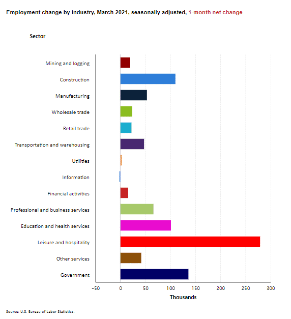
Another way to look at these monthly numbers. This one includes a decrease in government jobs and shows the magnitude of the gain in Leisure and Hospitality jobs.
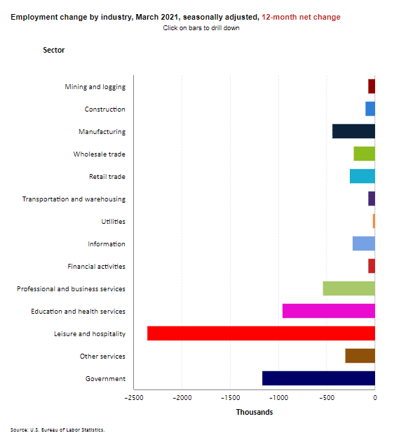
 Looking at the same information on an ANNUAL basis, we can see how bad the hit Leisure and Hospitality took, even with the massive recent gains. Once we get past March 2021 however, this chart will be less useful since we will no longer be comparing post-COVID numbers to pre-COVID numbers. In February this chart showed Leisure and Hospitality at almost -3,500 (thousand) so the current -2,352 (thousand) is a vast improvement. Note however that every industry is still below year-ago levels.
Source: BLS
U1 through U6 Unemployment Rates
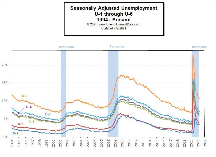
Due to COVID, all the various measurements of Seasonally Adjusted Unemployment from U-1 through U-6 spiked up sharply beginning in April 2020 except U1 which measures unemployment longer than 15 weeks. In July, they began falling rapidly. In November they only fell slightly due to renewed restrictions by several states. And in December they were basically flat. In January most of the measurements fell slightly on a seasonally adjusted basis even though they rose on a nominal basis. Interestingly, in the chart below we see that in recent months, U1 has gradually increased while the others have continued to fall.
For more information about the various measurements of unemployment see What Is U-6 Unemployment?
Current Employment
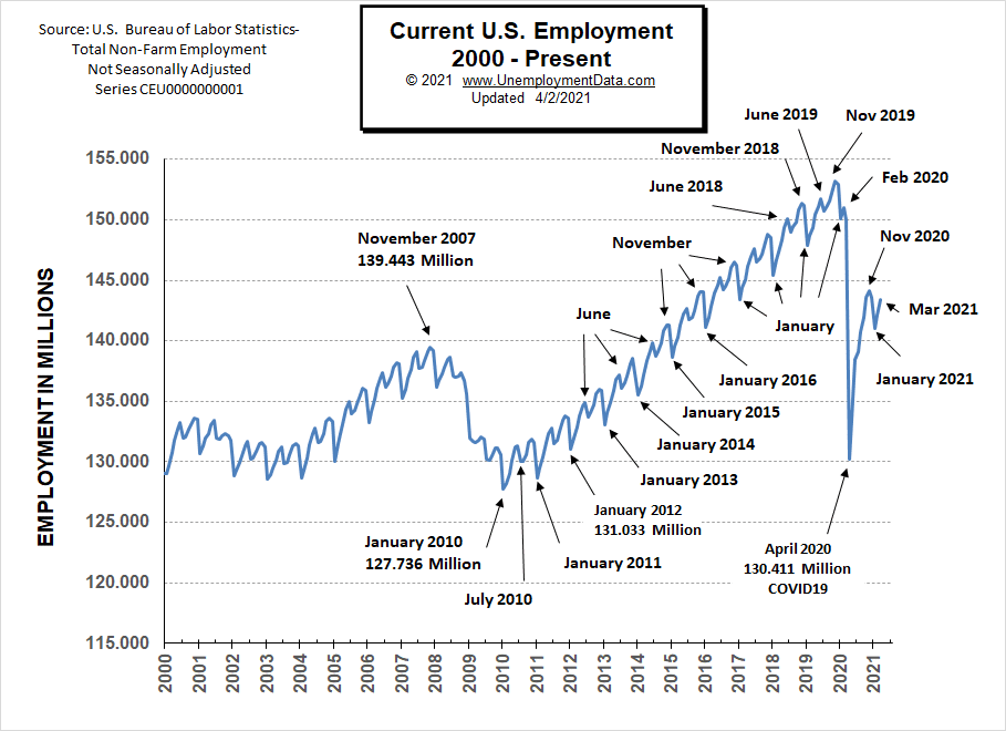
Typically the low point for each year occurs in January and then it moves almost straight up to a small peak around June with a slight drop around July and then the highest peak in employment happens in November with a slight decline in December. As expected January employment dropped sharply (perhaps a bit more sharply than typical). But as expected February and March saw the typical rebound.
Last year the COVID virus shortcircuited the normal trend with a drop that began in March and by April it had wiped out all the employment gains since July 2010. June 2020 saw employment rebound to approximately the January 2015 level. Fortunately, July did not follow the traditional falling pattern but instead rose (although only slightly). August’s employment rose to roughly the January 2016 level. September employment rose roughly triple the rate at which it rose in 2019. October’s employment rose to slightly above the January 2017 level. In December we got the traditional slight decline. And in March we have returned to the January 2017 level for employment but the Civilian Noninstitutional Population has increased by 6.9 million since then.
See Current Employment for more info.
Previous Record Low Unemployment (Seasonally Adjusted U-3)
If we consider anything 4% or below as “low” we have had a few “low” stretches as we can see in the table below.
(4% or below in Green)
| Jan | Feb | Mar | Apr | May | Jun | Jul | Aug | Sep | Oct | Nov | Dec | |
| 1950 | 6.5% | 6.4% | 6.3% | 5.8% | 5.5% | 5.4% | 5.0% | 4.5% | 4.4% | 4.2% | 4.2% | 4.3% |
| 1951 | 3.7% | 3.4% | 3.4% | 3.1% | 3.0% | 3.2% | 3.1% | 3.1% | 3.3% | 3.5% | 3.5% | 3.1% |
| 1952 | 3.2% | 3.1% | 2.9% | 2.9% | 3.0% | 3.0% | 3.2% | 3.4% | 3.1% | 3.0% | 2.8% | 2.7% |
| 1953 | 2.9% | 2.6% | 2.6% | 2.7% | 2.5% | 2.5% | 2.6% | 2.7% | 2.9% | 3.1% | 3.5% | 4.5% |
| 1954 | 4.9% | 5.2% | 5.7% | 5.9% | 5.9% | 5.6% | 5.8% | 6.0% | 6.1% | 5.7% | 5.3% | 5.0% |
| 1955 | 4.9% | 4.7% | 4.6% | 4.7% | 4.3% | 4.2% | 4.0% | 4.2% | 4.1% | 4.3% | 4.2% | 4.2% |
| 1956 | 4.0% | 3.9% | 4.2% | 4.0% | 4.3% | 4.3% | 4.4% | 4.1% | 3.9% | 3.9% | 4.3% | 4.2% |
| 1957 | 4.2% | 3.9% | 3.7% | 3.9% | 4.1% | 4.3% | 4.2% | 4.1% | 4.4% | 4.5% | 5.1% | 5.2% |
| 1958 | 5.8% | 6.4% | 6.7% | 7.4% | 7.4% | 7.3% | 7.5% | 7.4% | 7.1% | 6.7% | 6.2% | 6.2% |
| … | … | … | … | … | … | … | … | … | … | … | … | … |
| 1965 | 4.9% | 5.1% | 4.7% | 4.8% | 4.6% | 4.6% | 4.4% | 4.4% | 4.3% | 4.2% | 4.1% | 4.0% |
| 1966 | 4.0% | 3.8% | 3.8% | 3.8% | 3.9% | 3.8% | 3.8% | 3.8% | 3.7% | 3.7% | 3.6% | 3.8% |
| 1967 | 3.9% | 3.8% | 3.8% | 3.8% | 3.8% | 3.9% | 3.8% | 3.8% | 3.8% | 4.0% | 3.9% | 3.8% |
| 1968 | 3.7% | 3.8% | 3.7% | 3.5% | 3.5% | 3.7% | 3.7% | 3.5% | 3.4% | 3.4% | 3.4% | 3.4% |
| 1969 | 3.4% | 3.4% | 3.4% | 3.4% | 3.4% | 3.5% | 3.5% | 3.5% | 3.7% | 3.7% | 3.5% | 3.5% |
| 1970 | 3.9% | 4.2% | 4.4% | 4.6% | 4.8% | 4.9% | 5.0% | 5.1% | 5.4% | 5.5% | 5.9% | 6.1% |
| … | … | … | … | … | … | … | … | … | … | … | … | … |
| 1999 | 4.3% | 4.4% | 4.2% | 4.3% | 4.2% | 4.3% | 4.3% | 4.2% | 4.2% | 4.1% | 4.1% | 4.0% |
| 2000 | 4.0% | 4.1% | 4.0% | 3.8% | 4.0% | 4.0% | 4.0% | 4.1% | 3.9% | 3.9% | 3.9% | 3.9% |
| 2001 | 4.2% | 4.2% | 4.3% | 4.4% | 4.3% | 4.5% | 4.6% | 4.9% | 5.0% | 5.3% | 5.5% | 5.7% |
| … | … | … | … | … | … | … | … | … | … | … | … | … |
| 2018 | 4.1% | 4.1% | 4.1% | 3.9% | 3.8% | 4.0% | 3.9% | 3.9% | 3.7% | 3.7% | 3.7% | 3.9% |
| 2019 | 4.0% | 3.8% | 3.8% | 3.6% | 3.6% | 3.7% | 3.7% | 3.7% | 3.5% | 3.6% | 3.5% | 3.5% |
| 2020 | 3.6% | 3.5% | 4.4% | 14.7% | 13.3% | 11.1% | 10.2% | 8.4% | 7.9% | 6.9% | 6.7% | 6.7% |
| 2021 | 6.3% | 6.2% | 6.0% |
Historical Employment
Historically employment is closely tied to recessions because one of the primary determining factors of whether the economy is officially in a recession is an increase in the unemployment rate. The chart below provides the Historical Employment Data overlaid on blue bars showing periods of official recessions. In April, the number of people employed fell below the 2007 peak, near the lows of the 2008-2010 crash. In August it rebounded back above the 2007 peak level. According to the National Bureau of Economic Research (NBER) we have officially been in a recession since February. Since they measure a recession beginning from the peak, that just means the economy was no longer growing, which is pretty obvious due to the virus.
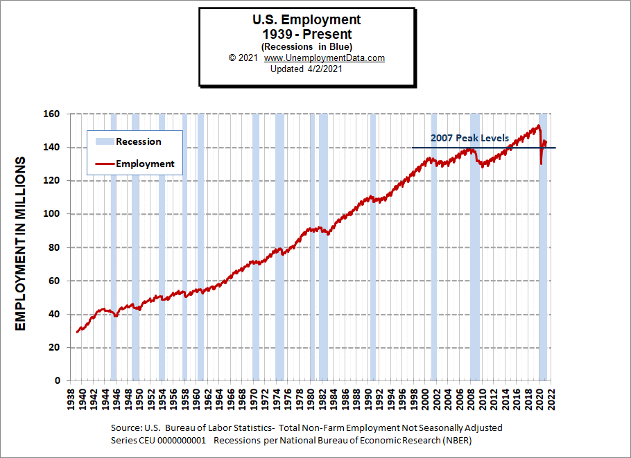
See Historical Employment Data for more info.
Current Seasonally Adjusted Unemployment
See Current Employment Commentary for more info.
Unemployment by Education
Although other metrics fell, unemployment among the less educated rose in February to 10.1% from 9.1% in January but in March it fell sharply to 8.2% This is still down from the peak of 21.2% in April 2020, after bottoming at 4.8% in September 2019.
Typically those with a Bachelor’s degree are relatively immune to unemployment. Although during the 2008 recession college grads’ unemployment rose to slightly above 4%.
Those with a Bachelor’s degree or higher had a low of 1.9% unemployment in February 2019 and rose to 8.4% in April 2020. Unemployment fell to 3.8% in December but rose back to 4% in January and returned to 3.8% in February and 3.7% in March.
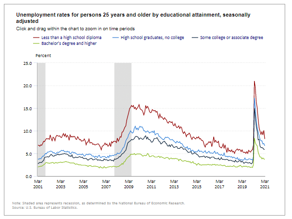
Source: Bureau of Labor Statistics
Reasons for Unemployment – Layoff Status
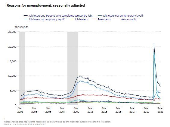 Most categories were down slightly from last month after falling sharply in previous months. New entrants and Job leavers remain very low. Those on temporary layoffs continue to fall.
Source: BLS
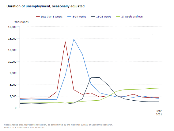
Duration of Unemployment
The troubling feature of this chart is the extension of the light green long-term unemployment line.
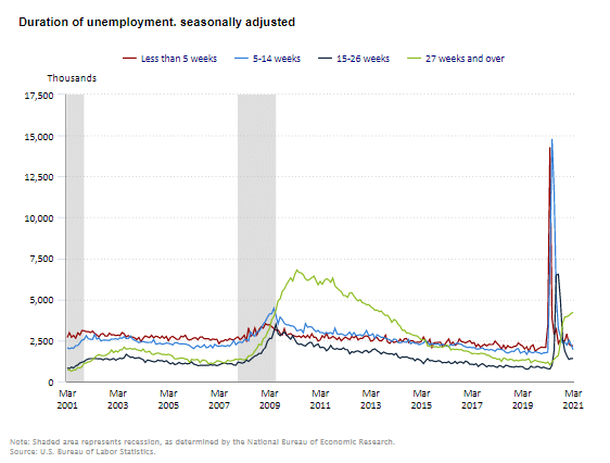
Taking a closer look at the chart just over the last couple of years we see long term unemployment is not falling.
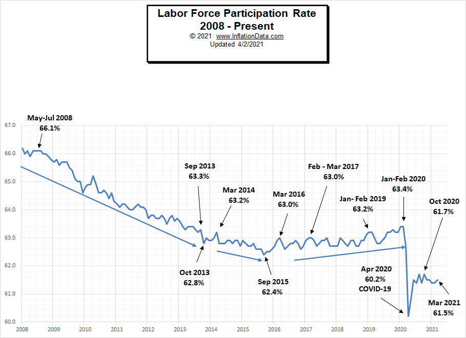
Labor Force Participation Rate
Even though Unemployment was in record low territory for quite some time, it wasn’t until January and February 2020, that the LFPR was finally able to claw its way back to 63.4%, its highest level since 2013.
Then COVID decimated all those gains dropping the LFPR down to 60.2% in April. In May it began to rebound and in June the LFPR was able to bounce back a little more to 61.5%, it fell slightly in July but this was probably due to people returning to the labor force rather than other factors. Over the last few months, the LFPR has bounced around between 61.4% and 61.7%. In January it fell again to 61.4% where it remained for February.
See Labor Force Participation Rate for more information.
If you would like to receive this monthly report and other article updates click here you can unsubscribe at any time.
Here are some articles you might enjoy in case you missed them:
Read more on UnemploymentData.com.
- Fleet Management 101: What Does It Take to Do It Well?
- 6 Tips to Help You in a Successful Job Interview
- February Employment Shows Improvement in Leisure and Hospitality
- Start a Career in Financial Risk Management
- Things to Consider When Opening Your Restaurant
From InflationData.com
- February Inflation Increases 20% over January
- January Inflation Setting Stage for Big Run Up
- Price and Wage Changes since 2000
- Why Hasn’t the U.S. Dollar Experienced Hyperinflation?
- Using Risk to Combat Inflation
From Financial Trend Forecaster
- Ripple the Cryptocurrency of Banks
- The Future of U.S. Energy Independence
- Top Financial Trends Shaping Banking
- The Death Of U.S. Shale Has Been Greatly Exaggerated
- China Ramps Up U.S. Crude Oil Imports
From Elliott Wave University
- Should Stock Markets Fear Inflation or Deflation?
- A Global “Debt Mountain”: Beware of This “New Peak”
- Bitcoin: Let’s Put 2 Heart-Pounding Price Drops into Perspective
- Spotting the Slide in Silver
From OptioMoney.com
- Downsizing to Pay Off a Mortgage – Is it a Good Idea?
- Teach Your Kids to Budget Money Effectively
- Top 7 Most Affordable U.S. Cities to Live In
- A Beginner’s Guide to Investing: 4 Major Dos & Don’ts
- Smart Finance Moves: Questions to Ask Yourself Before You Buy a New Car
From Your Family Finances