
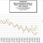
 The U.S. Bureau of Labor Statistics (BLS) released its monthly report on Friday April 4th for the month of March. In it the adjusted U-3 unemployment rate and the unadjusted U-3 were very similar at 6.7% and 6.8% respectively. In an effort to provide unbiased data, Gallup poll’s conduct a similar survey also on a monthly basis, but the Gallup numbers don’t always agree with the government numbers. See our BLS vs Gallup comparison chart to see how well the two rates compare. See BLS vs Gallup unemployment comparison.
| Adjusted | Unadjusted | |
| BLS | 6.7% | 6.8% |
| Gallup | 7.4% | 7.5% |
| Difference | 0.7% | 0.7% |
Current U.S. Unemployment Rate
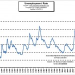 According to the commissioner of the Bureau of Labor Statistics, “Total non-farm payroll employment rose by 192,000 in March, and the unemployment rate was unchanged at 6.7 percent.” According to the BLS the key areas of growth were, “in professional and business services, in health care, and in mining and logging.” He also said, “The number of long-term unemployed (those jobless for 27 weeks or more), at 3.7 million, changed little in March” and “The rates for teenagers (20.9 percent), whites (5.8 percent), blacks (12.4 percent), and Hispanics (7.9 percent) showed little or no change.” Unfortunately although the report was viewed positively the BLS also indicated that the number of individuals who were working part time because their hours had been cut back or because they were unable to find full-time work were “little changed at 7.4 million in March.” Read more…
March Employment Changes
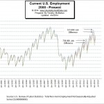 The Bureau of Labor Statistics reported that “Job growth averaged 183,000 per month over the prior 12 months… Professional and business services added 57,000 jobs in March” with “temporary help services” accounting for over half of the professional and business services growth (29,000/57,000). Computer and systems design services accounted for another 6,000 jobs.
The health care sector added another 19,000 jobs, mining and logging accounted for 7,000 jobs with food services accounting for an additional 30,000 jobs and construction employment added another 19,000 jobs. So of the 183,000 jobs added how many were minimum wage? Temporary help? Food Services? and at least a portion of the construction, mining and logging workers. Read more …
Current Employment vs Unemployment Chart
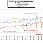 When comparing employment to unemployment we chart the inverse of the unemployment rate to the employment rate to see how well they correlate. In order to keep up with the population growth, the number of jobs has to increase just to keep the unemployment rate the same. So, actually employment has to increase sharper than the population growth in order to make the unemployment rate decrease.
This month it looks like the disagreement that we have been noting for months is starting to correct as we see employment rising while unemployment is flat. In this case, a cynical person might say that the BLS is trying to make up for previous fudging and get the unemployment numbers back on track. Read more …
Employment Levels During Recessions
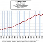 In this chart we look at employment levels during periods of official recession and see that in the most recent recession beginning in 2008 employment fell sharply and still has not reached pre-recession levels even though the population has grown by over 2 million people a year in the 5+ years since the recession began. Read more …
The Misery Index
The misery index is a combination of both inflation and unemployment to determine how miserable life for the average citizen is. It was originally developed in the 1960’s and has been used as a political football in a variety of presidential elections since. Misery Index chart is published by InflationData and includes the inflation rate, unemployment rate, misery index number, president and political party. See: InflationData’s Misery Index.
See Also:
- Historical Unemployment Rates in Table form from 1948 – Current
- What is U-6 Unemployment?
- How does the seasonally adjusted unemployment rate compare to the unadjusted rate?
- Is the Government fudging the Unemployment numbers?
- Current U-6 Unemployment numbers
- What is the real unemployment rate?
