• About WordPress
    • WordPress.org
    • Documentation
    • Learn WordPress
    • Support
    • Feedback
  • Log In
  • Skip to primary navigation
  • Skip to main content
  • Skip to primary sidebar
  • Home
  • Contact us
  • Related Sites
    • InflationData.com
    • Financial Trend Forecaster
    • Your Family Finances
    • Elliott Wave University
    • Optio Money
  • About
    • Terms of Use
    • Disclaimer & Disclosure
    • Privacy Statement
  • Sitemap
    • 2009-2010 Posts
    • 2011 Posts

UnemploymentData.com

Your Source for Employment and Unemployment Data

Unemployment
  • Charts
    • Current Unemployment Rate Chart
    • Current Employment Rate (Chart and Data)
    • Current Employment vs Unemployment Chart
    • Historical Employment Data
    • Employment Population Ratio
    • Misery Index
  • Unemployment
    • Historical Unemployment Rate Tables
    • What Is U-6 Unemployment?
    • Unadjusted vs. Seasonally Adjusted U-3 Unemployment Rate
    • BLS vs. Gallup Unemployment Numbers
    • Current U-6 Unemployment Rate
    • What is the Labor Force Participation Rate?
    • What is the Real Unemployment Rate?
  • Employment
    • Current Employment Rate (Chart and Data)
    • Historical Employment Data
    • Contacting a Live Person at the State Employment Commission
      • How to Talk to a Live Person at the Virginia Unemployment Commission
      • Florida’s FLUID Unemployment Program
    • Benefits
      • Insurance
      • Retirement
    • Careers
    • Employment Costs
    • Experience
    • Government
    • Job Hunting
      • Interview
      • Resume
  • Find Articles
  • Education
    • Skills
  • General
    • Small Business
      • Outsourcing
    • Success
You are here: Home / Archives for Featured

Featured

Have Wages Kept Up With Inflation?

September 23, 2024 by Tim McMahon

One of the most important questions regarding your income is whether your wages have kept up with inflation.  You might be getting nice yearly raises, but if inflation is growing faster, you are still falling behind. So, in order for your purchasing power to increase or at least stay the same it is important to look at Inflation-Adjusted wages.

If you ask your neighbors, they will almost certainly say that the average wage hasn’t kept up with inflation. And since “bad news sells” even the media tends to try to convince us that the average wage hasn’t kept up with inflation. But what do the actual numbers say?

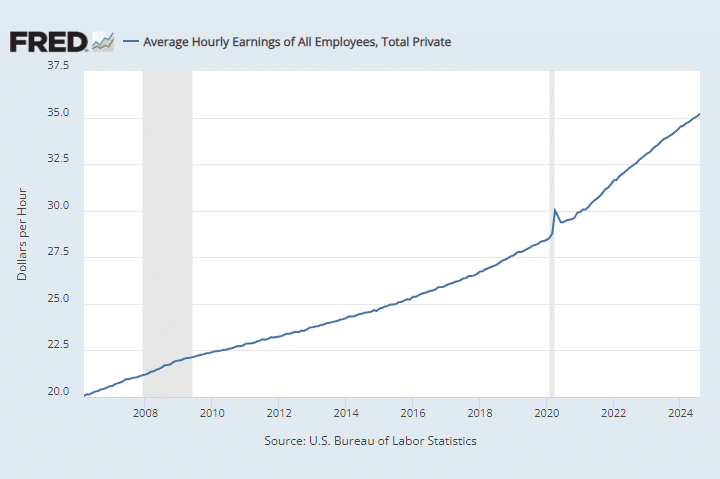
If we look at the numbers presented by the Federal Reserve CES0500000003 index (Average Hourly Earnings of All Employees) we get the following chart. And it looks pretty good, wages are going up fairly steadily. But is inflation going up faster? We really can’t tell.

Average Hourly Wages

Inflation-Adjusted Hourly Wages

So to get the true picture we have to adjust it by the Consumer Price Index (CPI-U) and then we get the following chart: [Read more…] about Have Wages Kept Up With Inflation?

Filed Under: Featured, Wages Tagged With: Hourly Wages, Inflation, Inflation Adjusted Wages, Wages

Unemployment and Employment Charts

January 1, 2019 by Tim McMahon

  • Unemployment Rate Chart – The seasonally adjusted unemployment rate from 1948 to the present is one of the most watched statistics. Where is it now and should you trust it?
  • Current U-6 Unemployment Rate– Many people consider the U-6 the “real” unemployment rate. See where it is now.
  • Current Employment Data – How many jobs are there actually? This chart shows Employment since Jan 2000 and what the current trend is.
  • Historical Employment Data Chart– How Many People Are Actually Employed? This chart shows the actual employment rate without all the mumbo-jumbo. It gives a clear picture of  the employment level in the United States from 1939 to the Present. When employment is rising the economy is growing. When the employment rate levels off or declines times are not so good. Take a look and see how employment rates correspond to recessions over time.
  • Current Employment vs Unemployment Chart When looking at employment vs. unemployment you would think that they are two sides of the same coin but the U.S. Bureau of Labor Statistics (BLS) actually uses two entirely different surveys to calculate them. Looking at both on the same chart we can see some strange anomalies.
  • Misery Index– Created by economist Arthur Okun to help gauge the level of misery the average person is suffering. It is a combination of the inflation rate and the unemployment rate.
  • Unadjusted vs. Seasonally Adjusted Unemployment Rate– Often it appears that the Seasonally Adjusted numbers are going one way, while the unadjusted numbers are going in the opposite direction. Here is how it looks in chart form.
  • Seasonally Adjusted Unemployment Rate in Table form– If you want to see the actual numbers.
  • Is the Government Fudging Unemployment Numbers? Now there is an alternative measurement. We can also see a discrepancy in the Government’s own numbers by looking at the Employment vs. UnEmployment rate.
  • U-6 is the broadest measure of unemployment and includes all classes of Unemployed plus those ”marginally attached” and/or part-time for economic reasons. See What is the U-6 Unemployment Rate? for more details of all the “U” classifications.
  • What is the “Real” Unemployment Rate? Many economists believe that the popularly quoted Unemployment Rate understates the real unemployment rate because it fails to include workers who would like to work but have given up looking because they don’t think there are any jobs available for them.
  • What is the Labor Force Participation Rate? You might think that the Labor Force Participation Rate [LFPR] would mean the percentage of the population that is working but it doesn’t mean that at all. According to the Bureau of Labor Statistics the “Labor Force” is made up of both employed and unemployed people.  Unemployed people are defined as those who are actively looking for work. Once you stop looking (i.e discouraged workers) you are no longer in the official labor force.


Filed Under: Featured, Unemployment Tagged With: employment rate, employment rate chart, unemployment, unemployment rate, unemployment rate chart

Primary Sidebar

Search Site

Sponsored:

URGENT: These Stocks Stand Poised to Benefit from President Trump's Trade Wars!

As the Trump administration moves ahead with aggressive tariff policies on key imports, the mainstream media is scrambling.

This Free Report - which you can download now - reveals the names and ticker symbols of 5 Stock Poised to Benefit Most from President Trump's Tariff Wars.

Click Here to Download Your FREE Stock Report Now.

Recent Posts

  • April 2025 Employment / Unemployment Report
  • Would More Jobs Help Social Security?
  • March 2025- Employment / Unemployment Report
  • February 2025 Jobs Report
  • January 2025 BLS Employment Report

Resources

  • Bureau of Labor Statistics Current Population Survey Monthly survey of households conducted by the Bureau of Census for BLS. It provides data on the labor force, employment, unemployment, etc.
  • Capital Professional Services Providing web design and development and Internet marketing services
  • Elliott Wave University Using the Elliott Wave Principle to improve investment performance
  • Financial Trend Forecaster Featuring Moore Inflation Predictor, NYSE Rate of Change and NASDAQ Rate of change
  • InflationData.com Inflation calculators, databases, etc.
  • Intergalactic Web Designers Web design and development services
  • Your Family Finances

Articles by Category

Articles by Date

Disclaimer

At UnemploymentData.com we are not registered investment advisors and do not provide any individualized advice. Past performance is not necessarily indicative of future performance and future accuracy and profitable results cannot be guaranteed.

Privacy & Terms of Use

Privacy Statement & Terms of Use

Do Not Sell My Information

Copyright © 2025 · News Pro on Capital Professional Services, LLC. All rights reserved · Log in