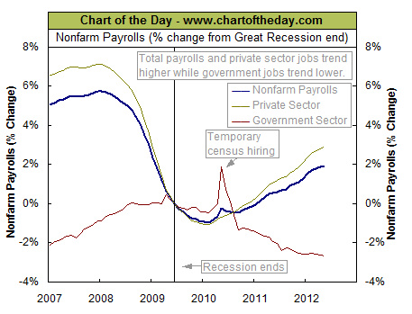
Non-farm Payrolls
The latest jobs report came out on June 1st with the U.S. Department of Labor reporting that non-farm payrolls (jobs) increased by 69,000 in May (seasonally adjusted). See Current Employment Data for the unadjusted non-farm payroll data.

This chart illustrates, the overall job market (blue line) continues to trend higher albeit at a pace that has slowed over the past several months. Today’s chart also illustrates that the government job market has been trending significantly lower since the first half of 2009 (with the exception of temporary census hiring in mid-2010). This decline is due to federal, state and local governments attempting to realign their budgets following an unexpected decline in revenues as a result of the historic plunge in housing prices (i.e. property taxes, capital gains, etc.) and nonfarm payrolls (i.e. income taxes, payroll taxes, etc.).
One of the major tennents of Keynesian economics is that during a recession as the private sector is shrinking the public sector should increase and provide jobs and run deficits. But the side of Keynesian economics that most politicians forget is that the public sector is supposed to shrink and budgets are supposed to be balanced and debts repaid during good economic times.

