According to the BLS Commissioner’s report for this month:
“The unemployment rate changed little over the month but, at 4.4 percent, matched the pre-recession low reached in 2007. The number of unemployed persons, at 7.1 million, also changed little in April.“
Today’s Bureau of Labor Statistics (BLS) Commissioner’s Report says, “Nonfarm payroll employment increased by 211,000 in April, and the unemployment rate, at 4.4 percent, was little changed. Thus far this year, monthly job gains have averaged 185,000, in line with average monthly job growth in 2016. In April, job gains occurred in leisure and hospitality, health care and social assistance, financial activities, and mining.”
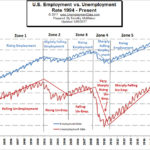
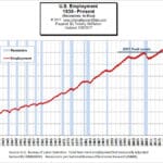
But we have to remember that typically employment increases in April. So what the BLS Commissioner is saying is that 211,000 more jobs than average were created. In layman’s terms, unadjusted employment was 144.953 million in March and 145.979 in April for a net gain of 1,026,000 jobs.
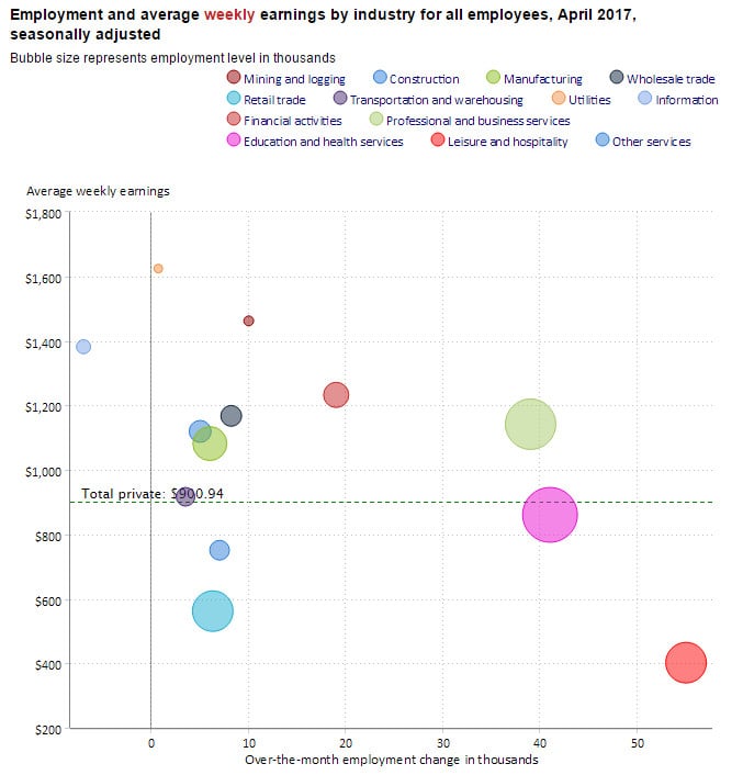
Employment Growth Bubbles
In the above chart we see the various sectors of employment. The size of the bubble represents the size of the sector so the large pink bubble represents the education and health services sector. The further to the right the bubble is the more jobs that sector gained over the month (on the bottom scale). So the pink education and health bubble gained just over 40,000 jobs over the month. If we look at the left hand scale we can see that this sector has a slightly below average weekly salary. Fortunately, we also see lots of sectors above the dotted average salary line that gained jobs as well, such as the large light green bubble representing Professional and Business Services. The average salary was $1,142/wk. and it gained 39,000 jobs over the month.
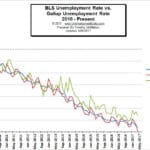
BLS vs. Gallup Unemployment Numbers
| BLS Numbers | April | March |
| Seasonally Adjusted U-3 | 4.4% | 4.5% |
| Unadjusted U-3 | 4.1% | 4.6% |
| Unadjusted U-6 | 8.1% | 8.9% |
| Gallup Numbers | ||
| Unadjusted U-3 | 5.4% | 5.7% |
| Unadjusted U-6 | 14.0% | 13.7% |
What U-6 Minus U-3 Tells Us
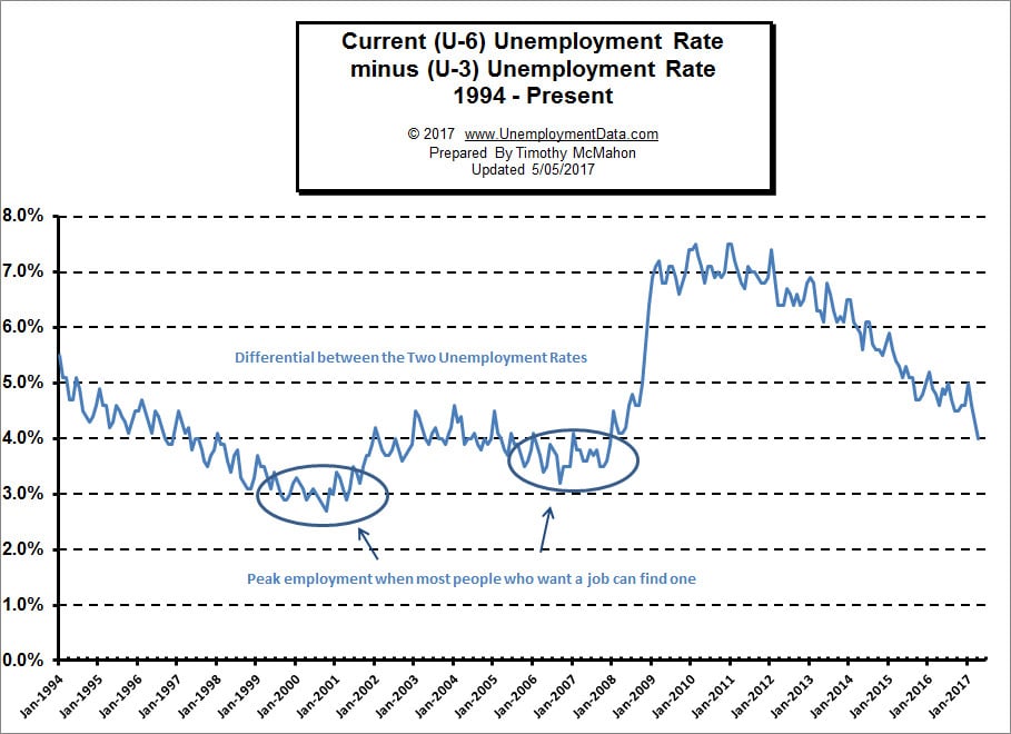
The following chart is the difference between U6 and U3. This is calculated simply by taking U6 minus U3. When it is low the economy is nearing full employment i.e. when everyone who really wants a job can find one. Historically, full-employment has been considered to be when unemployment was in the upper 3% range. Why not 0%? Even when employers are having difficulty finding employees some people are unemployed simply because they quit their job knowing it would be easy to find another (hopefully better) job.
This month we saw a massive drop in the differential between U-3 and U-6 so perhaps we are getting closer to “full employment” we we are still a full 1% away from the lows on this chart. In the chart above we have subtracted the U3 unemployment rate from the U6 unemployment rate and so we see the differential. When the differential is low it is easier to find a job (i.e. everyone who wants one can find one). Recently, commentators have been claiming that we are approaching “full employment” i.e. when everyone who wants a job can find one but this chart indicates that although we’ve seen a significant drop to a 4% differential between the U-6 and unadjusted U-3 we still have another 1% to go before we reach the levels of 2000 and 2006.
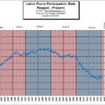
Another “fly in the ointment” is the Labor Force Participation Rate (LFPR) just because the current unemployment looks like it is low doesn’t mean that the actual situation is similar to that of 2000 or even 2006. The final reason that we may not be entering full employment is because the numbers are just plain wrong. According to Gallup (the survey people) the real unadjusted U-3 is 5.4% not the 4.1% that the BLS says and the real U-6 is 14.0% not 8.1%. 5.4% unemployment is nowhere near full employment and 14% U-6 is still horrendous. Add to that another 4% due to LFPR and we’re still looking at 18% unemployment.
Read the Full Article Here: Why the U.S. Isn’t at “Full Employment” Yet
Seasonally Adjusted Unemployment Rate Chart 1948-Present
See: Current Unemployment Rate Chart here.
 |
Current Employment Commentary |
 |
|
 |
Historical Employment with Recessions |
 |
BLS vs Gallup Unemployment Numbers |
 |
Labor Force Participation Rate |

