
The U.S. Bureau of Labor Statistics (BLS) released the unemployment rate information for the month of April. The typically quoted “Seasonally Adjusted U-3” rate fell from 6.7% in March to 6.3% in April. The unadjusted U-3 was even lower at 5.9%. The broadest measure of unemployment which includes those who “would like” and are able to work, but have not looked for work recently and also includes part-time workers who want to work full-time is U-6 and the BLS determined that that rate is 11.8% down from 12.8% in March.
 The BLS numbers continue to be much rosier than their counterparts determined by Gallup Polls. According to Gallup the adjusted U-3 is 7.5% (compared to BLS’ 6.3%), the unadjusted U-3 is 7.1% (vs 5.9%) and U-6 is still a whopping 16.6% (not 11.8%).
In addition according to Gallup the U.S. Payroll to Population employment rate (P2P), which is the percentage of the adult population that is working full-time for an employer was 43.4% in April up slightly from 42.7% in March. The average P2P for 2012 was 44.4% and for 2013 was 43.8% so we have not even reached those levels yet after declining sharply in January indicating that this has been a very anemic recovery in spite of the unprecedented level of quantitative easing.
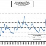
The U-3 Current US Unemployment Rate Chart shows the full picture of unemployment rates since 1948.
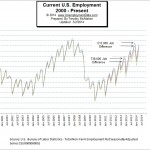 The number of people employed during April climbed to 138.288 million from 137.136 million in March almost reaching December levels. At 130,000 less than the 138.266 million that were employed in December it would appear that things are improving, but during that time the total population of the U.S. (according to the U.S. Census bureau) has increased from 317,346,096 to 317,968,667 for a net gain of approximately 622,500. See U.S. Employment Chart and commentary.
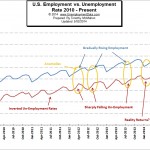
To get a better picture of the current employment situation you can compare the employment level vs. the unemployment rate.

In this chart we can see the historical employment figures from 1939 through the present. But in addition to the number of jobs we can also see the recessions shaded blue.
 In recent months the unemployment numbers published by the BLS have shown a massive divergence from those of the independent Gallup Polls. From the beginning it appeared that the BLS was slightly under-reporting unemployment but recently the BLS numbers have become laughable. Out of 51 data pairs the Gallup number was higher 35 times, while the BLS number was higher only 15 times and only once were the results the same. But not only do the Gallup numbers come out higher more often, the amount of difference is higher as well. The BLS numbers come out roughly 0.273% below the Gallup numbers on average. But on four recent occasions the difference has been more than quadruple the average with the BLS underestimating Unemployment by 1.4%, 1.6%, 1.6% and 1.2% respectively. See BLS vs Gallup Unemployment numbers for more information.
 The misery index combines two simple factors in an effort to show the condition of the average person. The two key factors are inflation and unemployment. Rapidly rising prices (faster than wages) will cause households to have difficulty affording the basic necessities while high unemployment will leave many households without any income at all. Fortunately during the recent recession the advent of two income families mitigated the pain somewhat since in most cases only one or the other member lost their job.