Employment vs Unemployment-

The first survey is called the “Current Population Survey” or (CPS) and it is used for calculating the Unemployment rate. The second survey, formerly called Current Employment Statistics, is now the Current Establishment Survey (CES). It is used to calculate the employment (jobs) data.
Current Population Survey (CPS) vs. Current Establishment Survey (CES)
For Calculating Unemployment, the BLS chooses 60,000 different households statistically calculated to represent the entire country. Every month Census Bureau employees interview one quarter (about 15,000) of these households, and then using statistical modeling, they estimate the U.S. unemployment rate from this data sample. The households in the pool are rotated to limit the burden on any specific family. In addition to questions about employment status, the CPS tracks work experience, annual earnings, whether school-aged children are working, school enrollment, etc.
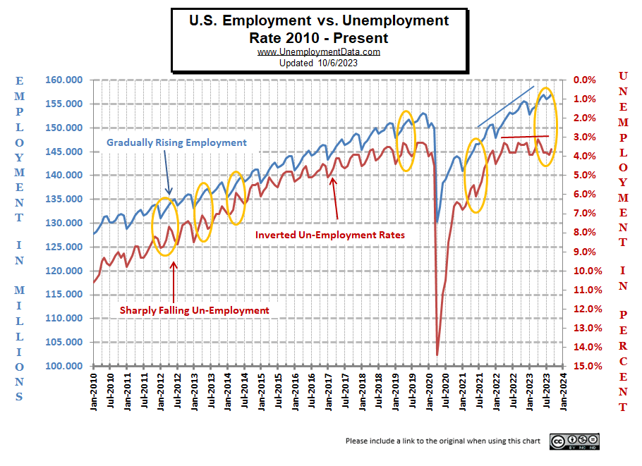
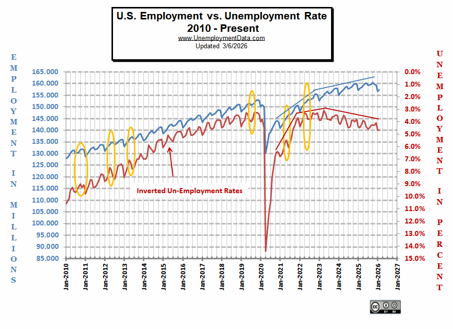
In May and June 2018, we saw one such anomaly. Employment was up, but so was Unemployment. In July, we saw them return to normal.
In March 2020, we saw the effects of the COVID-19 shutdown, and interestingly, employment fell slightly, but unemployment moved much more sharply.
Beginning in 2023, we note a whole new type of divergence. Although employment continued to trend higher, unemployment began rising as well (red line falling).
RE: Full Employment
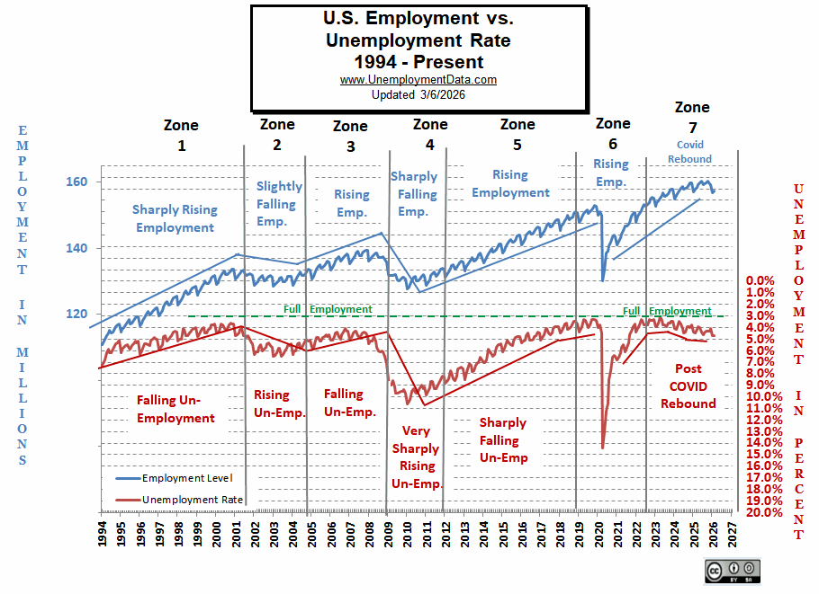
In the following chart, we see the longer-term view, and we can see that in zone 5, the employment rate rose steadily from 2011 through 2019. But as unemployment fell toward 3% (i.e., Full employment), the unemployment rate began to level off. Economists don’t agree on where exactly “full employment” is, but it appears to be around 3% unemployment. At that point, jobs are plentiful, so employees often quit, knowing it will be easy to find a better job. Others are short-term contractors between jobs, etc. this is called “Frictional Unemployment“.
Zone 7 – Since January 2023, we have seen a gradual decline in the chart (i.e., rising unemployment) as unemployment rises and moves away from the full employment line.
If the unemployment rate stays constant, but more people are working, where are these extra workers coming from?
Somehow, the workforce has to be growing to accommodate these newly created jobs. They could be long-term unemployed (no longer counted in the workforce), returning to the workforce, they could be immigrants entering the workforce, or possibly retired people returning to the workforce.
Full employment is not considered to be at zero percent because even when employers are having difficulty finding employees, some people are still unemployed due to either structural unemployment (mismatch between worker skills and job requirements, i.e., not enough training) or simply because they quit their job knowing it would be easy to find another (hopefully better) job. Often referred to as frictional unemployment (there will always be people who have quit or have lost a seasonal job and are in the process of getting a new job). See: Highly Skilled Worker Shortage in a Recession?
Zone 1 – Sharply Rising Employment vs. Falling Unemployment
Looking at the data in zone 1, we can see a correlation that makes sense. As the employment rate rises sharply from about 115 million in 1994 to about 130 million in 2000, the unemployment rate falls from around 7% to about 3.5% (see right-hand scale). If we look at the slope of the lines, we can see that the slope of the employment line is steeper than the slope of the unemployment line.
This makes sense because as the population increases, it takes more jobs just to stay at the same unemployment level. According to the U.S. Census Bureau, in 1994, the population of the United States was 263,126,000. By the year 2000, the population of the U.S. was 282,172,000 or about 19 million more people.
So, assuming that roughly 50% of the additional 19 million people entered the labor force, there were an additional 15 million jobs. So that would be enough to cover the new workers while at the same time reducing the unemployment rate as well. In general terms, we can see that the increase in population counteracts some of the increasing employment.
Zone 2 – Slightly Falling Employment vs. Rising Unemployment
In the second zone, from 2000 through the middle of 2003, we see employment falling slightly from about 133 million down to about 130 million. During this same period, the population went from 282 million to about 290 million for a net increase of about 8 million people. So, during this time frame, the unemployment rate rose sharply even though there was only a modest decrease in the number of jobs available. Thus the increase in population makes a moderate decline in jobs worse.
Zone 3 – Rising Employment vs. Falling Unemployment
During the third time period, from mid-2003 through mid-2007, employment climbed again. This time from 130 million to 137 million. And once again, the population increased from 290 million to 298.5 million. Seven million more jobs and 8.5 million more people (remember, only about half of the people are in the workforce). So once again, unemployment fell from 6% to about 4%. This time the slope of the lines is virtually identical.
Zone 4 – Sharply Falling Employment vs. Very Sharply Rising Unemployment
In the fourth period, around mid-2006, we see unemployment bottoming, although employment continues higher through 2007. Employment peaks at 139.1 million in November of 2007, at which point the population is about 301.5 million. So from mid-2006 to mid-2007, employment rose by 1.8 million while the population rose by about 3 million . And so Unemployment went from 4% to about 5%. From mid-2007 through mid-2009, we see employment falling sharply from 138.8 million to 127.3 million in January 2010. At that point, the U.S. population was about 308 million. So there were 11.5 million on fewer jobs and 6.5 million more people, so unemployment skyrocketed to 10.5%.
Zone 5 – Gradually Rising Employment
Beginning in January 2010, with an Employment rate of 127.7 million by November of 2013, we had about 138 million jobs. For a net increase of roughly 10.3 million jobs. During that time, the U.S. population went from 308 million to 317.1 million, or an increase of 9.1 million. And the unadjusted unemployment went from 10.6% to 7.0%. From the chart, we can see that somehow, gradually rising employment combined with a rising population resulted in rapidly falling unemployment… it shouldn’t work that way…
Zone 6 – Rising Employment
Employment continued rising, but unemployment is falling slower due to peak employment, people reentering the labor force, frictional unemployment and structural unemployment. And then, COVID restrictions hit, and massive unemployment occurred.
Zone 7 – Rebounding Employment
After the COVID-induced employment crash, the employment situation took a couple of years to recover to previous levels. This despite the 6-plus million increase in population. One reason for the long delay was all the government incentives to stay out of the workforce. And once again, unemployment hit the full-employment barrier.
See Labor Force Participation Rate and Employment-Population Ratio for more information.
Changing the Parameters for Calculating Part-Time Employment
In our article entitled Unemployment, Part-time Workers and Obamacare, we explained how under the “Current Population Survey,” workers are considered full-time if they work more than 35 hours a week. But under the “National Compensation Survey,” the BLS says, “Employees are classified as full-time or part-time as defined by their employer.”
But as mentioned in the article Unintended Consequences of Well-Intended Policies, all governmental policies have unintended consequences, and with the thousands of pages of hastily written law in Obama Care, there are probably hundreds, if not thousands, of unintended consequences.
One such consequence is related to section 1513 sub-section 4 Paragraph A, which says, “The term full-time employee means, with respect to any month, an employee who is employed on average at least 30 hours of service per week.” So, Obamacare rewrote employment law and changed the definition from 35 hours a week, as defined by the BLS, to 30 hours a week, as defined by Obamacare.
So it is possible more people are working part-time and fewer are working full-time, but the same number of total hours are worked, which reminds me of the following quote:
This is actually quite a good analogy of what happens whenever the government gets involved. Because what would actually happen to the blanket would be that it would get shorter because of the new seam. And that is actually what happens in the economy as well. Due to the increased inefficiency, additional bureaucracy, and the government getting its “cut,” the real economy actually gets smaller with every new regulation.
See Also:


Leave a Reply