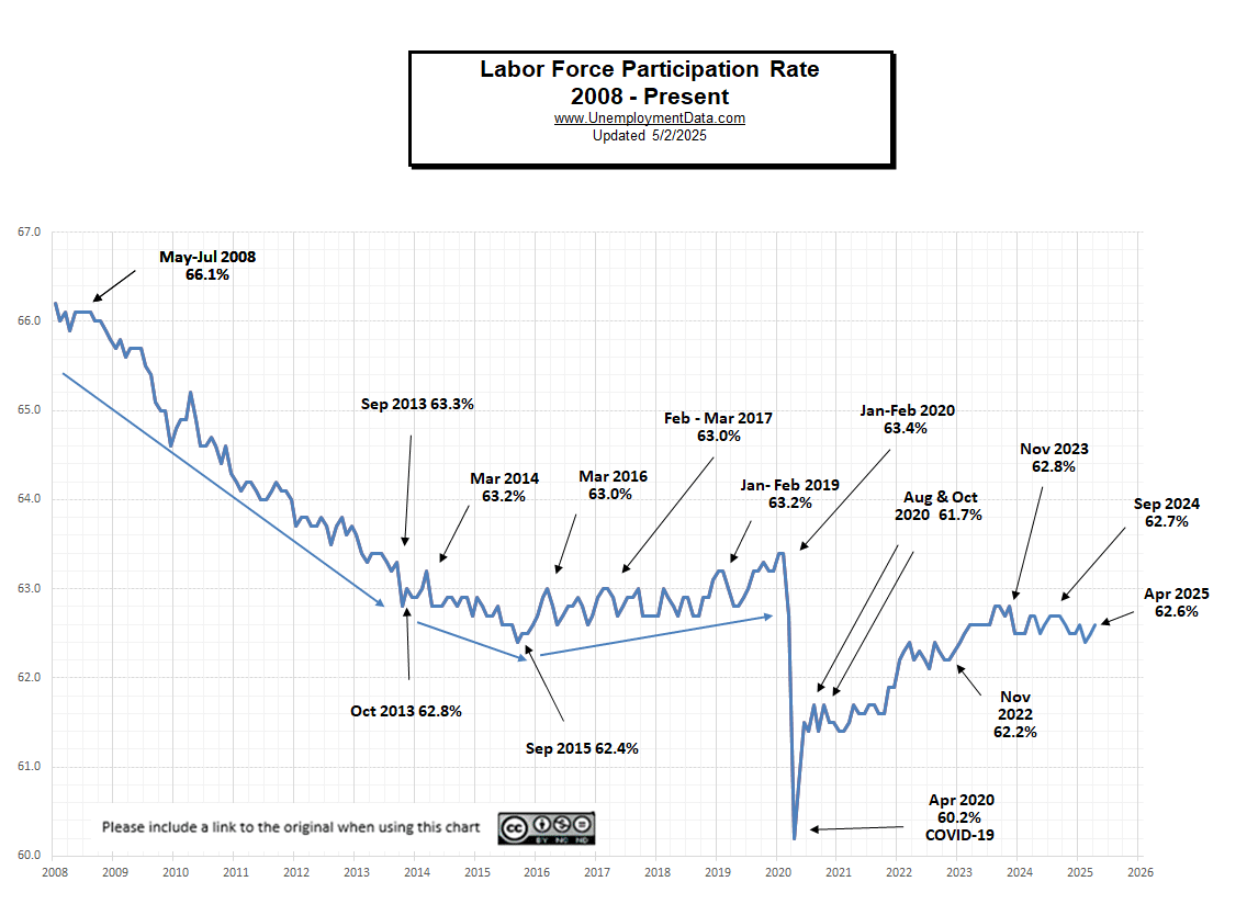
Current U.S. Labor Force Participation Rate for April was 62.6%.
What does the term Labor Force Participation Rate mean?
You might think that the Labor Force Participation Rate [LFPR] would mean the percentage of the population that is working. Unfortunately, a quick read of the definition presented by the BLS might reinforce that misconception. But it doesn’t mean that at all.
The BLS Glossary gives this definition:
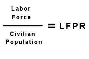
“Labor force participation rate- The labor force as a percent of the civilian noninstitutional population.”
But further research on the BLS site leads you to this expanded explanation:
- The labor force participation rate is the percentage of the [civilian noninstitutional] population that is either employed or unemployed (that is, either working or actively seeking work)
- People with jobs are employed.
- People who are jobless, looking for a job, and available for work are unemployed.
- The labor force is made up of the employed and the unemployed.
- People who are neither employed nor unemployed are not in the labor force.
How can you be neither employed nor unemployed? A rational person would think that you had to be one or the other. According to the BLS definition… long-term unemployed people are defined out of existence and therefore are neither employed nor unemployed. They are roughly 40% of the population not participating in the labor force.
So, in simple terms, the Labor Force Participation Rate is the percentage of the population working or “actively looking” for work.
But we must add a couple of big Caveats.
- By population, we don’t mean everyone, only those who aren’t in the military, in Jail, or other institutions. (This makes the percentage higher than if we looked at everyone).
- You haven’t become discouraged and stopped looking for a job (even though you might want one).
If you are long-term unemployed (and therefore not officially in the labor force) and you start looking for a job, two things happen to the statistics:
- The Unemployment Rate goes up because a newly unemployed person is added.
- The Labor Force Participation rate also increases because a new person was added to the labor force.
A higher Labor Force Participation Rate (LFPR) is considered better. If we look at the BLS’s seasonally adjusted Labor Force Participation Rate, we see that it fell drastically from 2009 through 2016. The LFPR fell in the aftermath of the 2008 recession and was starting to recover under Trump, but then COVID-19 hit and knocked it down sharply early in 2020. From there it rose through 2023 before starting to decline again.
Labor Force Participation 1989-Present
For the 20 years from 1989 to 2009, the LFPR held reasonably steady with around 66% of the population being in the workforce, but it is now below 63%. In September 2015, the Labor Force Participation Rate bottomed at 62.4% and then fell to 60.2% in 2020.
A falling LFPR indicates that an increasing percentage of the total population has stopped looking for a job… either voluntarily or involuntarily.

Although, today’s labor force participation rate is near that of the 1970’s it is not women who are disenfranchised but young people, the uneducated, and minorities.
Data Source: BLS Labor Force Participation Rate series LNS11300000
Calculating the Labor Force Participation Rate
According to the Bureau of Labor Statistics, the “Labor Force” is comprised of both employed and unemployed people. Unemployed people are defined as those who are actively looking for work. Once you stop looking (i.e., discouraged workers), you are no longer in the official labor force.

So if the Labor Force shrinks because people quit looking for a job, the LFPR falls. And because of the way that the unemployment rate is calculated:
- As the LFPR falls, it appears that the unemployment rate is falling
- Even though there are the same number of people who can’t find jobs (but are no longer “officially” unemployed since they stopped looking for a job).
Current Labor Force Participation Rate Table
Labor Force Participation Rate |
|||||||||
| 2017 | 2018 | 2019 | 2020 | 2021 | 2022 | 2023 | 2024 | 2025 | |
| January | 62.9% | 62.7% | 63.2% | 63.4% | 61.4% | 62.2% | 62.4% | 62.5% | 62.6% |
| February | 63.0% | 63.0% | 63.2% | 63.4% | 61.4% | 62.3% | 62.5% | 62.5% | 62.4% |
| March | 63.0% | 62.9% | 63.0% | 62.7% | 61.5% | 62.4% | 62.6% | 62.7% | 62.5% |
| April | 62.9% | 62.8% | 62.8% | 60.2% | 61.7% | 62.2% | 62.6% | 62.7% | 62.6% |
| May | 62.7% | 62.7% | 62.8% | 60.8% | 61.6% | 62.3% | 62.6% | 62.5% | |
| June | 62.8% | 62.9% | 62.9% | 61.5% | 61.6% | 62.2% | 62.6% | 62.6% | |
| July | 62.9% | 62.9% | 63.0% | 61.4% | 61.7% | 62.1% | 62.6% | 62.7% | |
| August | 62.9% | 62.7% | 63.2% | 61.7% | 61.7% | 62.4% | 62.8% | 62.7% | |
| September | 63.0% | 62.7% | 63.2% | 61.4% | 61.6% | 62.3% | 62.8% | 62.7% | |
| October | 62.7% | 62.9% | 63.3% | 61.7% | 61.6% | 62.2%* | 62.7% | 62.6% | |
| November | 62.7% | 62.9% | 63.2% | 61.5% | 61.9% | 62.2% | 62.8% | 62.5% | |
| December | 62.7% | 63.1% | 63.2% | 61.5% | 61.9% | 62.3% | 62.5% | 62.5% | |
Notes: (*Changed by BLS from 62.1%)
Labor Force Participation Rate vs. Recession
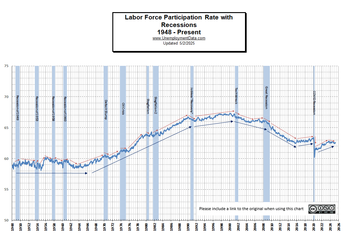
You might be wondering if recessions have any effect on the LFPR. It might make sense that the LFPR would fall during a recession. In the following chart, we can see both LFPR vs. Recessions. And the results were a bit surprising. The red arrows indicate short-term trends, and the blue arrows indicate longer-term trends. In this chart, we can also see the unprecedented nature of the decline beginning in 2008. Nowhere else on this chart since tracking began in 1948 do we see such a long sustained decline in the LFPR. We saw smaller and shorter declines but nothing of this magnitude. Looking at the red arrows we can see that some recessions had falling LFPRs while other recessions had rising LFPRs.

Labor Force Participation Rate by President 1948 – Present

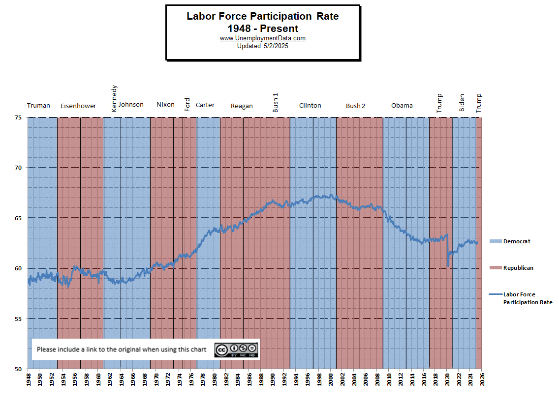
The LFPR remained at that level under Clinton and Bush 2 and then dove under Obama, where a falling LFPR masked a disastrous level of unemployment. In the second half of Obama’s second term, the LFPR started to level off and climbed slightly under Trump until COVID drove it down. Although today’s labor force participation rate is near that of the 1960s, it is not women who are currently disenfranchised but young people and minorities.
Tom Thomas, one of our readers, reminds us that if you want to compare U-3 numbers, you have to do it in light of the Labor Force Participation Rate (LFPR). He said,
“since U-3 only measures those who are actively looking for a job, if the labor force declines (i.e., lots of people stop looking), the U-3 rate will appear better than it actually is. So, to compare two time periods, you have to adjust for the LFPR.”
The U-3 Unemployment rate during the Bush administration averaged 5.2%, with an LFPR above 65%. And if you are thinking that the current decline in LFPR is a result of more seniors retiring early (it’s not), see Record Low LFPR, which shows the LFPR by age group since 1999. The most significant declines occur in the younger ages while those above age 60 show a higher percentage are working. For instance, in 1999, only 24% of those aged 65-69 were working, but 14 years later, 31% of those aged 65-69 were working. This is not good… it means that people of average retirement age cannot retire due to economic reasons.
Other reasons the LFPR could decline:
- More people are self-employed (self-employed individuals are not counted in the labor force).
- People retired (currently not the case according to employment statistics).
- If more people work “under the table” (i.e., unreported income).
- Illegal aliens are taking jobs (i.e., not reported as part of the workforce).
- People go on Welfare (not in the workforce).
- If more people work in the “gig economy,” they may not show up in the workforce.
So why has the unemployment rate fallen so much since 2010?
As people stop looking for jobs (discouraged workers), the Labor Force Participation Rate (LFPR) falls.
The Big Lie Perpetrated by a Falling LFPR
As the LFPR falls (bad), it appears that the unemployment rate is falling (good). So even though the ranks of the unemployed stay the same (or even grow), the numbers look like things are getting better. Conversely, as the LFPR rose under Reagan, the unemployment rate could remain the same or increase even though more people were working.
Employment-Population Ratio
The Employment-Population Ratio might better describe what many people think of when they hear the term “Labor Force Participation Rate”. This index shows the percentage of the entire population that is working. In many ways, it is a better index than the LFPR or the Unemployment rate. See Employment-Population Ratio for more info.
See also:
- Misery Index.
- Unemployment Rate Chart – The seasonally adjusted unemployment rate from 1948 to the present is one of the most-watched statistics. Where is it now, and should you trust it?
- U-6 Unemployment Rate– U-6 is the broadest measure of unemployment and includes all classes of Unemployed plus those” marginally attached” and/or part-time for economic reasons.
- Current Employment Data – How many jobs are there actually? This chart shows Employment since Jan 2000 and what the current trend is.
