
The Current U-6 Unadjusted Unemployment Rate
for May is 7.7%
Updated June 5, 2026
U-6 Unemployment–
 You would think that defining unemployment would be easy. If you don’t have a job, you are unemployed… right? But what about retired people? Or people who don’t want a job? What about people who would like a job, but have given up looking because they don’t think there are any jobs available? What about people who only work a couple of hours a week because their hours were cut, but would really rather work full-time? These considerations have caused the U.S. Bureau of Labor Statistics (BLS) to come up with six different measures of unemployment, classified as U1 through U6. U3 is the generally accepted and commonly quoted “Unemployment Rate”.
Data unavailable due to government shutdown.
Recent Unadjusted U-6 Unemployment Rates
| 2020 | 2021 | 2022 | 2023 | 2024 | 2025 | 2026 | |
| January | 7.7% | 12.0% | 7.9% | 7.4% | 8.0% | 8.2% | 8.8%** |
| February | 7.4% | 11.6% | 7.6% | 7.3% | 7.8% | 8.4% | 8.3% |
| March | 8.9% | 10.9% | 7.1% | 6.8% | 7.4% | 7.9% | 8.0% |
| April | 22.4%* | 9.9% | 7.6% | 6.1% | 6.9% | 7.3% | 7.7% |
| May | 20.7% | 9.7% | 6.7% | 6.4% | 7.1% | 7.4% | 7.7% |
| June | 18.3% | 10.1% | 7.0% | 7.2% | 7.7% | 8.1% | |
| July | 16.8% | 9.6% | 7.2% | 7.1% | 8.2% | 8.3% | |
| August | 14.3% | 8.9% | 7.0% | 7.2% | 8.0% | 8.2% | |
| September | 12.4% | 8.1% | 6.4% | 6.7% | 7.3% | 7.7% | |
| October | 11.6% | 7.7% | 6.3% | 6.8% | 7.3% | NA** | |
| November | 11.6% | 7.4% | 6.4% | 6.7% | 7.4% | 8.4% | |
| December | 11.6% | 7.2% | 6.4% | 7.0% | 7.4% | 8.2% |
*Coronavirus Shutdown
**January 2026 estimates were revised to incorporate updated population controls.
**Data unavailable due to government shutdown.
Jump to:
- The six classifications of unemployment
- Comparing U3 to U6
- Is U-6 “the Real Unemployment Rate”?
- The difference between U6 and U3
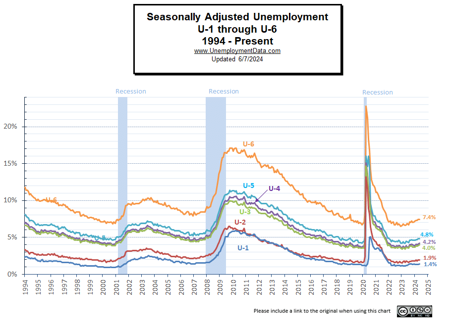
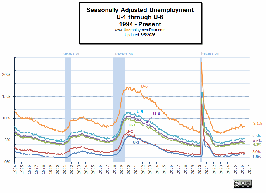
“U” Classifications of Unemployment U1 through U6
U-1 is the narrowest definition of unemployment, and U-6 is the broadest measure of unemployment. U-6 includes all classes of the Unemployed, even those considered “marginally attached” and/or part-time for economic reasons. In other words, those who would like a full-time job but can only find part-time work. Or perhaps they were working a full-time job, and their employer cut their hours rather than actually laying off employees.
Many people consider U-6 the “REAL” unemployment rate… although the Bureau of Labor Statistics gives that honor to U-3.

According to the BLS, persons “marginally attached” to the labor force are those who are currently neither working nor looking for work but indicate that they want and are available for a job and have looked for work sometime in the past 12 months. Discouraged workers, a subset of the marginally attached, have given a job-market-related reason for not currently looking for work (in other words, they want a job but don’t think there are any available, so they don’t even look). Persons employed part-time for economic reasons are those who want and are available for full-time work but have had to settle for a part-time schedule.
The Bureau of Labor Statistics also calculates Unemployment rates in “Seasonally Adjusted” and “Non-Seasonally Adjusted” versions. To see how they compare, see How Does the Unadjusted Unemployment Rate Compare to the Seasonally Adjusted Unemployment Rate?
The six classifications of unemployment that the Bureau of Labor Statistics tracks are:
U1 is the Percentage of the labor force unemployed for 15 weeks or longer.
U2 is the Percentage of the labor force who lost jobs or completed temporary work.
U3 is the Official unemployment rate per the International Labor Organization definition. It occurs when people are without jobs and have actively looked for work within the past four weeks.
U4 is U3 + “discouraged workers”, or those who have stopped looking for work because current economic conditions make them believe that no work is available for them.
U5 is U4 + other “marginally attached workers”, or “loosely attached workers”, or those who “would like” and are able to work, but have not looked for work recently.
U6 is U5 + Part-time workers who want to work full-time, but cannot due to economic reasons, i.e., the economy is bad, so their employer cuts their hours, and they can’t find other work.
Data Tables are available from the U.S. Bureau of Labor Statistics for U1 – U6.
Seasonally Adjusted U-1 through U-6 Chart
In May 2024, U1 was 1.4%; a year later, in May 2025, it was 1.5%. In July 2024, U1 was 1.6%, and a year later it was 1.8%. In December 2025, U1 was still 1.8%. U1 only measures people who are unemployed for 15 weeks or longer. When U1 rises, it indicates deep labor‑market distress and structural unemployment. It indicates deep labor‑market distress and structural unemployment.
Viewed seasonally, July usually shows a slight uptick in unemployment and then gradually declines throughout the rest of the year.
 Source: BLS
Is U-6 “the Real Unemployment Rate”?
The U-6 is the broadest measure of unemployment, including those who have given up looking for work and those who are working part-time but would prefer to work full-time. Many people consider U-6 the “REAL” unemployment rate… although according to the Bureau of Labor Statistics, the Seasonally Adjusted U-3 is the commonly quoted “unemployment rate” in the media. See: What is the Real Unemployment Rate?, Current U-6 unemployment rate
As you can see from the chart below, the unadjusted U6 was 15.2% in December 2011; it bottomed at 14.1% in April 2012, but by July, it bounced up again to 15.2% for a net loss of 1.1% from April through July. In November 2012, the U-6 was 13.9% but then rose back up to 15.4% in January 2013 before dropping to 12.7% in November 2013. In April 2020, due to the Coronavirus layoffs, U-6 spiked to its highest levels since its creation in 1994, at 22.4%.
The next question is whether the Bureau of Labor Statistics data is accurate. The Gallup poll people track a similar metric called “Underemployment Rate,” and they say that for November 2013, the rate of Unemployed and “underemployed” totals were 17.3% and not the 12.7% proclaimed by the BLS. By March of 2014, the BLS U-6 “unadjusted employment rate” had fallen to 12.8%, but Gallup’s “Underemployment rate” was still at 16.9%. In April of 2015, the BLS U-6 was 10.4%, while Gallup said it was 14.8%.
Comparing Unadjusted U3 to U6
In the previous chart, we looked at all 6 of the “Adjusted” Unemployment rates. In the chart below, we are only looking at the Unadjusted U-3 and U-6, you will see that the U-3 rate is consistently below the U-6 rate. But the gap between them varies.
Note: During the Coronavirus layoff, they appear to overlap because they rose so quickly, but in April 2020, U3 was 14.4% while U6 was 22.4%. So, the gap was 8%.
The following chart is a comparison of the Official Unadjusted Unemployment Rate, U-3 to the broader U-6 Unemployment rate. In the January 2019 data, it appears that U-6 is spiking much more sharply than U-3. This may have been because of record increases in the Labor Force Participation Rate, i.e., long-term unemployed started looking for work again (bringing them back into the official definition of the labor force), making the unemployment rate look worse.
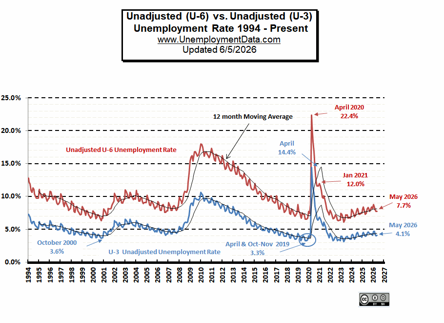 In 2020, COVID precautions shut down all but essential operations, and consequently, the unemployment rate spiked. It took until the end of 2022 for U-6 unemployment to return to pre-COVID levels.
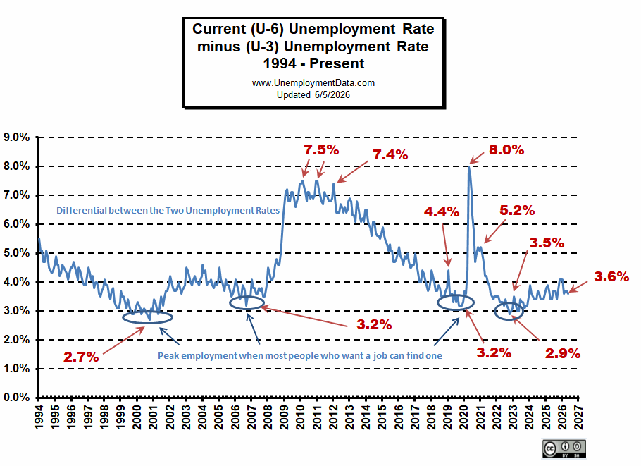
Looking at U6 minus U3 provides a unique view into how different segments of society are faring. As the economy gets worse, U6 rises faster than U3, so we see an increasing differential. But as the economy nears full employment, the differential falls, because there are so many unfilled jobs that even the “discouraged workers” can find one.
The previous lows on this chart are at 2.7% in October 2000, and 3.2% in September 2006, and November 2019. In August, September, and October of 2018, the differential between unadjusted U-3 and unadjusted U-6 dropped to 3.5%, indicating that we were getting closer to “full employment”. Then we had a cluster of really low differential numbers. May and July of 2019 were both 3.5%, and September 2019 came in at 3.2%, equal to the previous low in 2006. Plus, 2006 was quite erratic, with only one month being especially low. But in 2019, we had quite a few low numbers clustered quite close together. In October 2022, the previous low was broken with a reading of 2.9% due to the massive stimulus, which resulted in massive inflation.
 For the current U-3 vs. U6 chart, see Current U-6 unemployment rate. Also, see Is the Government Fudging Unemployment Numbers? for the comparison of Gallup numbers vs. Bureau of Labor Statistics numbers.
Unemployment Rate Chart – The seasonally adjusted unemployment rate from 1948 to the present is one of the most-watched statistics. Where is it now, and should you trust it?
Current Employment Data – How many jobs are there actually? This chart shows Employment since January 2000 and what the current trend is.
Historical Employment Data Chart– How Many People Are Actually Employed? This chart shows the actual employment rate without all the mumbo-jumbo. It gives a clear picture of the employment level in the United States from 1939 to the Present. When employment is rising, the economy is growing. When the employment rate levels off or declines, times are not so good. Take a look and see how employment rates correspond to recessions over time.
Misery Index– Created by economist Arthur Okun to help gauge the level of misery the average person is suffering. It is a combination of the inflation rate and the unemployment rate.
Note: The Current U-6 unemployment rate data has moved.
See Also:
- What is the Labor Force Participation Rate?
- What is the True Unemployment Rate? – Is the Government Fudging the numbers?
- What is the Real Unemployment Rate? – Should discouraged workers be counted?
Source: U.S. Bureau of Labor Statistics- U-6 Unemployment Rate