
Current Employment Level–
Updated July 2, 2026
BLS Employment Numbers Up
 Initially, for May, the BLS reported 159.467 million jobs, which they changed to 159.398 million which erased -69,000 jobs making the June numbers of 159.830 million look like a 432,000 increase instead of a 363,000 increase.
April’s initial job numbers were 158.695, which they actually adjusted up 31,000 in May but in June they adjusted it back down to only an 18,000 increase over the original.
June’s employment numbers are currently listed as 159.830 million.
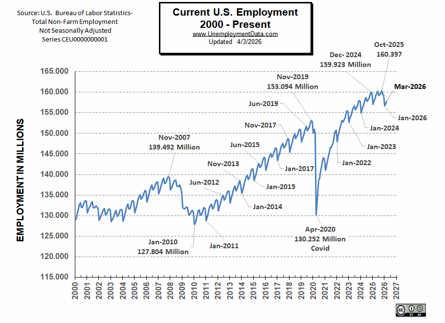
Historically, January’s employment shows a steep decline, and then employment moves almost straight up to a small peak around June with a slight drop in July, and then the highest peak in employment happens in November with a slight decline in December.
Employment in Millions
The number in the right-hand column is how far off the original numbers were from their current numbers (sometimes a million jobs difference). Such as, June 2018, August 2012, December 2012, September through December 2024, and September through December 2025.
| Date | Latest BLS Numbers (in Millions) |
Original BLS Numbers (in Millions) |
Change from Original (in thousands) |
| Jun-2026 | 159.830 | 159.830 | NA |
| May-2026 | 159.398 | 159.467 | -69 |
| Apr-2026 | 158.713 | 158.695 | 18 |
| Mar-2026 | 157.751 | 157.775 | -24 |
| Feb-2026 | 157.214 | 157.286 | -72 |
| Jan-2026 | 156.728 | 156.714 | 14 |
| Dec-2025 | 159.358 | 160.448 | -1,090 |
| Nov-2025 | 159.571 | 160.652 | -1,081 |
| Oct-2025 | 159.355 | 160.411 | -1,056 |
| Sep-2025 | 158.729 | 159.732 | -1,003 |
| Aug-2025 | 158.424 | 159.410 | -986 |
| Jul-2025 | 158.267 | 159.227 | -960 |
| Jun-2025 | 159.299 | 160.475 | -1,176 |
| May-2025 | 159.032 | 159.964 | -932 |
| Apr-2025 | 158.368 | 159.316 | -948 |
| Mar-2025 | 157.540 | 158.506 | -966 |
| Feb-2025 | 157.157 | 157.983 | -826 |
| Jan-2025 | 156.382 | 157.091 | -709 |
| Dec-2024 | 159.289 | 160.458 | -1,169 |
| Nov-2024 | 159.307 | 160.560 | -1,253 |
| Oct-2024 | 158.853 | 160.007 | -1,154 |
| Sep-2024 | 158.111 | 159.177 | -1,066 |
| Aug-2024 | 157.712 | 158.650 | -938 |
| Jul-2024 | 157.485 | 158.445 | -960 |
| Jun-2024 | 158.513 | 159.392 | -879 |
| May-2024 | 158.117 | 158.918 | -801 |
| Apr-2024 | 157.370 | 158.016 | -646 |
| Mar-2024 | 156.612 | 157.218 | -606 |
| Feb-2024 | 156.007 | 156.555 | -548 |
| Jan-2024 | 154.942 | 155.626 | -684 |
| Dec-2023 | 157.828 | 158.228 | -400 |
| Nov-2023 | 157.950 | 158.461 | -511 |
| Oct-2023 | 157.531 | 157.984 | -453 |
| Sep-2023 | 156.563 | 157.001 | -438 |
| Aug-2023 | 156.107 | 156.302 | -195 |
| July 2023 | 155.779 | 156.126 | -347 |
| June 2023 | 156.701 | 156.963 | -262 |
| May-2023 | 156.038 | 156.306 | -268 |
| Apr-2023 | 155.155 | 155.337 | -182 |
| Mar-2023 | 154.253 | 154.517 | -264 |
| Feb-2023 | 153.818 | 153.955 | -137 |
| Jan-2023 | 152.689 | 152.844 | -155 |
| Dec-2022 | 155.210 | 154.771 | 439 |
| Nov-2022 | 155.519 | 154.990 | 529 |
| Oct-2022 | 155.936 | 154.369 | 567 |
| Sep-2022 | 153.730 | 153.073 | 657 |
| Aug-2022 | 153.209 | 152.572 | 713 |
| Jul-2022 | 152.813 | 152.249 | 636 |
| Jun-2022 | 153.176 | 152.692 | 564 |
| May-2022 | 152.264 | 151.773 | 483 |
| Apr-2022 | 151.434 | 150.938 | 491 |
| Mar-2022 | 150.413 | 149.938 | 473 |
| Feb-2022 | 149.606 | 148.967 | 639 |
| Jan-2022 | 147.932 | 147.525 | 407 |
| Dec-2021 | 150.740 | 150.170 | 570 |
| Nov-2021 | 150.543 | 150.004 | 539 |
| Oct-2021 | 149.606 | 149.217 | 388 |
| Sep-2021 | 147.918 | 147.682 | 235 |
| Aug-2021 | 147.159 | 146.856 | 303 |
| Jul-2021 | 146.619 | 146.470 | 149 |
| Jun-2021 | 146.627 | 146.517 | 109 |
| May-2021 | 145.391 | 145.385 | 7 |
| Apr-2021 | 144.403 | 144.398 | 4 |
| Mar-2021 | 143.308 | 143.400 | -92 |
| Feb-2021 | 142.129 | 141.926 | 203 |
| Jan-2021 | 140.975 | 140.927 | 47 |
| Dec-2020 | 143.604 | 143.777 | -173 |
| Nov-2020 | 144.117 | 144.005 | 111 |
| Oct-2020 | 143.565 | 143.459 | 105 |
| Sep-2020 | 141.957 | 141.855 | 102 |
| Aug-2020 | 140.728 | 140.598 | 129 |
| Jul-2020 | 139.105 | 139.100 | 5 |
| Jun-2020 | 138.507 | 138.513 | -6 |
| May-2020 | 133.421 | 133.342 | 80 |
| Apr-2020 | 130.252 | 131.071 | -818 |
| Mar-2020 | 149.952 | 150.804 | -852 |
| Feb-2020 | 150.966 | 150.997 | -30 |
| Jan-2020 | 150.057 | 150.102 | -46 |
| Dec-2019 | 152.846 | 153.342 | -497 |
| Nov-2019 | 153.094 | 153.624 | -529 |
| Oct-2019 | 152.501 | 152.962 | -462 |
| Sep-2019 | 151.509 | 151.949 | -439 |
| Aug-2019 | 151.094 | 151.517 | -423 |
| Jul-2019 | 150.658 | 151.183 | -525 |
| Jun-2019 | 151.713 | 152.307 | -593 |
| May-2019 | 151.096 | 151.629 | -536 |
| Apr-2019 | 150.422 | 150.988 | -566 |
| Mar-2019 | 149.360 | 149.867 | -507 |
| Feb-2019 | 148.684 | 149.133 | -450 |
| Jan-2019 | 147.879 | 148.201 | -323 |
| Dec-2018 | 150.831 | 151.190 | -359 |
| Nov-2018 | 151.032 | 151.232 | -200 |
| Oct-2018 | 150.554 | 150.753 | -200 |
| Sep-2018 | 149.546 | 149.741 | -196 |
| Aug-2018 | 149.236 | 149.226 | 10 |
| Jul-2018 | 148.767 | 148.901 | -134 |
| Jun-2018 | 149.930 | 148.912 | 1,018 |
| May-2018 | 149.264 | 149.309 | -45 |
| Apr-2018 | 148.329 | 148.332 | -3 |
| Mar-2018 | 147.353 | 147.332 | 20 |
| Feb-2018 | 146.648 | 146.696 | -47 |
| Jan-2018 | 145.413 | 145.473 | -61 |
| Dec-2017 | 148.509 | 148.346 | 163 |
| Nov-2017 | 148.758 | 148.507 | 251 |
| Oct-2017 | 148.182 | 148.006 | 176 |
| Sep-2017 | 147.169 | 146.880 | 289 |
| Aug-2017 | 146.781 | 146.541 | 241 |
| Jul-2017 | 146.464 | 146.368 | 96 |
| Jun-2017 | 147.565 | 147.388 | 178 |
| May-2017 | 146.924 | 146.748 | 176 |
| Apr-2017 | 146.085 | 145.979 | 107 |
| Mar-2017 | 145.061 | 144.949 | 113 |
| Feb-2017 | 144.405 | 144.271 | 134 |
| Jan-2017 | 143.374 | 143.220 | 156 |
| Dec-2016 | 146.252 | 146.148 | 104 |
| Nov-2016 | 146.465 | 146.399 | 66 |
| Oct-2016 | 146.031 | 145.928 | 104 |
| Sep-2016 | 145.149 | 144.943 | 207 |
| Aug-2016 | 144.484 | 144.424 | 61 |
| Jul-2016 | 144.232 | 144.185 | 47 |
| Jun-2016 | 145.205 | 145.239 | -34 |
| May-2016 | 144.541 | 144.592 | -52 |
| Apr-2016 | 143.892 | 143.944 | -51 |
| Mar-2016 | 142.797 | 142.877 | -80 |
| Feb-2016 | 141.900 | 142.005 | -104 |
| Jan-2016 | 141.073 | 141.123 | -51 |
| Dec-2015 | 144.045 | 144.191 | -146 |
| Nov-2015 | 144.048 | 144.128 | -79 |
| Oct-2015 | 143.627 | 143.739 | -113 |
| Sep-2015 | 142.478 | 142.627 | -150 |
| Aug-2015 | 141.921 | 142.126 | -205 |
| Jul-2015 | 141.731 | 141.794 | -65 |
| Jun-2015 | 142.681 | 142.817 | -136 |
| May-2015 | 142.205 | 142.420 | -215 |
| Apr-2015 | 141.264 | 141.462 | -198 |
| Mar-2015 | 140.080 | 140.326 | -246 |
| Feb-2015 | 139.324 | 139.566 | -243 |
| Jan-2015 | 138.491 | 138.728 | -237 |
| Dec-2014 | 141.306 | 141.256 | 50 |
| Nov-2014 | 141.314 | 141.301 | 13 |
| Oct-2014 | 140.848 | 140.817 | 31 |
| Sep-2014 | 139.793 | 139.752 | 41 |
| Aug-2014 | 139.105 | 138.989 | 116 |
| Jul-2014 | 138.727 | 138.666 | 61 |
| Jun-2014 | 139.804 | 139.761 | 43 |
| May-2014 | 139.217 | 139.192 | 25 |
| Apr-2014 | 138.308 | 138.288 | 18 |
| Mar-2014 | 137.169 | 137.135 | 34 |
| Feb-2014 | 136.212 | 136.183 | 28 |
| Jan-2014 | 135.471 | 135.396 | 75 |
| Dec-2013 | 138.275 | 137.753 | 521 |
| Nov-2013 | 138.525 | 137.942 | 583 |
| Oct-2013 | 138.002 | 137.540 | 461 |
| Sep-2013 | 137.077 | 136.600 | 477 |
| Aug-2013 | 136.471 | 135.961 | 510 |
| Jul-2013 | 136.034 | 135.664 | 370 |
| Jun-2013 | 137.208 | 136.805 | 404 |
| May-2013 | 136.797 | 136.367 | 430 |
| Apr-2013 | 135.906 | 135.494 | 411 |
| Mar-2013 | 134.901 | 134.485 | 416 |
| Feb-2013 | 134.102 | 133.603 | 499 |
| Jan-2013 | 133.062 | 132.705 | 358 |
| Dec-2012 | 135.945 | 134.822 | 1,125 |
| Nov-2012 | 136.022 | 135.069 | 954 |
| Oct-2012 | 135.633 | 134.792 | 841 |
| Sep-2012 | 134.783 | 133.797 | 986 |
| Aug-2012 | 134.155 | 133.092 | 1,064 |
| Jul-2012 | 133.778 | 132.868 | 910 |
| Jun-2012 | 134.987 | 134.072 | 914 |
| May-2012 | 134.648 | 133.723 | 925 |
| Apr-2012 | 133.836 | 132.945 | 891 |
| Mar-2012 | 132.953 | 132.081 | 873 |
| Feb-2012 | 132.050 | 131.210 | 840 |
| Jan-2012 | 131.095 | 130.297 | 797 |
| Dec-2011 | 133.702 | 132.965 | 736 |
| Nov-2011 | 133.876 | 133.172 | 704 |
| Oct-2011 | 133.540 | 132.870 | 670 |
| Sep-2011 | 132.618 | 131.746 | 871 |
| Aug-2011 | 131.871 | 131.058 | 812 |
| Jul-2011 | 131.599 | 130.821 | 778 |
| Jun-2011 | 132.869 | 132.144 | 727 |
| May-2011 | 132.381 | 131.707 | 675 |
| Apr-2011 | 131.698 | 131.072 | 626 |
| Mar-2011 | 130.482 | 129.899 | 583 |
| Feb-2011 | 129.575 | 128.994 | 582 |
| Jan-2011 | 128.760 | 128.183 | 577 |
| Dec-2010 | 131.622 | 131.050 | 572 |
| Nov-2010 | 131.931 | 131.371 | 559 |
| Oct-2010 | 131.623 | 131.071 | 553 |
| Sep-2010 | 130.650 | 130.090 | 560 |
| Aug-2010 | 130.158 | 129.624 | 534 |
| Jul-2010 | 130.095 | 129.569 | 525 |
| Jun-2010 | 131.430 | 130.908 | 523 |
| May-2010 | 131.311 | 130.801 | 512 |
| Apr-2010 | 130.195 | 129.698 | 497 |
| Mar-2010 | 129.073 | 128.584 | 489 |
| Feb-2010 | 128.241 | 127.746 | 494 |
| Jan-2010 | 127.804 | 127.309 | 495 |
Current Employment Chart
BLS Commissioner’s Report
According to the BLS Commissioner’s report:
“Both total nonfarm payroll employment (+57,000) and the unemployment rate (4.2 percent) changed little in June, the U.S. Bureau of Labor Statistics reported today. Employment continued to trend up in professional and business services, social assistance, and health care. Leisure and hospitality lost jobs…
The number of long-term unemployed (those jobless for 27 weeks or more) changed little at 1.9 million in June but is up by 286,000 over the year. The long-term unemployed accounted for 27.3 percent of all unemployed people in June.“
You can read the full BLS report here.
ADP® National Employment Report
ADP® provides an independent (non-government) estimate of private-sector employment and pay, based on data derived from ADP client payrolls. Their report is entirely different than the BLS version.
ADP: Private employers added 98,000 jobs in June
- Job creation was uneven in June. Financial activities and information were among the gainers, while leisure and hospitality delivered a sixth month of weak hiring.

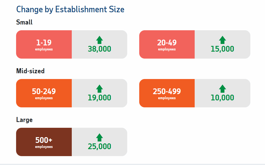
ADP also lists increases by “firm size”.
ADP Changes for June:
Gainers and Losers in April
When broken down further into individual industries, we see that once again, Education and Health were the biggest gainers. This month (like last month), only two sectors were down and only slightly.

Source: ADP©
The National Employment Report is produced by the ADP Research Institute in collaboration with the Stanford Digital Economy Lab.
Looking Back at 2020
In 2020, the COVID virus short-circuited the normal trend with a drop that began in March, and by April, it had wiped out all the employment gains since July 2010. June 2020 saw employment rebound to approximately the January 2015 level. Fortunately, July did not follow the traditional falling pattern but instead rose (although only slightly). August’s employment rose to roughly the January 2016 level. September 2020 employment rose roughly triple the rate at which it rose in 2019. October 2020’s employment rose to slightly above the January 2017 level. In December, we got the traditional slight decline. In November and December, employment was still just over 9 million below year-ago levels, and the civilian population has increased by more than a million people. And January got the expected sharp drop. By June 2021, employment rose above the January 2018 level.
The Effects of Population Increases
According to the BLS, in November 2007, there were 139,492,000 people employed, the unadjusted unemployment rate was 4.5%, and the civilian noninstitutional population was approximately 232 million.
Seventeen years later, in November 2024, there were 160,539,000 employed for a net increase of 21.047 million jobs with an unadjusted unemployment rate of 4.0%.
But in November 2024, there were approximately 269.463 million civilians (not in jail, the military, or institutions). So, the population had increased by about 37.5 million, but there were only 21.047 million more jobs. So, what are the other 16 million people doing? And how can we have a lower unemployment rate with 16 million more not employed?
According to the Census Bureau, there is one birth every 9 seconds, one death every 10 seconds, and one international immigrant every 32 seconds for a net gain of one person every 22 seconds. That means there are 6.7 births, 6 deaths, and 1.9 net migrations into the U.S. every minute. If we subtract deaths from births, we get a net gain of 0.7 per minute from births and 1.9 from immigration, so we can see that the vast majority of our population gain comes from immigrants. But immigrants need jobs… babies do not.
Employment / Population Ratio vs. Labor Force Participation Rate
The employment-population ratio is probably what people are thinking of when they hear the term Labor Force Participation Rate (LFPR). The employment-population ratio is actually the percentage of the population that is working… while the LFPR is the percentage of the population that is in the labor force i.e. working or looking for work.
| Date | Labor Force Participation Rate | Employment/Population Ratio |
| July 2007 | 66.0% | 62.9% |
| July 2010 | 64.6% | 58.5% |
| July 2015 | 62.6% | 59.3% |
| July 2018 | 62.9% | 60.5% |
| July 2019 | 63.1% | 60.8% |
| July 2020 | 61.5% | 55.2% |
| July 2021 | 61.7% | 58.4% |
| July 2022 | 62.1% | 60.0% |
| November 2022 | 62.1% | 59.9% |
| December 2022 | 62.3% | 60.1% |
| January 2023 | 62.4% | 60.2% |
| February 2023 | 62.5% | 60.2% |
| March 2023 | 62.6% | 60.4% |
| April 2023 | 62.6% | 60.4% |
| May 2023 | 62.6% | 60.3% |
| June 2023 | 62.6% | 60.3% |
| July 2023 | 62.6% | 60.4% |
| August 2023 | 62.8% | 60.4% |
| September 2023 | 62.8% | 60.4% |
| October 2023 | 62.7% | 60.2% |
| November 2023 | 62.8% | 60.4% |
| December 2023 | 62.5% | 60.1% |
| January 2024 | 62.5% | 60.2% |
| February 2024 | 62.5% | 60.1% |
| March 2024 | 62.7% | 60.3% |
| April 2024 | 62.7% | 60.2% |
| May 2024 | 62.5% | 60.1% |
| June 2024 | 62.6% | 60.1% |
| July 2024 | 62.7% | 60.0% |
| August 2024 | 62.7% | 60.0% |
| September 2024 | 62.7% | 60.2% |
| October 2024 | 62.6% | 60.0% |
| November 2024 | 62.5% | 59.8% |
| December 2024 | 62.5% | 60.0% |
| January 2025 | 62.6% | 60.1% |
| February 2025 | 62.4% | 59.9% |
| March 2025 | 62.5% | 59.9% |
| April 2025 | 62.6% | 60.0% |
| May 2025 | 62.4% | 59.7% |
| June 2025 | 62.3% | 59.7% |
| July 2025 | 62.2% | 59.6% |
| August 2024 | 62.3% | 59.6% |
| September 2025 | 62.4% | 59.7% |
| October 2025 | NA* | NA* |
| November 2025 | 62.5% | 59.6% |
| December 2025 | 62.4% | 59.7% |
| January 2026 | 62.1% was 62.5% before adjustment |
59.4% was 59.8% before adjustment |
| February 2026 | 62.0% | 59.3% |
| March 2026 | 61.9% | 59.2% |
| April 2026 | 61.8% | 59.1% |
| May 2026 | 61.8% | 59.2% |
| June 2026 | 61.5% | 59.)% |
| Date | Labor Force Participation Rate | Employment/Population Ratio |
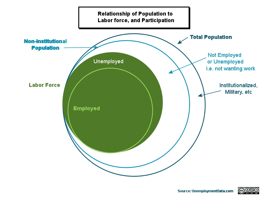
Diagram showing the relationship between Labor Force Participation and Employment-Population Ratio. The Labor Force Participation Rate is the percentage of the Non-Institutional Population that makes up the Labor Force. And the Employment – Population Ratio is the percentage of the Total Population that is employed.
In 2007, roughly 63% of the population was working, but in 2022-24, just over 60% of the population was working.
Source: BLS Employment-Population Ratio
For more information, see Employment-Population Ratio or Labor Force Participation Rate.
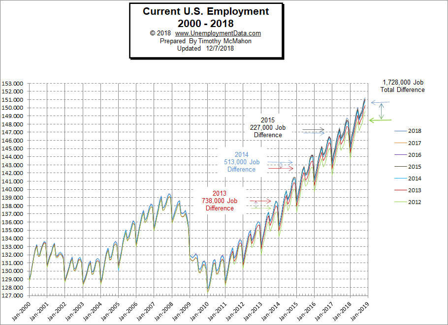
January Adjustments to the Employment Rate:
In previous years, we had our doubts about the January adjustments, we have been tracking the data as released along with the changes since 2012. In 2013, they found 738,000 “previously overlooked” jobs, in January 2014, they found another 513,000 jobs, and in January 2015, they found another 227,000 jobs. In January 2016, they backtracked and erased 75,000 jobs, and in January 2017, the difference was only about 20,000 jobs. The BLS calls this adjustment “Benchmarking”.
January 2022 has once again “benchmarked” the data all the way back to 1990.
2018’s Commissioner’s Comment reads: “Following our usual practice, there were routine annual adjustments to the data from our two surveys. The establishment survey data released today reflect the incorporation of annual benchmark revisions. Each year, we re-anchor our sample-based survey estimates to full universe counts of employment, primarily derived from the Quarterly Census of Employment and Wages, which enumerates jobs covered by the unemployment insurance tax system. The effect of these revisions on the underlying trend in nonfarm payroll employment was minor. (Additional information about the benchmark revision and its impact is contained in our news release and on our website at www.bls.gov/web/empsit/cesbmart.htm.)”
2018’s benchmarking increased the number of jobs by an average of about 135,000 from April 2016 through December 2017, which corresponds to the period of change for that year. They say they adjust the numbers only a few years back. But when we actually verify their numbers pre-adjustment and post-adjustment, the changes often go much further back than they claim. In 2016, the BLS “Benchmarked” their data back to 2000. Changes in 2014 went all the way back to 1979.
2019’s benchmarking was extremely minor.
2019’s Commissioner’s Comment reads:
With the release of January 2019 data on February 1, 2019, the Bureau of Labor Statistics (BLS) introduced its annual revision of national estimates of employment, hours, and earnings from the Current Employment Statistics (CES) monthly survey of nonfarm establishments.
The March 2018 benchmarked seasonally adjusted employment level for total nonfarm employment is 148,279,000. The not-seasonally adjusted benchmarked employment level is 147,368,000.
Compared with the sample-based, published seasonally adjusted estimate for March 2018, total nonfarm employment had a revision of -1,000 or less than -0.05 percent. The not seasonally adjusted total nonfarm employment estimate was revised by -16,000, or less than -0.05 percent.
See BLS Changes Employment Numbers for the details.
On the Current Employment Rate Chart below, we can see how the various sets of numbers compare. The 2016- 2018 numbers are so close that it is difficult to see the difference on the chart. However, earlier changes were more significant, resulting is a 1.7 million job total difference. In addition to the issue of the numbers changing, there is the problem that the “Civilian Non-Institutional Population” continues to increase by roughly 200,000 people a month, although from December 2014 – January 2015, there was a massive 700,000 increase… possibly due to the changes allowing illegal aliens to become legal at that time (although the BLS claims that they were just adjusting their numbers to match the Census Bureau numbers). Although, supposedly, they did that the previous year as well, so there was still a massive increase coming from somewhere. The bottom line, though, is that the number of jobs needs to increase more than the population increases for the unemployment rate to actually fall.
Note: Since the changes have been so minor over the last few years, we will not be updating this chart.
According to Shadowstats, the government is really underestimating unemployment by even more than our numbers suggest since “long-term discouraged workers were defined out of official existence in 1994.” The new U-6 numbers only include short-term discouraged workers, long-term discouraged workers are removed from the Labor Force and not counted.
The ShadowStats Alternate Unemployment Rate

Plus, according to David Stockman, a two-term Congressman from Michigan and Director of the Office of Management and Budget under President Ronald Reagan:
“In fact, at the February 2008 peak prior to the crisis, the BLS reported 138.5 million nonfarm payroll jobs compared to 143.9 million in April 2016. The net gain is thus only 5.6 million, and it means nearly 9 million or 61% of the 14 million new jobs our President (Biden) has been crowing about are not “new” at all; they were born-again jobs, and even then, they consist of lower-paying and lesser quality jobs than the ones obliterated during the crash and so-called Great Recession.
For instance, there has been a loss of 2.3 million goods-producing jobs in manufacturing, mining/energy, and construction, paying an average of$58,000 per year; and these have been swapped for 1.9 million jobs in leisure and hospitality, paying less than $20,000 per year.”
Historical Background:
The U.S. Employment rate peaked in November 2007 at around 139 million and then fell to 136 million, bounced above 138 million before falling below 128 million in January 2010. By December 2012, the number of people employed reached between 135 and 136 million, depending on which BLS numbers you believe. A year later, in December 2013, the BLS was saying the employment was above 138 million, and by December 2014, the official numbers had topped 141 million.
From the Employment Rate Chart, we can see that employment in November 2013 was nearing levels reached in November 2007 when employment peaked at just over 139 million jobs. But then it fell sharply, as it seems to do every January (which is why they “seasonally adjust the numbers” to make annual comparison easier). Once again, we need to note that the total U.S. population (not just the “civilian non-institutional population) has increased from about 305 million to about 323.5 million since 2007.
BLS Changes Employment Numbers
Note:
In January 2018, an average of 135,000 jobs were added, although in December 2017, jobs increased by 212,000.
In January 2017, 112,000 jobs were added to December 2016.
In January 2016, the “non-adjusted” numbers underwent their annual massage (i.e., adjustment), and this time, rather than creating phantom jobs, they actually removed 75,000 phantom jobs.
But in January 2015, the “non-adjusted” numbers were adjusted, and the BLS found roughly 227,000 jobs.
In January 2014, they found roughly 513,000 jobs. And even though they say they only go back three months with their regular adjustment, their annual adjustment can go back years. This time, they went back and created more jobs out of thin air, going all the way back to 1978. Just like with the “Ministry of Truth” in George Orwell’s classic book “1984,” it becomes increasingly difficult to determine where employment really stands and to track any trends if the “yardstick” for measurement is constantly changing.
According to the BLS, “On an annual basis, the establishment survey incorporates a benchmark revision that re-anchors estimates to nearly complete employment counts available from unemployment insurance tax records. The benchmark helps to control for sampling and modeling errors in the estimates. For more information on the annual benchmark revision, please visit www.bls.gov/web/empsit/cesbmart.htm.” But that doesn’t explain why they would change data going back several years.
They said the “benchmarking” for January 2014 only went back as far as January 2009, but in actuality, they changed the numbers all the way back to April 1979 — 20 years further than they reported!
For 2015, they “only” changed the numbers as far back as April 2013 and added 227,000 jobs. But the newest change is on top of the change they made in January 2014, which added 513,000 jobs and changed the numbers all the way back to April 1979.
In 2016, the BLS “Benchmarked” their data back to 2000. Previous revisions have resulted in roughly a 1.5 million job difference, but this revision resulted in very minor differences and even reduced the peaks in recent years minimally. These changes supposedly resulted from a new database for Services for the elderly and persons with disabilities coming online, which allowed the BLS access to more accurate numbers.
In 2013, the BLS changed the employment numbers back through July of 1991. At that time, I contacted the Bureau of Labor Statistics, and they pointed me to a short obscure blurb on their website that supposedly explains why they did it. See BLS Changes Employment Numbers for our full discussion of this (pseudo) BLS explanation. Their justification was that they hadn’t properly counted all the “Property and Casualty insurers”. And somehow, Property and Casualty insurers increased the total number of jobs by 104,000 in August 2010 and by 738,000 in December 2012. Boy, there must have been a lot of Property and Casualty insurers hired during that couple of years of recession!
You can see the cumulative difference between the 2012 numbers and the new numbers on the above chart, the total difference is now 1.478 million jobs.
Note: The Employment rate and the Unemployment rate are based on two entirely different surveys, but theoretically,0 they should be two sides of the same coin. If you look at the chart above, it does look like the employment rate is climbing, i.e., more people are getting jobs as the trend channel does seem to be up.
By looking at the employment rate, we should be able to tell how many jobs there are in our economy, pure and simple. (As Detective Joe Friday in Dragnet would say, “Just the facts, Ma’am”). Are there more jobs than last year? Good! Are there fewer jobs than last year? Not good. Simple as that! But things have gotten a bit more complex with the implementation of Obamacare. It has inadvertently created incentives for companies to switch from full-time employees to part-time employees. Thus, two people may be considered employed where there used to be only one… except there is no additional work being done… but the numbers look better.
We also need to consider the population factor. If the number of jobs stays the same, but the population increases drastically, then the unemployment rate will rise even though the number of jobs stayed the same. So looking at the unemployment rate is also important. Unfortunately, it still doesn’t give us the full picture. If the U.S. population is growing (and it is), but the number of jobs only holds steady, the number of people without jobs will increase. So in order for the real unemployment rate to stay the same, the number of jobs has to increase by at least the same rate as the population. If the number of jobs increases at anything less than the rate at which the population is increasing, the unemployment rate will be increasing.
The U.S. Bureau of Labor Statistics uses the Labor Force Participation Rate. If we look at the BLS’ Seasonally Adjusted Labor Force Participation Rate, we see that it has fallen drastically since 2009. Prior to 2009, it held fairly steady at around 66% of the workforce being employed, but it is now below 63%. In January 2015, the Labor Force Participation Rate was 62.9% it slowly worked its way down to 62.5% in October 2015 and November but appears to have bottomed there and now has rebounded a bit back up to 63.0% by Feb-Mar 2017 but couldn’t seem to break the 63% barrier until January and February 2019 when it hit 63.2%.
See What is the Labor Force Participation Rate? for more info on the current LFPR.
See Current Unemployment Rate for an explanation of how the government calculates the official Unemployment rate.
Source: U.S. Bureau of Labor Statistics- Current Employment Rate Data
For more information, see:
- Article: Employment vs. Unemployment how do they compare?
- Historical Employment Data Chart
- Current Unemployment Rate Chart
- Current Employment vs. Unemployment Chart Are they really “two sides of the same coin”?
- What is U-6 Unemployment?
- The Misery index measures inflation plus unemployment and is a good measure of the discomfort of the country’s population.
- More Unemployment and Employment Charts
- 10 Awesome Jobs You Can Do From Home
What is the rate of taxes with drawn from wages that go to S/S and Medicare?
An employee’s portion of social security tax is 6.2% of his or her social security wages (i.e., up to the “wage base limit”). Employers are taxed an additional 6.2%, for a total contribution of 12.4%. There is no maximum income to pay into Medicare, so you pay an additional 2.9 percent of all W-2 income toward medicare.